Yeah the issuewas actually realted to sharedarraybuffer, my mistake, I see the option in the settings so I guess it's fine!
Pipo
Creator of
Recent community posts
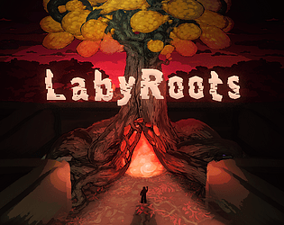
The atmosphere is so good, really creepy and scaring. I’m impressed by the amount of beautiful artworks u managed to create! Especially loved the last one in the intro, with the guy staring at you. The audio is also very well done, delivering (lol) the mood perfectly, I felt uncomfortable and unsettled (which is a good thing in this case). Not only the artwork and music, but the direction of the intro is very interesting, loved everything about it and that alone was an impressive work!
The gameplay though, I mean, I still like the atmosphere and the amount of visual stuff that it is in it, let’s say, on a “sensory” level (visuals, sound, mood) it was well done, but the gameplay, not at all.
As first, the way u control the character is very very basic platform and was not good. There were some visual glitches, like the box stretching, I did not understand and were confusing.
The hitbox are too big and get hit too easily, it feels unfair because, to me, it felt like I was not even close to the object hitting me. U usually do the hitbox smaller than the visual, not bigger. Some jumps are too precise on a height level, and since the controls are so basic this sometimes required to press jump before moving, otherwise I would have not been able to do that 1 pixel more to go over the platform. It might feel like “u need to get better” but it just feels like I can’t do what should be very simple and easy.
I also encountered some body parts, the leg, which I could not reach (guess it was impossible?) and the body at the end, but could not interact with them. Not sure if the game has an ending after the body bridge.
In general, the level design was artistically interesting, but not very interesting gameplay wise, maybe because it felt too generic. At some point, I got outside the level by walljumping, which was kind of fun lol
As others have pointed out, even though I liked being overwhelmed by sounds and visuals during the gameplay, it felt a bit too much always. With this I mean that there was no change of pace, it was just a lot for the whole duration, while it would have probably helped to have moments of relative calm to have a better pace and make the “a lot” moment stand out and also not get boring and annoying.
Minor things, the click here to close button could have just been a properly scaled X without any other text annoying the player while watching the beautiful intro! Second one, since UP is not used, u could have made up also jump together with space, so people can pick their preferred one. After a while I realized that the rocks were the checkpoints, maybe some visual thing happening when u touch one could make that more clear. Besides, u should opt out of the humor category for the jam, I mean it doesn’t hurt but it will not have a huge rating in theory since there is no humor in your game.
These are all suggestions related to the gameplay, but I want to remark how I am impressed by the artistic work on this, amazing work!
I've tested this by printing the local storage itself from the game, and I can see the entry of other games made by me.
I'm not sure if the local storage is also shared between games of different authors.
If u have done a game that uses local storage let me know so I can also test that!
This was already pointed out in this archived post: https://itch.io/t/1158456/html5-local-storage-seems-to-be-shared-between-multipl...
Of course this is an annoying issue, especially if the local storage is shared between every author
PICO-8 is like a small editor with everything you need to make a game, but has a lot of limitations, like 128x128 pixel, 16 colors, limits on how many lines of code you can write, and limits to memory. You also only have arrow keys and two buttons.
They say it's a fantasy console, because developing for pico8 is like developing for an old console like nes/snes.
I find it cool especially because of the editor that gives you all the tools, its simplicity driven by its limitations, and the fact that it export for web and is also playable from mobile (the web version).
You can find more info in PICO-8 home page, here.
Hi all PICO-8 users and enthusiasts!
Want to upload your game to itch.io, but those huge gray borders are haunting you? Here is my solution!
Fabulous Guide to PICO-8 on itch.io
On the guide you can also see a comparison between a standard upload and my fabulous guide upload on itch.io.
I hope it will help you in making your PICO-8 look cooler on your itch.io page.
The steps are very easy and well explained, let me know if there is something you don’t understand or other suggestions or whatever!
Hi to everyone!
I'm proud to announce that Egypto has been finally released!
Egypto is a 2D space shooter, where you can by upgrades to enhance your spaceship. It features 3 level with 3 unique boss, all made with a super nice pixel art!

Even though i've already realesed games and published them on itch, I consider this the very first one. Developing it was a great experience, so i truly hope you will like it!
Here, a link to the game:
Have fun with it!


