1:22 for me ;)
And that's on the jam version, which doesn't have all of the fixes improving movement that the post-jam version has
sirius-black9999
Creator of
Recent community posts
unfortunately, after the first phase, the offset between the ring being emitted and the target being hit is far less than the full measure it's supposed to be, it's only slightly more than 3 beats, which instantly makes it have nothing to do with rhythm anymore since you can only react to the visuals.
hiya, i said i'd give a few pointers, so keep in mind i'm being overly harsh:
First off, your UX could use some work, there's a few little details here and there where, as a player, you'd expect things to work one way, and they work different.
For instance the intro text progresses only when you press enter, i might expect other controls like space or z/x to also work, or even just any key, and the way the text is laid out "suggests" that it would automatically progress
(usually there's a small visual indicator, like an arrow or dots to show when you're expecting input to progress).
Second, the control scheme isn't very intuitive, and there's no in-game way to figure them out, even just a static screen on the pause menu could help a ton here, and you'd usually expect to be able to return to the main menu from there, too (that also means there's no real way to exit the game other than alt+f4).
I also seemingly couldn't use the grappling ability at all? and by that i mean z and i didn't seem to do anything, so that made the start of the second level an almost impossible jump to pass.
Finally, the music feels a bit harsh, and the same is true for the graphics, mainly the tileset has a little bit too much contrast between the gray and brown.
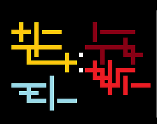
very interesting idea, from a technical aspect, here's some small things i've noticed:
The middle mouse button isn't a great button to use for unmixing, because on my mouse that actually maps to pressing the scroll wheel which doesn't register half the time, i found it was generally more reliable to just swap colors.
The UI for showing what the primary and secondary colors are are also somewhat tricky, during combat i found myself just running away trying to figure out what color or combination of colors i'm supposed to have? perhaps it'd be more intuitive to use the triangles of keys "1-2-q" and "3-4-e" so you don't have to rotate through a color wheel? on controller that could be a combination with a trigger and a flick of the right stick? or perhaps it'd already help to put the UI elements near the player so you don't need to look away to find the color combination?
Taking damage might also benefit from better feedback, at one point i was wondering if the palettes were indicating my health, or the number of rooms i had left to complete because the hitboxes were a little odd,
Also when i died i respawned in the wall and flew off the map.
Still, a great start ;)


