Indie game storeFree gamesFun gamesHorror games
Game developmentAssetsComics
SalesBundles
Jobs
TagsGame Engines

TappTapp

7
Posts
1
Followers
A member registered Jan 05, 2022 · View creator page →

Creator of

Recent community posts

I forgot about the windup animation, on review I think the windup animation is fine. Just popped into dark souls to compare and found a few ideas that could make it feel better:

Less delay between button press and damage dealt, more recovery time after. I'd rather land the hit and risk getting hit back than be unable to land a hit.

A small lunge forward during windup, to give the illusion of still being in control of your character (since you're probably running forwards when swinging anyway).

Starter enemies that are less likely to step back or move out of the way.

The improved shield control will also help the sword feel better.

Great graphics, nice grass texture. I like the concept of building networked self-sustaining villages.

I think the game could communicate more information visually. The mechanics are centrally about the connections between buildings (and how those connections bounce off of mirrors), but these connections are not visible. It felt like playing laser redirection puzzles with invisible lasers.

Networking was tough to understand, and the house implies you need to know it in the first level. I was unsure if any structure counted or just paths. Some indication of which tiles were networked (like an outline) would help.

I wish I could see decay status of different buildings more easily. Or just highlight the ones on zero turns left. 

The graphic for the mirror pool doesn't look like it reaches all the way to the shore. The wall graphic implies it can be built on meadow.

I couldn't work out how to deselect my tool so I could inspect tiles. Usually this would be done by clicking on the selected tool again.

Having to clear land before building is tedious. Its fast regrowth is annoying, but not difficult enough to bother planning around. The timber pile and stone foundation similarly feel unnecessary. Makes me wonder if houses could just cost 3 actions instead of 1. This wasn't as bad once I got used to using the keyboard shortcuts.

Took me a while to realise you could have multiple houses with 1 garden, or that this was necessary for building a mason.

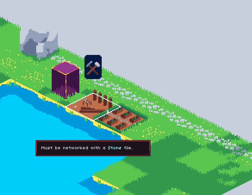
I think I encountered a bug here, with the house not registering stone as being networked.


Good luck and I'm curious to see how it develops.

Delay between button press and sword swing feels bad. Even just a windup animation would help.

Crossbow/poison kiting feels much easier and less risky than trying to melee

Shield doesn't raise after swinging if you press and hold the shield button during swing

Auto sprint after dodging leads to accidentally running out of stamina during fights

(2 edits)

The visuals and sounds are a great match for the gameplay. Was listening to Caramelldansen while playing.

Levels 7 & 8 are easier than 6.

The wall dash at the start of level 10 is frustrating.

Entering a door instead of the elevator resets your progress if you have a save.

Tutorialising is good and the movement feels right.

Found a visual bug when facing away from a wall but close enough to wallslide:

Not much to comment on so far.

Took a bit to understand the piece limitation but I think the UI hints at it decently.

Between the cost of moving pawns and the fact that you have 8 pawns for 8 rows, the best strategy was just "1 pawn in each row".

Love the concept and the vibe. The presentation is consistent and shows discipline. I've finished the violin and doll missions and plan to play the third.

It felt like once you were spotted, you couldn't escape that guard by breaking LOS without an oil bomb. I like escaping to a hiding place, but it seems the better strategy is to let the guard catch up to you and oil them.

It was hard to gauge the sound mechanic. I understood what made more noise, but it was hard to tell whether the noise would alert a guard.

From what I could tell, oiling part of a window would block the whole window. But the decal size is quite small.

The turn mechanic seemed to encourage two approaches: either waiting for guards to finish their turn before moving out of a hiding spot, or ignoring the mechanic because you're running away from a guard. I enjoyed when a guard's patrol would force me to reposition mid-turn rather than just waiting for them to finish. Normally having no permanent hiding spots is too stressful, but the ability to stop and plan alleviates that.

An interesting side-effect of the turn mechanic is that players naturally create 'checkpoints' by ending each turn in a hiding spot. Returning to a hiding spot (basically save-scumming) could be used to help explore the level.

The plunger was great for horizontal motion, but not for gaining height. I liked the way Dishonoured would let you teleport up over a ledge.

Overall a great experience.

Thanks for the feedback! Plenty I can incorporate for the UI/learning curve overhaul.