Hey there! You can now download the PDF with the character sheets on the game page!
Thoughty by Beau Jágr Sheldon
Creator of
Recent community posts
Thank you for being understanding! I need to get better at understanding the website, to be honest, I'm a little behind on updating listings. I hope you enjoy it! If you'd like a hard copy of Turn to use to play, please feel free to email me at thoughty-bjs at outlook dot com with your mailing info and I'll send you a copy free of charge! I have plenty of community copies left :)
Hi!
That's a great point! Honestly, I just let the writers/designers choose what to design for their own contributions, so it was just mostly what they were excited about, less about hitting any expected notes. I also had hoped to do further supplements before my health worsened, and was going to do a town in Maine to add a seal someday! I agree it would be a really fun option. If you ever want to try designing one of your own, I would love to see it and share a link to it on the Turn pages here! Otherwise, hopefully sometime my health will allow me to do more.
Thank you so much and I really appreciate the feedback and support!
I had primarily taken Clayton's down just because of the overload of files on the page - not meant to malign Clayton! - it was just so much stuff and it got pretty confusing. I have no ill will toward it, I just wanted to ensure people could easily find the new complete documents. I'll try to restore it this weekend in a zip file if that is okay (will post a devlog), that way it's downloadable but it doesn't make it hard for people to find the Final (mostly because I updated language in the Final that is important in part for translations).
I appreciate the understanding, and I promise I don't mean to be sharp! I just wanted to contextualize how difficult this can be from the creative perspective, and why it is so challenging to meet everyone's requests at times.
I understand the desire to have a cool looking design, but that design was a gift and it also was one that many noted was very bright and sometimes hard to look at. I designed the new cards myself and spent six months designing it to the dream style I had wanted to do for Script Change since the start, in part because people were declining to properly credit me and claiming that the tools I spent 10 years designing were useless without the work of another person (the layout designer).
So, I understand liking the yellow cards! But I also feel to a degree that it's a little insulting to ask me to go back to another person's design when I learned how to use InDesign to make the new design and cards, and I also feel like I would be moving backwards in color accessibility for those who asked me to change from the yellow to move back to it or make the primary cards that bright yellow again.
I will consider making the download available, but I do admit a little bit of disappointment in people responding like I didn't invest a decade into this project and months into the planning and redesign after having to fight to have my work recognized as mine at all. I thought my design was pretty decent, but if the trendiness is priority, I see the issue. I'll update with a design blog if I decide to make the download available again.
Hi!
I've been working on my own personal transition zine with illustrations of body changes and bottom growth progress, plus discussion about the impact of T on my body as someone with previously untreated PCOS who is nonbinary-masc and now on testosterone. I'm so excited to see other zines exploring testosterone and how it impacts us!
Would an illustration or comic-panel style image page, primarily framed as a clear depiction of anatomy changes, and a short text essay about the ways T has impacted me be acceptable for this? I think that fits within your guidelines, and I can provide an example of my illustrations if needed!
Thank you for doing this!
This game is absolutely fantastic! Filled with gorgeous, sexy, affirming art, and designed to explore an experience that's exciting and enticing! I love the layout, the thoughtful safety section, and the support for framing your body in your terms as you explore erotic and intimate play. Full five stars well deserved!
It is totally amazing to see Script Change in so many different forms! I really am so excited for how you all have made such amazing contributions. While I was not super involved with the jam itself, Script Change is one of the most valuable things I have designed, so it's incredible to see this happen. Thank you!
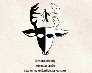
Thank you! Oh wow, I had not made that connection at all! I'll talk to John about how we might be able to adjust that (I think putting some space between the Man and the Stag might solve it like you suggest). That's not the type of imagery I've seen before, to be honest - we were going with like a kind of old world naturalist / hiker vibe in our heads, so I'm sorry it came across this way! I'll see what we can do.


