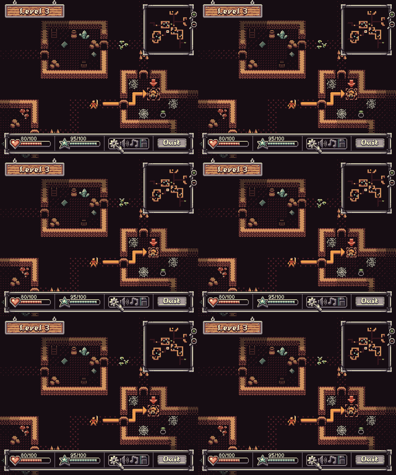
Hey! Just wanted to say, awesome stuff! You have a really unqiue pixel style, loving everything I'm seeing here (and other packs).
Cheers from a fellow pixel artist!
VEXED
Creator of
Recent community posts
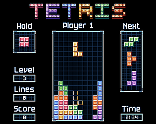
Really excited to announce my new Micro Classics asset series with Micro Classics Tetris! This series will feature classic video games and board games, such as what you see below (Tetris). All packs come in both 8x8, and 16x16 tile sizes.
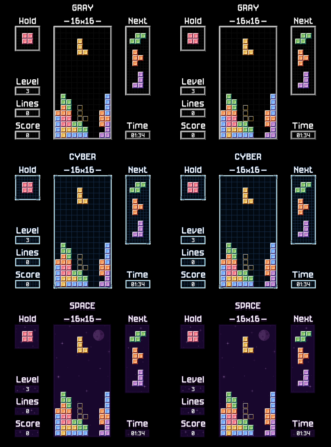
The intent is to design classics game assets for new devs to learn with. Going forward I plan to include a few code demos for educational purposes as well.
Hope you enjoy, cheers!
Really excited to announce my new Micro Classics asset series with Micro Classics Tetris! This series will feature classic video games and board games, such as what you see below (Tetris). All packs come in both 8x8, and 16x16 tile sizes.
The intent is to design classics game assets for new devs to learn with. Going forward I plan to include a few code demos for educational purposes as well.
Hope you enjoy, cheers!
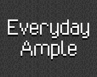
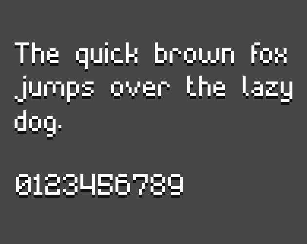
Just released font 5/6 for my Everyday pixel font collection. Titled, Everyday Ample, this one is 11pt.
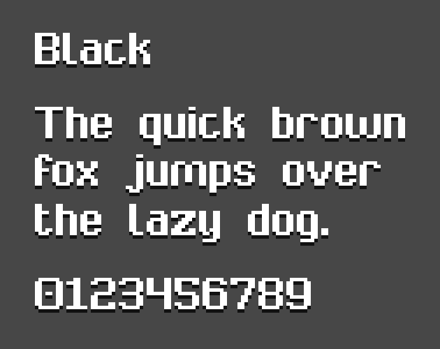
Everyday Ample like other Everyday fonts focuses on simplicity and legiblity. As always it comes with multiple variations including, standard, bold, black, and original. Enjoy!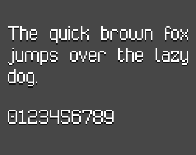
Just released font 5/6 for my Everyday pixel font collection. Titled, Everyday Ample, this one is 11pt.
Everyday Ample like other Everyday fonts focuses on simplicity and legiblity. As always it comes with multiple variations including, standard, bold, black, and original. Enjoy!

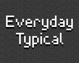
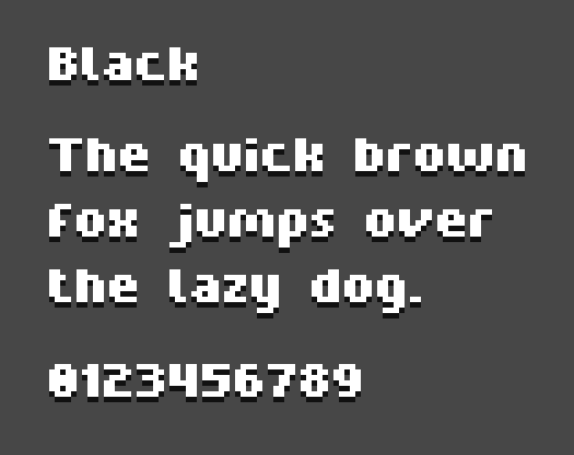
New release in my Everyday pixel font collection! This one is titled Everyday Typical and is a 9x9 variation.
Everyday Typical like other Everyday fonts focuses on simplicity and legiblity. As always it comes with multiple variations including, standard, bold, black, and original. Enjoy!
New release in my Everyday pixel font collection! This one is titled Everyday Typical and is a 9x9 variation.
Everyday Typical like other Everyday fonts focuses on simplicity and legiblity. As always it comes with multiple variations including, standard, bold, black, and original. Enjoy!
Hey, thanks for using and enjoying my assets! Always love seeing wonderful projects being made using them!
Notes on the suggestions:
- The vision tiles are included in the "interface" file at the bottom.
- I do think I need to include the +, I'll look into that and have it included with the next update.
- This is planned!
Thanks for the suggestions, cheers!
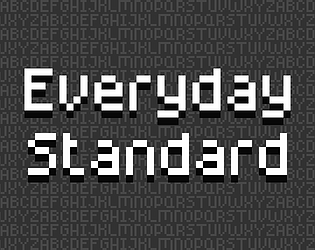
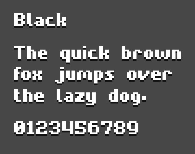
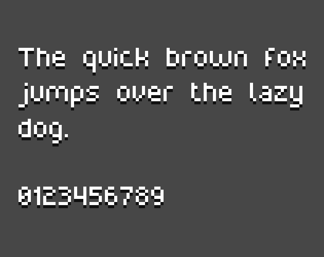
New font release for you all! Part of my growing Everday font series. This one is titled Everday Standard.
Everyday Standard like other Everyday fonts focuses on simplicity and legiblity. As always it comes with multiple variations including, standard, bold, black, and original. Enjoy!
New font release for you all! Part of my growing Everday font series. This one is titled Everday Standard.
Everyday Standard like other Everyday fonts focuses on simplicity and legiblity. As always it comes with multiple variations including, standard, bold, black, and original. Enjoy!
I have my doubts, not only the size difference but also Chroma Noir has a very unique visual style even for 1bit.
That being said it all depends on context. I'll leave it to your judgement.
Perhapse I'll make an industrial expansion at some point, those assets you mentioned seem to have that vibe. Cheers!
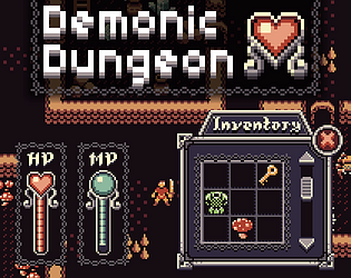
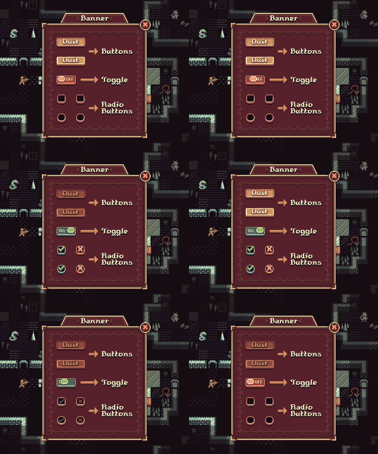
It has been a long road but Demonic Dungeon's User Interface expansion is finally finished and relased.
Demonic Dungeon's User Interface is a highly flexable UI pack with everything you could need to design your rouglike (or other genre) UI. The User Interface comes with multiple variations for almost everything, as well as two color palettes (silver and gold).