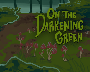
The design and aesthetics of this game are on point! It's a very difficult game and the death can get a little annoying... as others have pointed out. I don't mind dying so often in a game like this (it feels.... intentional?) but I'd like to move on a little quicker. I also think that overlaying a texture over your graphics (like paper or rusty metal), or something would be very simple to do, and add even more charm. Overall, I'm really impressed with the polish on this game!
Valya
Creator of
Recent community posts
Mmmm, I'm gonna have to agree with the other comments about nerfing the second level. I think there's something to be said about introducing concepts slowly so the player can learn mechanics better, especially in puzzle games. I think focusing on teaching the player the enemy movement mechanics would've been a big boon, or giving us simpler enemies while the player learns how their own troops move. And then later, you could introduce more complicated enemies. I was caught off guard by their attacks and movement, because I spent the majority of the first levels trying to figure out how my troops moved. It's really difficult for me to just read something and intuitively understand how it works in action (although different people learn differently, so it's still good to have the written information available.) I really love turn-based strategy games though, so it was really neat to see one in the jam! And I can tell you put a lot of thought into this. Thank you for sharing!!!
The aesthetic is cool, and some of the visual effects really add a lot to it. I think some animation stuff (the character leaning into turns, ect) would have contributed very positively to game feel, but I understand time contraints :P I did notice a couple bugs (like sometimes hitting a sharp turn wrong flipped my character completely backwards, which really sucked!) To be fair, that may have been an intentional mechanic, but it didn't feel that way. The music was awesome. I think this is definitely an aesthetic and game that could be expanded on very well.
This concept is really cool and I really enjoyed it (I'm a meta game fan, though, haha.) The art style is really nice too, and this is a really cool use of the theme cycle. I could not tell if the typos were intentional or not, but they didn't bother me much. I really enjoyed all of the really individual and unique personalities of all of the characters :)
I really like the aesthetic of this game and the concept and story you put around it really add a lot. I think the concept of the mechanics is really good, but I agree with some of the other comments about them not being communicated very well. It sounds like you're pretty aware of the rest of the issues and I'm interested to see a build of this where they are resolved :)
Thank you! I'm really glad you enjoyed our game and that the connection to the theme came across so clearly. And I'm still kinda in awe of the amount of content our musician produced in such a short period (he even made a couple other tracks for other games and finished with our game a day or two early!!!!!)
That's fair! Admittedly my hands were a little tied with the backgrounds since I had to find CC free use stock photos and edit them. You would not believe how few photos there are for dirty laundry rooms xD. Due to the nature of jams and sacrifices we have to make, I did not spend a lot of time on the backgrounds and it shows in some cases. Thank you for pointing it out- I'll keep a closer eye on that kind of thing in the future.
I did not want to focus on gender exploration for this project but I still wanted to reflect some gender diversity in my characters, with a heavier focus on female characters. Big woman/Alma is a woman, and the second character is nonbinary. That said, it probably would have been more appropriate for Ivy to have asked about pronouns very briefly instead of being psychic about genders, and that would help us all develop good habits :) Although in the case of Whisp, who doesn't talk until the end of your encounter with them, they wouldn't have shared that kind of information anyway!
Thanks for the feedback and thanks for playing!
This is a really really cool idea. I think the controls could have been clearer (and I would have liked to known about the restart function in the second level!) I also think the difficulty curve was a bit off for me, and mechanics could have been introduced a little more gracefully. Also, some of the boxes/the player character clipped through boundaries a few times and got stuck! =x= But the aesthetic is nice and the controls worked really nicely for me.


