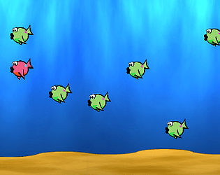
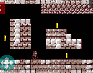
I like how the use of color in the background suggests depth. I would have liked to have the arrow keys as a control option.
wsmcclain
Creator of
Recent community posts
I am thankful for the dedicated tutorial. The bright green text on the busy background image in the menus was somewhat difficult to read. I would have liked to see the ship turn in the direction of its movement. The background images in the levels are noticeably compressed and blurry. Perhaps a smaller image that is then tiled to fit the area would work better.
Maybe the font used in the menus was meant for mobile devices and looks better there but the font was a bit difficult to read on desktop.
The announcement text at the top of the screen looks very bland. A different font and a place card behind it would help. There's some grass sprites that look realistic and don't fit the pixel aesthetic. The player can continually jump if they're touching a wall. Was that intentional?
The credits do not list the sources of your assets. Did you make everything yourself?
The User Interface of the 1st Level is a bit of a sensory overload. Even with the tutorial, it was difficult for me to be sure of what I was doing. I would suggest moving the tutorial to an optional "training ground" where it could possibly be much more straight forward, and hide or reveal User Interface elements as they're needed.


