Indie game storeFree gamesFun gamesHorror games
Game developmentAssetsComics
SalesBundles
Jobs
TagsGame Engines

MasterPlan

Visual planning ideaboard, by indie devs, for indie devs and creatives · By SolarLune

Better visual for ellipsized Check Box/Progress Tasks

A topic by wuffie created Oct 26, 2020 Views: 194 Replies: 1
Viewing posts 1 to 2

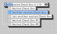
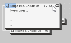
When Check Box/Progress Tasks contain multiple lines of text for their content, they are ellipsized. The only method to display that extra information is to open the Edit window. To  reduce the number of steps, maybe temporarily expand the Task (without changing collision with other Tasks) on solo selection/hover instead?

Here is a mockup: