On Sale: GamesAssetsToolsTabletopComics
Indie game storeFree gamesFun gamesHorror games
Game developmentAssetsComics
SalesBundles
Jobs
TagsGame Engines

Bow and Dork, feedback on the page and the game itself

A topic by FarmerHoggit created Nov 14, 2020 Views: 323 Replies: 3
Viewing posts 1 to 2

https://farmerhoggit.itch.io/bow-and-dork-demo

Hi! I'm farmerhoggit and I've been working on my very own point and click game. I've made a demo that I am very proud of but there is a problem. 


I am really struggling to get people interested in taking an interest or trying the demo. Even friends of mine keep putting it off (though the ones that have tried it very much enjoy it). 
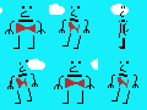

So I am asking for feedback here, is the genre putting people off? Perhaps the screenshots and description are offputting as a first impression? 

Please have a look and let me know. I am very new to all this so any feedback will help a lot. If you have time to try the demo, that would be great too! 

Moderator(+2)

Hi FarmerHoggit,

I’ve taken a look at your game page. You don’t mention the platform the game supports, so I didn’t get a chance to try it. Here’s some feedback for the game’s page:

  • The cover image doesn’t really convey much about the game. As someone that looked at it for the first time, I just see grass and the sky, with possibly some sea of the same color. I also see two figures that it’s hard for me to make out what they represent. Also the title is a bit cropped on the left. I would suggest for that image to represent a slice of your game. Possibly an image related to the story, or the gameplay, depending on what’s more often encountered in the game.

  • Itch seems to think the cover image is a gif, but when I hover over it, it doesn’t animate. I tried other games and I can see the animation as expected.

  • The small description of your game could use some more details. Imagine someone who has no idea what your game is about, how can you convince them to give it a try with 1-2 sentences? For reference here’s the current text:

A bitesize introduction to my adventure game

  • Keep in mind the cover image and the small description are the first chance for you to convince users to visit your game page. That’s the first step.

  • Your game page is almost empty and using default styles and colors. That’s fair enough, since most indies focus their skills on the actual game. However people that look at that page, are people who are interested in your game, and want to be convinced to try it. Looking at a page that has minimal effort, might signal them that the game itself was made with minimal effort, even if that’s not true at all.

  • You only have one screenshot. Just by looking at it, I can’t really tell what the game is about. Is it point and click? Can I walk around? Do I have to solve puzzles? Are there multiple options in the dialogue?

  • The description is ok-ish. It describes the premise of the game, but I think it might be nice to include some more information about the gameplay itself. Something like “To achieve your goal, you need to talk with locals to convince them to vote for you”. This is of course an example, but would give users an idea of what to expect.

  • Your game page doesn’t seem to mention what platform your game is available for. That means when users search the site for games for X platform, they won’t see your game, even if it supports it.

  • A trailer can do wonders. Even if the game is not finished yet, record some footage of you playing the game for 5-10 minutes, then select 3-4 of the most entertaining scenes, and add them together in a small video of 1-2 minutes. This is a great idea to show users what they’ll be doing in the game.

That’s all I could see. I also noticed this is your first game, if that’s the case, don’t let this wall of text overwhelm you. It is already difficult enough to make a game, and it’s an amazing first step that you should be very proud of!

Everything I mentioned here is my personal opinion on how to improve the presentation of your game. It’s up to you to decide if you want to implement any of it.

(+1)

Hello Dark Dimension


This has been insanely helpful thank you so much. A lot of this will be hard to fix since it's such a bitesize section of the game that is available but there are also many things I can look at changing. 

I hope my fixes are adequate. I will be able to add more screenshots and maybe a trailer once I have access to my desktop again. Thanks again for the feedback and I hope you enjoy the demo if you have the time (and also a windows computer). 

Honestly I very much appreciate the time you took to provide all of that feedback you are a saint.


Hoggit