

Here's a screenshot showing a nearly unreadable (13" macbook) display with this app.
Most unreadable is what looks like a little X/Y pad which seems to be a primitive mixer. That's also where I think you need to add the volume + and volume - buttons. Instead of an X/Y pad or a volume button you could use a four band graphic EQ as a bar and another slider beside it for volume.
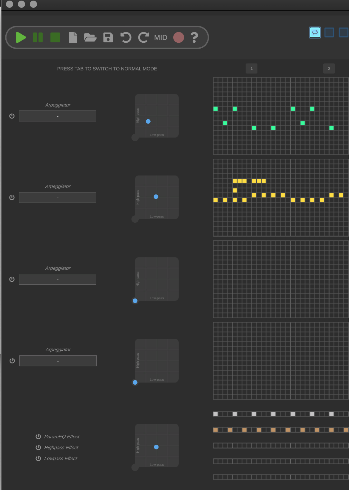
Remember that even if the above looks fine on your screen some machines have higher Density screens and the above mac display is not very large, and so having tiny light gray text like the word "Low-pass" is unreadable not only for most modern laptop screens but also for people who have less than 20:20 vision. Please consider increasing the contrast here (bright white larger NON ITALIC TEXT on black background), and make all the text in this app larger.
I suggest you show your app to kids from age 6-8. If you can make it even more fun for them it will also still be fun for teens and adults.