finally. Finally. FINALLY I finished what I set out to do 1.5 years ago and completed my final stage with no perks. More on that later.
Imma start off that in the time I missed out on 0.4 and 0.5, WAKER became much better in almost every way. From what I remember, granted, it’s a while back, 0.3 still felt like a prototype, among others due to lack of sounds, this feels like a mostly finished product, in terms of the polish for the existing features. The gameplay is fun, music is a banger, and OMG the mouse control is sooo well implemented - and now I know that playing with a graphics tablet is amazing.
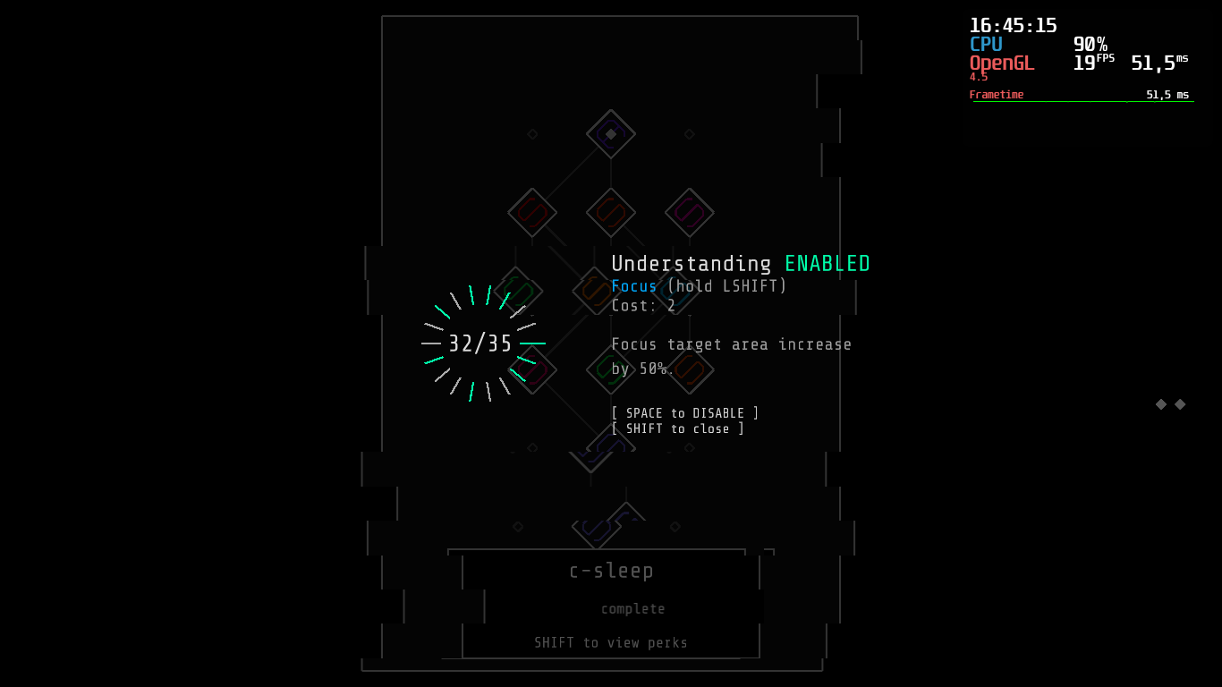
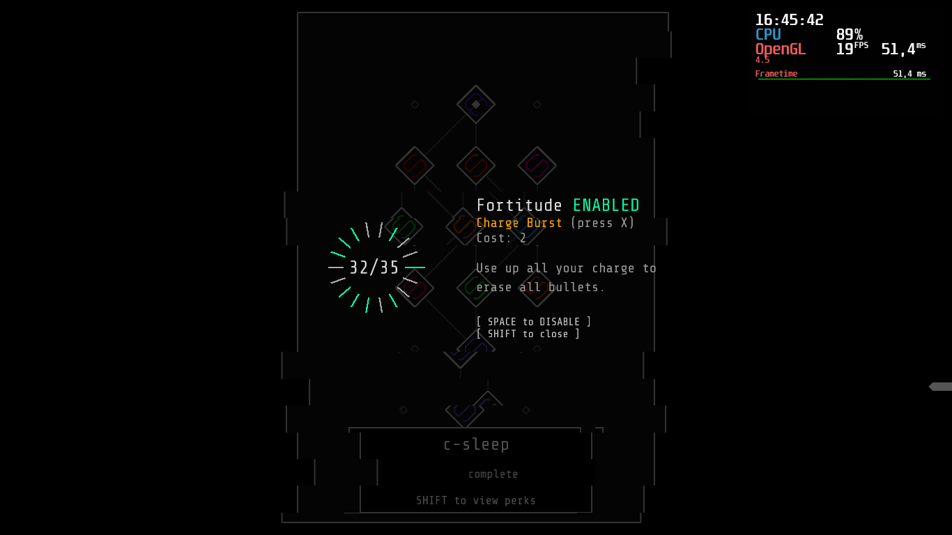
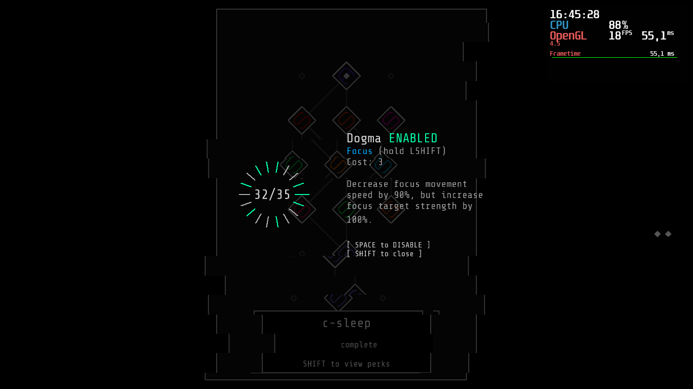
To the still less polished parts - big elephant in the room are the perks. I’m not sure if it’s something fundamental or simply a matter of adjusting some numbers, but the reason I spent the last year trying to beat it and dealing with the frustration of not using perks is because it feels like they trivialize the game, apart from adding complexity where I fell for WAKER because of it’s simplicity (Which I could live with, if it weren’t for the first part).
As can be seen in the latter part of my playthrough, perks pretty much melt bosses (and everything else, for that matter), which I don’t like especially because at that point the attacks don’t even reach you before the next phase is initiated. Basically my issue here is that “avoid bullets” becomes “do a bunch of the easier levels, then grind them with perks and the remaining 2/3 of the map are pretty much done at that point.
As I said, I’m not sure what exactly can be done to solve this issue. Or maybe that’s not even a problem and I’m just too much of a purist.
Other than that, there are a few other issues:
- The perk selection is a little uneasy to handle, I’m not quite sure what the best way to advance and go back is with the mouse, and the left-right key interpretation doesn’t make sense to me, either.
- suggestion: Get rid of perks. Ok, JK, but at least make the perks not rotate but rather change the selection, and also allow selecting the perks with the cursor. Maybe a complete overhaul of the perks would come as a natural change, too. I’m thinking of Resident Evil’s inventory management, and the completed levels correspond to one slot, with the perks being tetris-esque shapes. Maybe the maps have different colors and the perks get boosted a little for each time they cover a corresponding color. That’s just theorizing though.
- If you keep the perk selection screen as is, please at least allow the scrollwheel to interact with it.
- Maybe we could use mouse and keyboard, at least in the overworld?
- With the cursor, sometimes the select sound is played every single frame on certain spots (video will be added later)
- Perk selection screen requires about 3 times more resources than regular overworld. I think that making the glitched background once and then just displaying the picture would work? How do you achieve the effect, anyway? If it’s not, maybe a shader would be better?
- Add a line between the cursor and player, as it is easy to loose track in chaotic scenarios
- Rework the screen-shake, as it’s very hard to see what happens with it. I suggest just letting the frame shake, like in the original XIII - youtu.be/mI-OEhJXPng?t=418
- Hardware accelerated cursor, please?
- Achieving a lower rank than previously on a level overwrites the better rank. Seems like it’s not the wanted behavior. Ignore if it’s not.
- these (cursor):


- This particular “missing” pixel in the top right corner:

Further suggestions, unrelated to the update(s):
- Add [Enter] and [Y] (for german layout) as default confirmation, and make the menu’s confirm button the secondary shift option.
- Add a way to see the seed (If there’s no singular seed to create a map, merge it into one seed, worst case scenario just apend all seeds for the maps) and the ability to put one in for a new game.
- As a followup, add a daily seed. Unless there are online leaderboards, having the date or a simple derivative should suffice.
- Add an automatic end to the intro when the boot sound finished playing.
- Add the title of the song playing in the level to the screen/ level description.
- Add a credits screen, even though it’s just two people (to my understanding), it’d be a great place to list and link the songs used. Maybe also let it be used as a jukebox.
- Add support for vertical resolutions. The format this game is in literally begs for that.
- V-sync toggle
- configurable frame limiter
- Add an option to remove the charge bar when no perks that use it are enabled
- Add a visual representation for how far the rank is from getting to the next one, and also the whole progress from D to S on the grand scale. My suggestion is to put the former as a vertical bar that fills from top to bottom in the Rank area and the same with the latter, but as one that fills the score bar form bottom up. Let it overflow, if S requirements are exceeded.
So, closing up: Game feels amazing, the perks are IMO too OP, and difficulty of individual levels has occasional big spikes. Out of game controls are a bit awkward. Perk description is also not entirely clear - what is focus speed vs strength? No remarks to sound and music other than that they feel just right. I love how the mouse movement is implemented, especially how seamless shifting with it is.
Of course all that implies that you still want to work on this game. It’s understandable if you don’t. Good luck with your school either way :)


