Indie game storeFree gamesFun gamesHorror games
Game developmentAssetsComics
SalesBundles
Jobs
TagsGame Engines

Liking this so far and some QOL suggestions

A topic by Sam created Aug 09, 2017 Views: 554 Replies: 4
Viewing posts 1 to 5

Hi.  I just purchased the game and am having fun with it so far.  I like that the Custom Game sandbox mode has so many options that you can pick to change the difficulty and the feel of the game. I think it adds greatly to the replayability because I am finding that I want to try so many different configurations and difficulty levels.  And try different paths like different careers and educational goals.  I am really glad that I found this game.

I wanted to share some small quality of life suggestions that I have so far.

1.  In the information display next to the avatar add commas to the dollar amount format once the amount is 10,000 or more.  That would make that number easier to read.

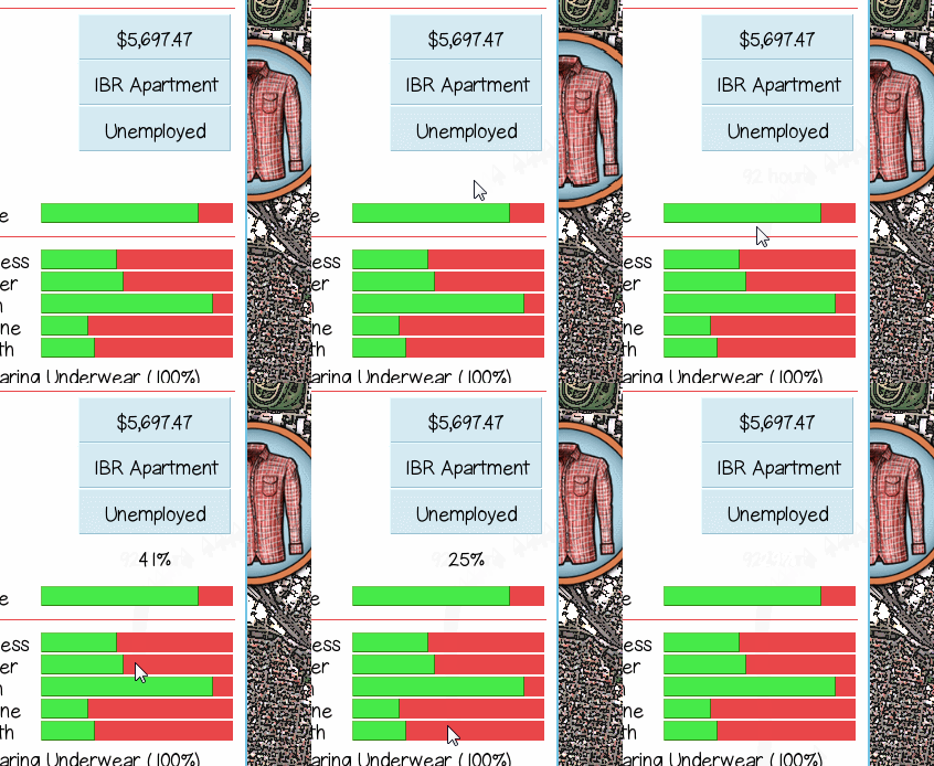
2.  For the info bars like Time, Happiness, Hunger, Fun etc, could you add a popup when moused over that says "x out of y" or the percentage filled so we can see exactly what the values are and can tell precisely if we are over or under 50%.

3.  Add a way to see the breakdown of your work hours by types of work experience.  I can see how many total hours that I've worked in the Time Usage report but haven't found a way to tell how much cooking work experience I have so I don't know when I can apply for jobs that require a certain amount of a specific type of experience.  I haven't had time to get too far into the game so maybe I am missing where it tells you this but if not I think it would be helpful add.

Thank you for this game.  It feels like it is going to be a lot of fun.

Developer

Hi, I'm glad that you're enjoying the game so far :)

1. I can try that adjustment. It should be pretty easy to add commas to all the currency numbers in the game actually because of the way I designed the currency display.

2. A mouse-over popup for the info bars, I'm not sure if I have the functionality for that but I will investigate. Maybe there is another way to display the information you want as well. I will think about this more.

3. You can see the type of work experience by clicking the "Character" button on your profile panel. It should be under the Experience heading.

Thanks very much for your suggestions, they really help me see the game from the player's perspective.

(1 edit)

Thanks for the reply.

1.  I think that commas in all of the currency numbers would make them a lot easier to read so I am glad that seems like an easy change.

2.  Some other ideas for displaying the information for the info bars are putting text in the bars that say "53/100" or "100 hrs left of 168" for the time bar.    Or putting little notches in the bars every 10% or 25% like a thermometer or a gas tank gauge so it would be easier to eyeball.

3.  Okay, thanks, I see where it says that now.

Developer

I got 1 and 2 working, should be in the next version :)

Thank you so much.  I think both changes will be super helpful.