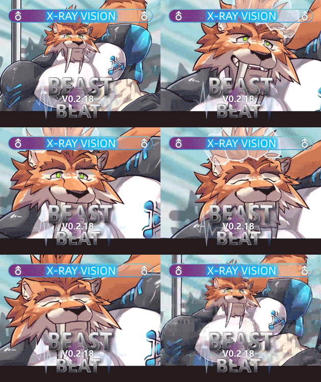
so i like your game and as someone that's like this type of rhythm games i realized 2 problem in your arrow
1. the big problem here is using the man symbol as the arrow is confusing to the eyes, at least for me idk for the other, i don't really sure how to explain it, but if you see the same type of game like ayo dance or au, you will see solid arrow like this ⬆️➡️⬇️⬅️ with cubes texture where you can clearly see the arrow contrast to the background, meanwhile your arrow is having hollow circle ○》and see through so it's confusing to me and idk how to explain it, it's like watching that illusion type of picture that changing when being moved, idk how to explain it sorry.
please at least please make it solid arrow that's not see through so you can see it clearly contrast to the background
2. second problem is all arrow is the same pointing upward ⬆️ you should know right why this type of game have 5 or 4 types of arrow pointing difrent direction ⬅️⬆️⬇️➡️ and middle buttons if it's 5
so in conclusion please change the arrow so it's bigger and not see through so you can clearly see it contrast to the background, and please make the arrow pointing other direction other than up ward


