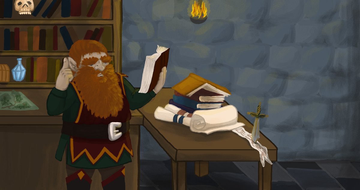
So we are making a third-person fighting game as a school project and instead of
a normal intro we wanted to do something more original.
So please tell me, what do you think of our first pic?
 Sincerely,
the Unseemly Tales Team
Just looking at the picture it looks great.
Looking closer I did notice this:
Your light sources vs shadows don't quite align.
The dwarf is holding the book balanced on his forearm - rather than on his thumb - and the book lacks any kind of real support to keep it there - it's too high for it to be resting on the crook of his arm, and too low for it to be resting on his thumb. It seems a bit awkward. He's not quite looking at it either - which might be by design.
The objects on the top 2 shelves of the bookshelf appear to be floating. You need a fine line between the floor of the shelf and the back of the shelf to create the shelf effect so that the objects don't float.
Love the beard!
Very nice glow effect on the bricks - but your light source is too small to reach all across the wall.
The room is very bright for your small light source. If you want to accentuate the light source place a semi-transparent black square over the picture with a fully transparent / gradient circle in the middle and positioned over the light source - this darkens the corners and areas away from the light.