Indie game storeFree gamesFun gamesHorror games
Game developmentAssetsComics
SalesBundles
Jobs
TagsGame Engines

I Am Overburdened

A topic by Spidi created Jan 31, 2017 Views: 5,479 Replies: 47
Viewing posts 1 to 42
(6 edits)

Hi there, people of itch.io!

My name is Tamás Karsai (Spidi) and I've been writing a blog about my game development journey for a long while now. Since I released my previous games on itch.io (+ I'm planning to keep this habit of mine ;) ), I decided to share my posts with this community.

This entry is the first one for the new game I'm working on called "I am overburdened" and the first one when I published a video log entry too! I decided to try this format due to the following reasons:

  • I'm writing pretty lengthy posts (I'm a blabbermouth) and at this day and age many dislike to read, what I totally understand, since a video log / pod-cast can be listened to while doing something else + it is usually more content rich.
  • I also like to consume this type of content myself, besides following and reading blogs of many indie developers, I often watch video logs too about game development.

Content wise it essentially matches this entry, but has much more live stuff presented. I would like to continue creating these videos too (and would love to make them as frequently as my blog entries) as I had fun recording it, so I encourage you to leave a comment/critique here or under the video on youtube to help me make it even better (or fix annoying things about it) for the upcoming episodes.
So, here goes nothing:


The project.

So the new game I'm working is a small project, with the goal to complete it and take it to market in a short period of time (approx 3 months), focusing first and foremost on practicing my skills besides making a fun game. Currently I'm at a point where the design documentation (and the feature set) is finalized and most parts of the prototype is up and running.

I have to say, that designing a game with this tiny scope itself, which I would be proud to release and sell, was a challenge in an off itself and it took some time to pull off, but I feel like I succeeded.

The game idea.

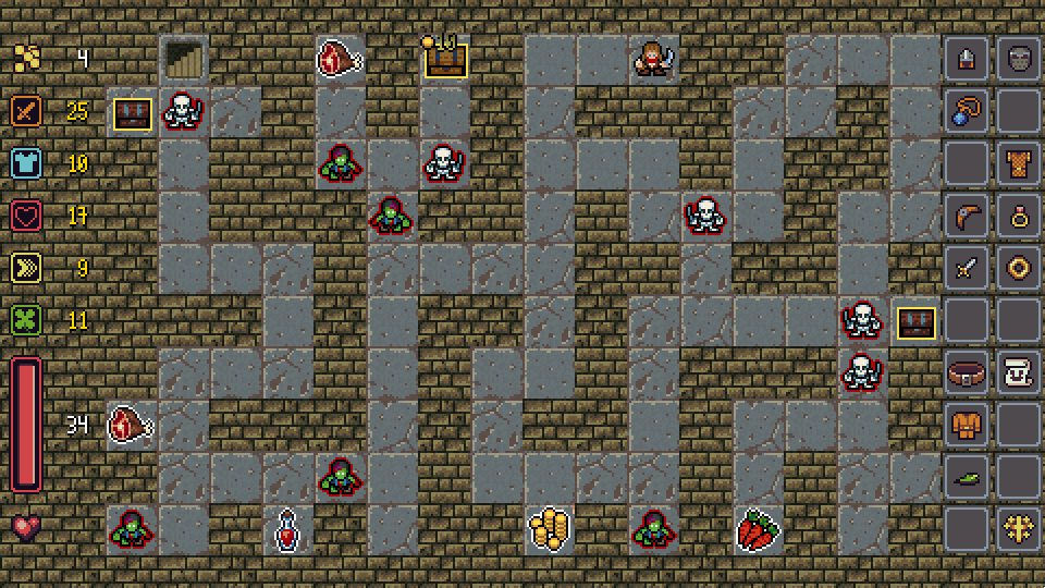
So the game is going to be a small "arcadey" rogue-like with a fun twist to the tried and true formula. The core idea driving the design were artifacts/loot and a huge and messy inventory :). Every single item in this game is going to be unique with mostly unique skills and abilities (or a unique combination of them) on contrary to the procedural item design of many action RPGs. * Mystical zombie blood tainted socks of the necromancer *, you get the idea. Around a 100 items are planned currently, will see if I can create those in time. The other "weirdness" is the number of slots in your inventory, which is 20 :D :P . So from feet to head gears, everything, literally! The punchline is, that all of the character customization will be done by gear, no leveling, no extra maximum life received after killing a bunch of monsters. You have to get more "powerful", by collecting lots of magical artifacts and selecting your preferred bonuses.

A vertical slice of the features to convey a better idea for the final product:

  • Turn based rogue-like with perma-death.
  • Run focused campaign, playable in short bursts with lots of deaths/retries :).
  • Huge inventory (20 slots) with a great number of artifacts to find.
  • Carefully crafted RPG system with complex customization possibilities thanks to your inventory, but no leveling!
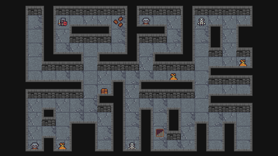
  • Semi-procedurally generated dungeons using hand authored layouts.
  • A funny story, packed with a vicious evil, puns, jokes and a hero with a surprisingly large carrying capacity.
  • Hall of fame for remembering your best playthroughs.

Important to note that nearly 100% of what you will see now is composed of open art assets, so the look is fully subject to change!


So there you have it, I am overburdened. I'll finalize the prototype with all the core features in a few days. Afterwards I'm going to move onto mostly producing content for the game (dungeon layouts, monsters, items and abilities etc...), but probably by next week it will still look kind-of the same, as I'm planning to work on the graphics only at a later phase, when the game is already in a solid playable state.

You can follow the daily progress of the game too on it's Trello board.

I could go on about this game for pages :D, but this should be enough for the first entry.
Take care!

Hello everyone!

I worked on a lot of stuff since my last post:

  • Thought a lot about the content/format of my blog and my freshly started video series, and made some decisions about their future.
  • Worked on the linux/mac port of Operation KREEP, but still no announcements yet (but not far).
  • Lot of progress on the development of "I am overburdened", although not as much as I hoped :| ...

Blog

The previous video entry was pretty huge in length and quite empty (was okay? I guess as the first one). My goal with the series is to have a little introspection of the development process and to showcase the games I'm working on + to gather some interest for them. Of course with dreadfully uninteresting videos this is not going to happen :D . Cooked up these rules and goals to try to fix this:

  • Cut short the videos or fill them with more "action" (50+% game/feature showcase sounds about right).
  • Made an introduction video. This allows omitting the silly "greeting and explanation" section from the upcoming entries.
  • Embrace "freestyle" recording to act more naturally (+ to cut down the time it takes to prepare an entry).
  • Increase recording quality.

So here it is, in it's full glory, episode two:


As always, open for critique and comments both for the video and the blog entry. Please leave them here or below the video, so I can make better follow-ups.

Progress

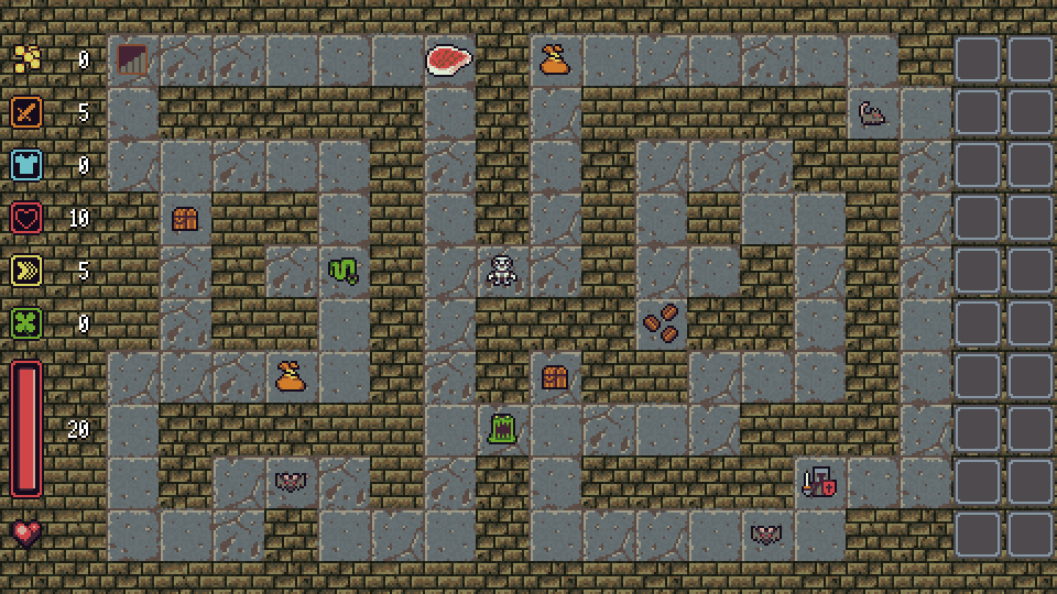
Steady, but a tad bit slow. I hoped I could complete all the core features by now, but failed to implement monsters. It is starting to become a real game though, but I'm still in the "prototyping" phase, hence the title. Here goes last weeks progress in GIFs:

RPG layer

The RPG design and its implementation is mostly complete. Our hero has health points (damage, healing and death when reaching 0 works), and the main attributes are done (most of it is integrated and takes effect on certain events).

  • Attack: damage output.
  • Defense: damage reduction.
  • Vitality: maximum health points.
  • Speed: who attacks first.
  • Luck: luck trial influence (item find chance, potion efficiency etc...)

Pickups

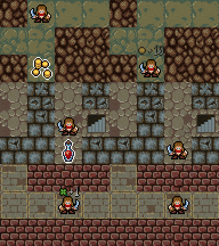
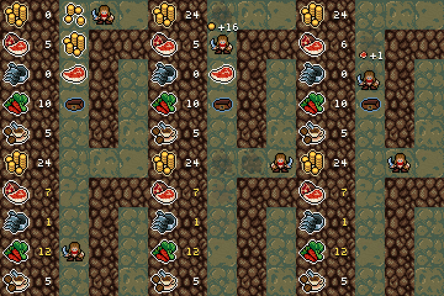
Treasures scattered around the dungeon floor are fully functional. There are various types (e.g.: gold sacks, health potions, permanent attribute bonuses, random artifacts), with varying probabilities to be spawn. The system is data driven, so without modifying the game a lot of pickups (and types) can be added to the mix easily.

Chests

Chests, the most valuable targets, are working. Again large part of the system is data driven (sprites, cost to open, probabilities etc...) and I have some "okay" default chest settings added to the game already.

Items and inventory

The inventory system and the basic item logic is in place. Items don't have their bonuses and skills implemented yet, but I'm already working on it :) . The plan is to have an event system "fueling" the skills, so the bonuses can be configured in tiny "scripts" (e.g.: [+X] ["Attack"] when [attacking "undead"] or [+Z permanent] ["Health points"] when [reaching "stairs"]). It has to carry the weight of 100+ unique items, so I hope this approach will be adequate.

As the next step, I have to complete the monster and battle logic. I put down the skeleton code for this too but it is going to take a few days to finish. Once that is done, the game will be pretty much playable, but lacking content and original assets. So the next post will focus on the monsters, finalization of the RPG layer and the item system. Maybe it will have plans for an open alpha release too :) ?!

Stay tuned!

Hi there!

Small update this time. Been working on wrapping up all the remaining core features, but got a bit sidetracked so I'm going to write a little about level editing too besides monsters + I'm trying out yet another video setup.

This video is the most condensed so far, focusing exclusively on last week's development and showcasing gameplay features. I thought making a third video using this form will result in a diverse and easily comparable set and will help to draw my final conclusions about the series.

So it is short (3 minutes), maximally to the point and heavily "scripted" :) :


Monsters


During this week, I pretty much completed all the logic related to the monsters of the game. From their type description (sprites, attributes, inventory?! :o :) :P , database of monster types etc...), all the way to battling with them. Also filled the game with a bunch of placeholder monster sprites/types to test it out, and now it feels like a real rogue-like with character advancement, treasures and risk of death :) .

Battle system

Once you try to move to a tile occupied by a monster a "battle" starts. Both entities will take their turns to attack, the faster one (speed attribute) will start or it will be decided with luck trials if there is a match. If both contestants survive the first attack the slower/unlucky entity strikes back, and shortly after the player gets back input control.

Levels and modding

Official mod support is sadly out of the scope of this project, but I still managed to come up with a clean solution for a "half-offical" way :) . Since all the configuration files (monster/pickup/chest types, starting attributes, spawn profiles, item skills) will be shipped as plain XML files, huge part of the game can be tweaked with a plain old text editor, but for a pleasant level editing experience that will not suffice...

Tiled

I decided to ship the game with built-in support for the Tiled editor. Now the game can read plain tmx files. Never made a run-time parser for it before, but I used this editor multiple times so it was a natural choice. The final package will also feature a pre-built tile set for Tiled map files (placeholder one pictured) and a written guide on specific map properties related to the game.

By the next entry I will have all the missing bits and pieces of the game-play loop implemented (difficulty management and item skills) and the game will be pretty much fully playable albeit lacking content or balance. As always, open for questions, comments and critique.

Take care!

Hello everyone!

This entry turned out to be lengthy and pretty technical. Sorry about that, but last week was spent only on "under the hood" stuff. I did my best to make it interesting though ;) ! So the agenda is the item system which became really sophisticated, especially compared to the size of the game + the difficulty and pacing management.

I settled on the video format of the last entry, because EP 3 was the most pleasant recording experience and in my eyes it was the most enjoyable video so far. So from now on, I'm going for condensed and "scripted" logs focusing on the features and development of the game.

Items, loot

The plan for the game is to have a wast and diverse set of unique items (approx 100). Since no leveling will take place, the player will have to risk collecting as much loot as possible during the journey and focus on customizing the play-style by carefully picking which items to wear. So the technology behind the game has to support a great number of skills and excessive customization of the items, but also has to allow lightning fast iteration times, since I will be spending a significant amount of time during the upcoming 2 to 4 weeks with designing and balancing the possible loot.

Attribute bonuses

The easiest development was attribute bonuses on items. Adding the following piece to the descriptor of an item in the loot configuration file will provide the given bonus attributes to the player while equipped:

<Attributes>
<Attack>1</Attack>
<Defense>2</Defense>
<Vitality>3</Vitality>
<Speed>4</Speed>
<Luck>5</Luck>
</Attributes>

Skills, event system

For a high level of flexibility and to have a varied set of special skills I implemented an event system. Essentially an event is a string (the name of the occurred event) and a context holding additional data related to it and a skill is an event handler implementation.

The execution of a skill can also be chance based (luck of event firing creature is taken into account). so one may only take effect with a given chance (e.g.: 10% chance to "XYZ" types). An item can have a list of skills listening for events when equipped by a creature.

Few of the most common events in the game:

  • NextDungeonReached: the player reached the next level.
  • Attacking: a creature starts attacking.
  • OpenChest: the player just opened a chest.
  • Pickup: the player picks up a bonus item (e.g.: health potion, gold sack etc...)

Some of the existing skill implementations:

  • Attribute: grants a "bonus" for the upcoming trial (e.g.: +10 luck for the next luck trial).
  • Cripple: interrupts the next attack of the target.
  • Thorns: reflects a "bonus" amount of damage to the attacker.
  • Vampiric: a "bonus" amount of the damage dealt is healed to the attacker.

"bonus" == modifier applied to an integer value. Can be an integer like +/- 5 or a percentage like +/- 5%. The integer bonuses are applied first and the percentage modifiers afterwards.

Most of these events and skills took only a few lines of code to integrate and I have several more ready and working. Combing and configuring them to take effect on specific events with various chances is already an immensely versatile system to build items :) !

Tags

String tags can be added to a creature when describing it in a configuration file, like: undead, deamon, boss etc... The event system allows to define tag requirements for targets before a skill can take effect. A creature meets a given a requirement if it does not have any tags from its "can not have" set of tags and has all the tags from its "must have" set of tags. It is as simple as that.

This tiny addition allows skills which have real "character" to be made. Some cool examples would be monsters tagged as "undead" and a life-steal granting sword which does not work on them (pictured in the GIF), or a holy shield which grants enormous extra defense, but only when attacked by monsters tagged as "deamon". This also allows to disable certain skills against bosses which could make them too overpowered otherwise.

I'm still at the beginning when it comes to designing the concrete items, but with these systems in place I hope I'll have a pleasant experience while implementing the actual artifacts. As closing words for the loot topic, here is a rather complicated item description just to show how this is all put together in configuration files:

<!--
  Forearm armor:
    +1 Defense
    20% chance to cripple non "Boneless" enemies
-->
<ItemDescriptor>
  <Type>Forearms</Type>
  <Name>Vambraces</Name>
  <Sprite>Item22</Sprite>
  <Level>1</Level>
  <Attributes>
    <Defense>1</Defense>
  </Attributes>
  <Skills>
    <Skill>
      <Cripple>
        <EventHandled>InflictDamage</EventHandled>
        <ChanceBased>true</ChanceBased>
        <Chance>20</Chance>
        <TargetTags>
          <CantHave>
            <string>Boneless</string>
          </CantHave>
        </TargetTags>
      </Cripple>
    </Skill>
  </Skills>
</ItemDescriptor>

Difficulty, pacing

It's important to constantly introduce new content and to increase the difficulty curve so the player always finds a challenge while progressing deeper into the depths of the dungeon. I achieve this with a construct called "dungeon profile". For each level of the story (currently planning to have around 30) a profile will specify which tile-set to use, what kind of monsters can be spawned and what type of pick-ups, treasures and chests can be placed. Of course this data is read from asset files and it is fed into the dungeon generator after constructing the layout for a level. This gives fine control over the length, the pacing and the minute to minute difficulty changes of the whole game without modifying a single line of code.

Yep, last week was rather busy, though I'm behind my schedules once again :( . A little more than a week ago I was confident I will have some (even if not many) art assets done for the game by now. Sadly slipped a little. This is the next step though, so the following entry will have pretty sprites and screenshots ;) !

Stay tuned!

Hi everyone!

This post is going to be more like a tutorial, than a journal entry. I highly recommend checking out the video version, as it is heavily audio oriented + it contains some recent game-play footage ;) .

I missed out creating an entry last week. I juggled between projects and tasks a lot, which led to me feeling a bit weary + no significant progress was visible on any front due to working just a tiny little on many aspects, so I decided to postpone it a little. Nevertheless, I've spent the last few days on finalizing the audio and sounding of I am overburdened.

Chip tune or not?!

My two completed games used pixel graphics and as a natural fit they were armed with 8-bit style sound effects. This is a really economical approach since making matching effects with a tool like sfxr takes only a few hours tops. From the get-go I wanted to try something different for I am overburdened, both for personal development and because some pixel games with realistic sounds (Canabalt) made me want to experiment with this style. I'm even less qualified as a sound engineer than as an artist :D so take my words with a grain of salt! All my mumblings here are based solely on tutorials scattered around the INTERNETZ + some fiddling with tools...

Recording

I decided to record and process as many effects of the game as I can. Last week almost a day was spent clowning with common household items to create noises :) . If you are thinking about a similar approach, start by throwing together a DIY "recording studio" (sponge box). Even if you have a decent microphone it will help immensely with canceling noise and reverberation. Some sponge (check the boxes of your PC parts ;) ) or a curtain can do the job. Otherwise you may end up with really echoing results (noise can be helped with software!).

Audacity to the rescue

First things first, download Audacity. It's GIMP for sounds so to speak. Its interface is relatively straight forward (all what you would expect: select, copy, cut, paste, new track, the 'z' key ?! for clean cut selection etc...), but Youtube is filled with video tutorials (even with advanced tips and tricks) if you get stuck.

The following is a good repertoire to familiarize yourself with from the "Effect" menu:

  • "Noise Removal": for sampling noise profiles (noisy but otherwise silent segments of a track) and noise canceling.
  • "Change Speed/Tempo/Pitch" and "Bass and Treble": for mixing and changing effects (e.g.: making them play slower/faster or higher/lower etc...).
  • "Echo" and "Reverb": for making sounds feel more spatial, and for creating some fancy voice effects (e.g.: making yourself sound like a ghost, demon or a robot etc...).
  • "Fade-In/Out" for correctly starting and cutting off sounds, especially alongside cuts.

My approach, which helped me out learning the ins and outs of effects, is to change back sliders to default positions (0Db, 0% +/-0) and experiment a lot, gradually trying out various modifiers, to see how something affects a sound.

Here is a short reel of what I was able to record and mix for the game: Sound_Reel.wav

Public domain

For I am overburdened approximately 50% of the final audio were recorded (some stuff is just hard to record in your room :( ), the other half came from OpenGameArt.org and Freesound.org. Both of them are wonderful sites full of really good content, many even final production quality. After listening to an hour worth of sound effects I selected the best matching ones based on my list of requirements and remixed many of them using Audacity for even better results.

One thing to be aware of before browsing around these sites is licensing. Keep in mind, just like code, various assets like pictures and sound effects can only be used under strict terms. Some only require author attribution, but some permit fully free modification or commercial use. If you don't really want to dig into the topic, simply make sure you search for and use assets under CC0. This means the asset is essentially public domain, you can do what ever you want with it, even for commercial purposes!

Runtime tricks

You should be applying effects runtime too, to make the sounding of your game more dynamic. I constantly need to remind myself of this practice, I tend to forget about it. Few simple examples are: dynamic pitch, panning and volume control. If a sound effect is played a lot (e.g.: footstep, attack, shoot, hit) and your API of choice allows to set the pitch value (e.g.: XNA SoundEffectInstance) throw in some minor, but random changes! This will make it feel more varying. If your API does not allow this, have no fear! Pre-generate some good sounding variations for the often played effects and randomly select between them.

Example walking cycle in I am overburdened:

If you are not really into the video series but want to hear the difference between the placeholder sounds and the final sounds of the game, here is a timed link: Sound effects comparison

That is all for this post. I already cranked-out tiles and some sprites for the game, so I'm guessing the next entry will be kind of similar, but focusing on the art side.

Take care!
Hello there!
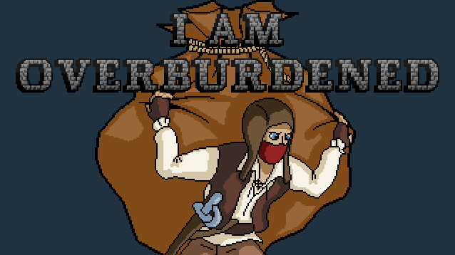
Took most of last week off for vacation == no entries, sorry about that, but this week I'm going to make multiple videos and blog posts :) ! This first one is about the box-art of the game.

Backstory, requirements

For previous projects I did not spend too much energy on the promotional art. That was obviously a mistake, because usually it is the first thing both the players and the press comes across when checking your game, so it needs to have a good teaser, but it is easy to forget the importance of it and miss allocating time for it...

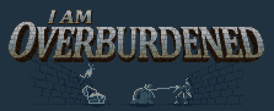
I planned to make a difference this time, but I significantly underestimated the needed efforts :( . I wanted to capture the plot of the game in an image, suggesting the core mechanic, which is trying to collect a lot of loot and having a huge inventory, but still not being enough. All in all I think I succeeded but it took two tries :) .

First try

My first idea was to focus on the protagonist of the game, who is a tomb raider kind-a guy (the not so morally OK one). Not being a typical hero or warrior, I wanted to present him as a bit of a simpleton and not someone who would kill a bunch of monsters with a single slash, since you won't be able to do that in the game either.

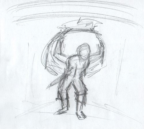
Concepting and direction

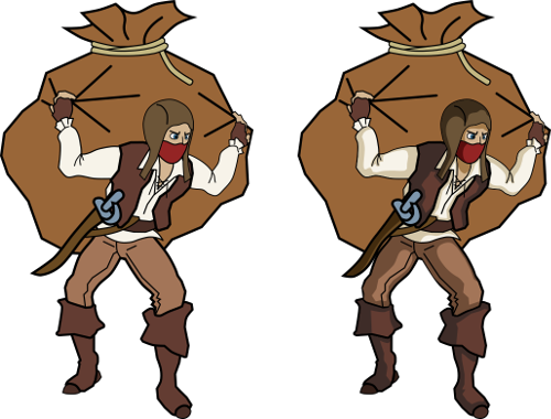
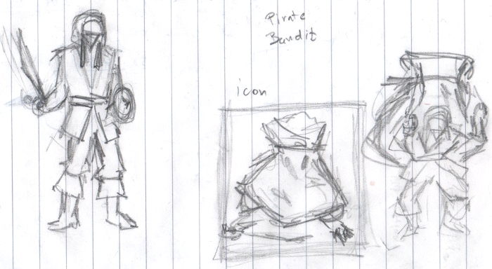
I started out with some concept sketches in my notebook, portraying a bandit/pirate figure carrying huge bags...

I continued with flashing out this character with a composition I thought I like:

I wanted to create a pixel art end result, because I dislike box-arts with totally disconnected from the game (except if it is top-notch quality + it adds to the lore of the game) but from my experiences with Operation KREEP, I knew I'm going to need a s#!tload of image sizes for promotional art (especially true if you plan to sell the game on multiple storefronts). Steam alone requests 5+ marginally different aspect ratios. So I decided to go with vector art as a base, and fix various sized renders instead of manually doing 3 to 4 different setups pixel by pixel.

Inking, results and confession

I use Inkscape for vector art. It is a free and cross-platform vector graphics editor, and has a convenient user interface . Perfect for line-art, icons etc...

First batch of line-art and shading work was pretty promising, I grown to quite like the character...

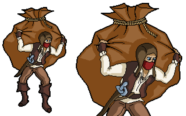
I tried out rendering the character in various sizes and fixing them up in GIMP using color reduction and manual pixel pushing. I still had "hope" at this point :D .

Then I throw together a "placeholder" pixel art title text.

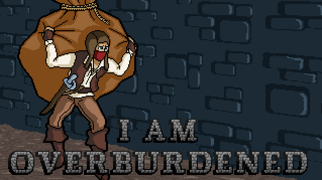
The only thing left, was composition, fine-tuning and polish, so putting together an actual art piece which I could use as the promotional material for the game. Here are my attempts:


Of course I made close to a dozen of these, to try out various text sizes, backgrounds etc...

I don't know if anyone likes them, but I sure felt like they simply aren't working. I liked the character, I liked the colors, but the image was lacking detail, a good looking title-text, a correct composition and most importantly somehow it was lacking life :| . After days of fiddling on-and-off with it I decided, that no amount of polish is going the fix these problems, so I scraped it and started over!

Second try

I wanted to approach the next trial smarter. So instead of jumping in I looked at a lot of reference pictures and lay down much clearer goals and concepts before jumping into producing the picture.

Reference material

Looking at some images made for other games helped a lot! It made me realize, that I have to focus a lot more on the text first and foremost, and a more clever use of both color and space is required for the image as a whole.

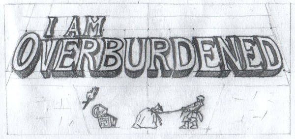
I came up with the following concept afterwards which I really liked:

I followed a similar approach for scalability, using Inkscape to create the outline and work from the renders, manually pixeling the final image:

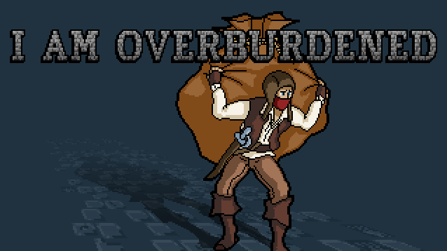
Final, final, final, final!

Funny thing about the final image is, that it took much less time and effort than my first attempt and I think it turned out to be a good deal better looking :) .

The takeaway is if you feel even a tiny bit stuck, sit back to the drawing board and spend some more time on your concepts, it will probably yield better results !

The upcoming entries will be about the linux and mac ports of my previous game Operation KREEP and the tile graphics of I am overburdened. Here is a little sneak-peek of the last one:

Stay tuned!

Hi there!
Short entry, a bit tutorial-ish, about the tile graphics of the game.

Art direction, ideas

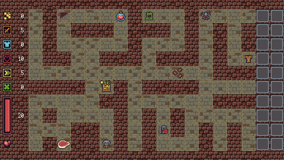
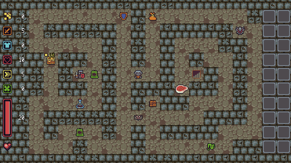
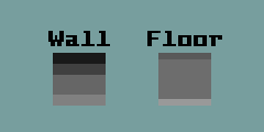
I really liked the style of the open art assets I used for prototyping. Pixel art, huge value differences between the wall and the floor tiles and a little noise to make it a little grimy & wrecked.

Though I liked it's looks and simplicity, I wanted to try some other ideas before settling on anything so I went ahead and made mockups.

False positive

The most interesting and furthest developed one was a tile-set and look with an oblique top-down view effect. I think this looks really good in many games, but sometimes it can get too exaggerated covering too much of the entity sprites.

I came up with this, but I decided to scrap the idea. I liked it sort-of, but making multiple varied sets for the 30 to 60 minute long campaign and fully fleshing them out in this would require and immense amount of work. I choose the original simple style with a decent amount of variation instead.

Goals, final looks

So I returned to the looks of the prototype. Easily distinguishable wall and floor tiles, noisy and grimy places (it is an old dungeon after all) and good variations (many sets and small randomization within each set too) so it does not become boring during a full play-through. I needed a cool palette. Something murky. While picking colors I naturally deviated towards the looks of a game I always cherished for its atmosphere :) .

Colors were picked carefully for supporting the look of the entity sprites, as they will use a marginally different palette full of contrasting colors instead of saturated ones to make them pop from the terrain (again just like in the prototype).

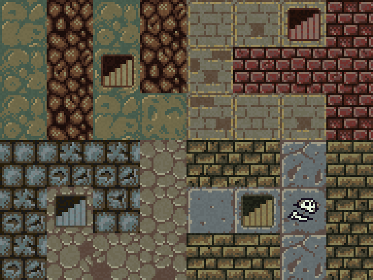
Here goes some shots about the results:

I have 10 different tile sets ready which I suspect will provide a good variety :) . With 30-ish level deep dungeons a set change will happen after every 3 levels.

How-to?

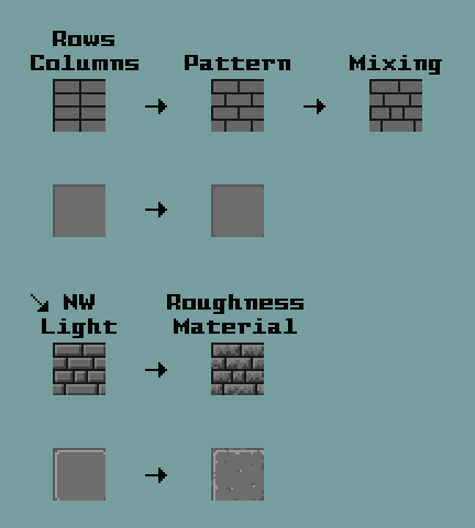
For creating a lot of pixel art tiles, like the ones I made, you are going to need a frame so to say. Some rules and patterns how you start pixeling each tile and afterwards patience for experimentation. That is all to it actually. I walk through the creation of one.

I use GIMP, a free and cross-platform image editor, but pixel art can be done just as well in a lot of paint programs (even in paint, but I advise you to choose a better one which supports layers). A graphics tool which can work with tiles or a hot-reload engine feature (because GIMP as an example does not support tile graphics) also helps, since you can check while you are drawing, whether your graphics work well when tiled instantly.

First I usually start with selecting values for the whole set. This is a handy technique for defining an overall lightness/darkness balance for each tile.

Than I "sketch" a simple pattern for a tile using the values, usually with a light-source residing in a North-West direction.

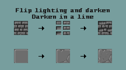
I add a little variation, like cracks, missing bricks, mixing up the pattern etc... Detail like wines or stains can be added after coloring is done but this step alone makes enough differences between tiles.

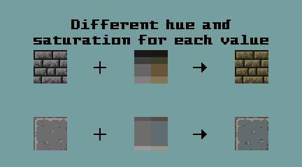
I know simply selecting the same hue for the given values feels easy, but it makes the outcome look kind-of boring. Try to make colors interesting by selecting at least two different hues and by playing with saturation a little. It will make a huge difference!

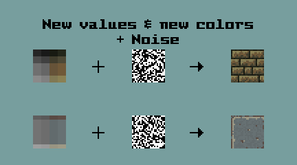
Now you have a nice looking tile. The next step is optional. Adding noise was a deliberate choice in my case. You simply add an extra set of values with only slight changes relative to the originally used ones. Select the noise colors the same way as the "normal" colors. Generate a noise pattern and overlay the noise colors on top of the tile using it as a mask.

A screenshot with the final tiles:

Thanks for reading.
Stay tuned!

Hello everyone!

Tiny post with lot of pics this time. Last week I worked on the original sprites of the game and progressed steadily. Far from finished with every piece but a huge portion is done!

Missing pieces

In the last log I showcased the tile graphics, but one final adjustment was missing back then. All the tile-sets shared a single stair sprite which wasn't fitting well, so I made a separate sprite for each one.

Entity sprites

The next stop was entities. I started out with defining clear goals for the looks and creating a palette serving these goals. The idea was to select contrasting, vivid colors to make entities pop from the environment and on contrary to the looks of the dungeons make them lively (browns and yellows are still pretty strong still :D )!


Not yet finalized!

Player

I really liked the design I came up with before for the player character so I reused my concept which was a failed attempt at the box art of the game. Two sprite states exists, since in the planned "story" scenes the player will have his sword in its scabbard.

Chests

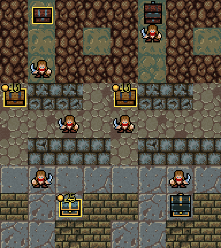
The first apparent visual choice here are the light borders. I decided to add a colored one to every interactive entity type, so the player can not miss which tiles poses a threat and which ones provide bonuses. I made four chests with various costs/functions but I'm keeping the last one as a secret for the final version ;) .

Pickups

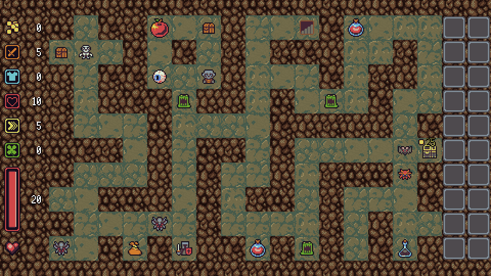
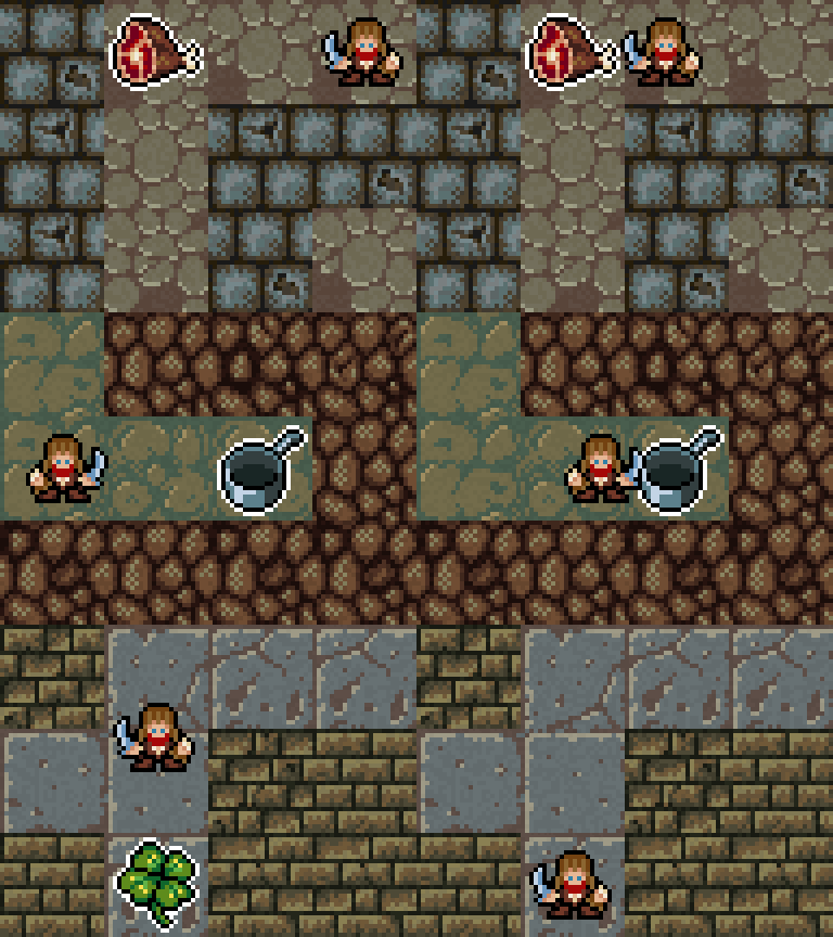
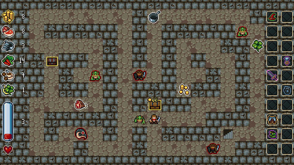
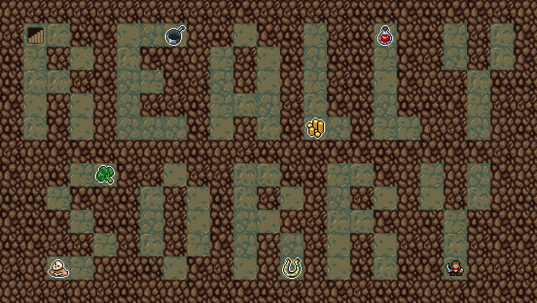
Pickups come in many flavors. Permanent attribute bonuses (Meat = +Strength, Frying pan = +Armor, Carrot = +Vitality, Coffee = +Speed, Clover = +Luck), gold, potions, random items etc... Here are a few:

Monsters

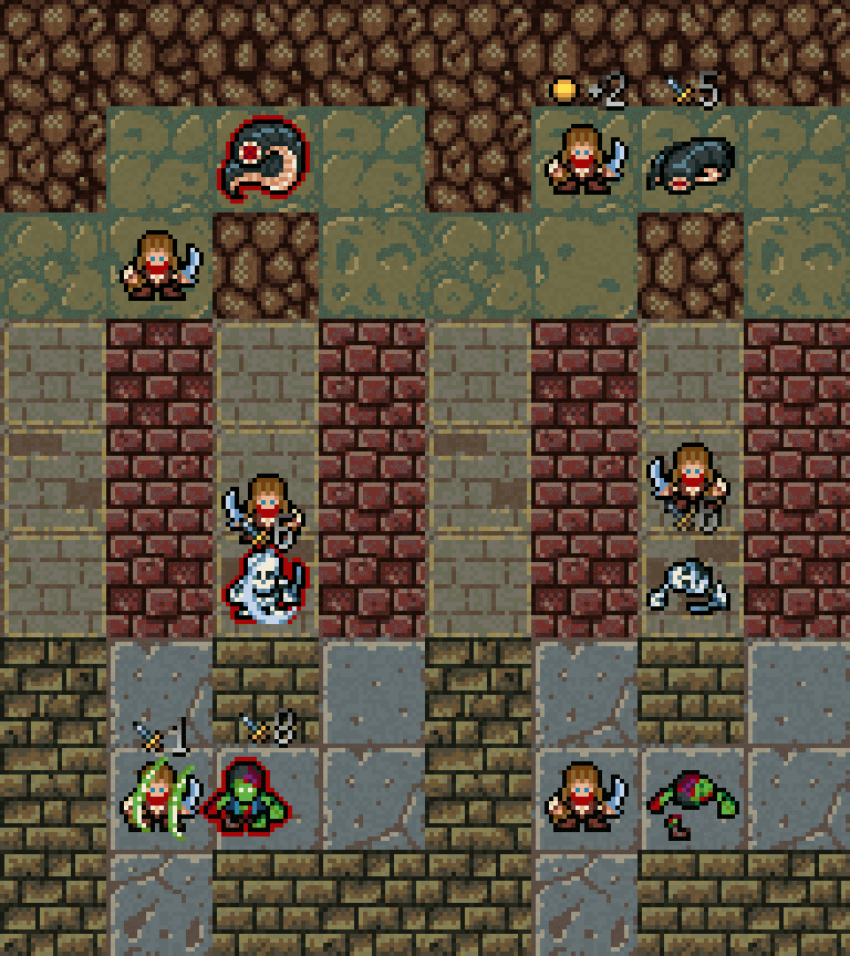
I settled on a after a few tries where the monsters are pictured from the same angle as the player. I plan to have around 15-20 unique monsters and a boss, which will provide a good variety for the 30 dungeon levels. They were divided into four groups based on the story when designing the looks: were/giant animals, goblinoids, undead and the allies of the boss. Almost all of them is ready (currently at 16).

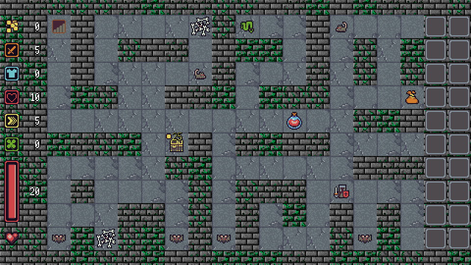
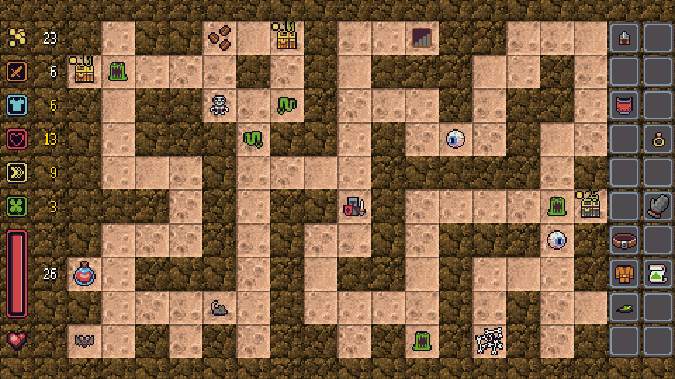
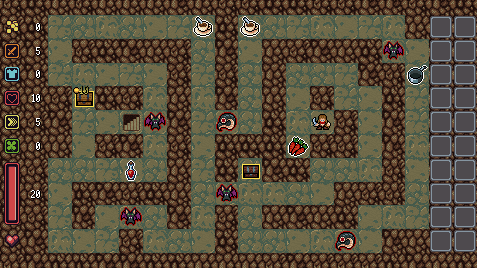
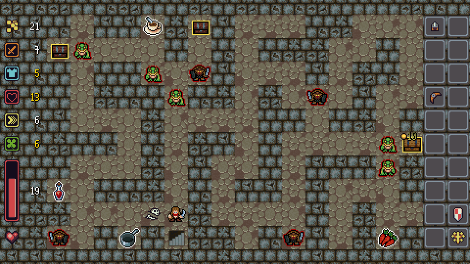
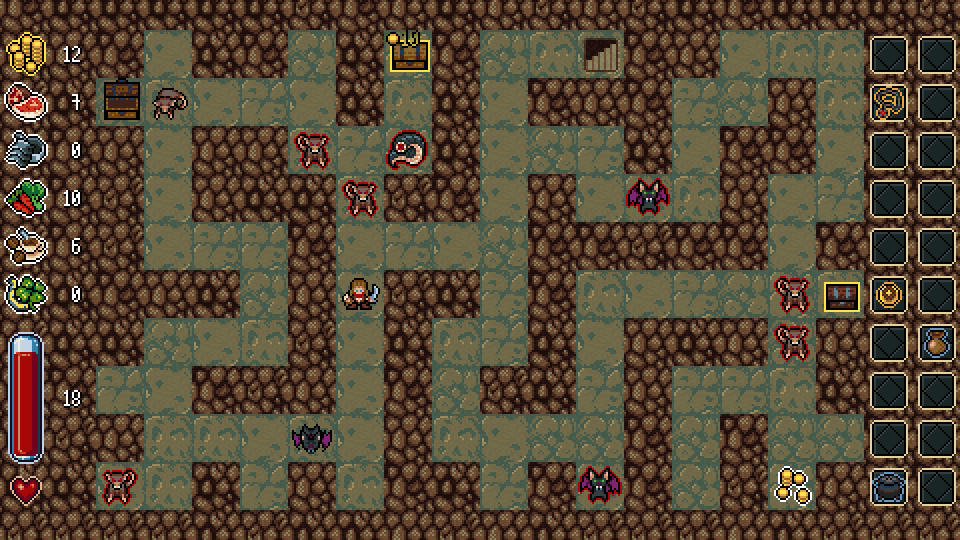
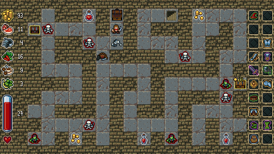
Some screenshots from the current version of the game:

This week will be spent on completing the missing sprites (e.g.: items, some monsters) and overall visual improvements and polish, so I'm guessing the next entry will be similar. A kind-of "news" is my plans for an alpha demo. Before I complete and release the game I really want to do a open build (which will become the demo later) to gather feedback. I think wrapping this version up sometime next week is perfectly viable, so by the end of this week I'll post a finished plan for this too.

Thanks for reading.
Take care.

Hi there, long time no see!

Last month was rather chaotic for me. After a lengthy Easter vacation a nasty flu forced me to spend almost a week in bed, and overall the progress on "I am overburdened" was dreadfully slow up until last week. That is why I had no energy and not much drive to write new posts or to create video log entries, but it is time to break the silence.

Really, no progress?

There was a lot actually, but the development entered its last stage where there are a zillion small tasks left to be done but no modifications are substantial. The notorious last 10% which takes 90% of the development time :D . I go through all the changes made during last month in a few sentences, than I'll adumbrate when and how am I planning to push this game through its finish line.

Monsters

I completed all the monsters from the easiest pawns up until the final boss. Their attributes are not balanced yet, but all their names, sprites and basic settings are done. Now each and every one has its own corpse graphic and unique sound effect too. This last bit was originally flagged as a nice-to-have addition, but after trying out the game with a few monsters having its own sound and carcass, there was no turning back :) .

Attack and skill effects

The battles and item skills were lacking visually, so I decided to apply some cosmetics. I Implemented a simple system to flash in and out various sprites at given coordinates in the dungeon on top of the entities. I was pleasantly surprised with the effectiveness of the initial results. Since than, I added configurable opacity easing- in and out and timings. Now item usage and battles are really shiny :O .

Notifications

Another set of crucial visual queues missing from the game were notifications. Many pickups and events yield varying results in a roguelike and yes a player can figure out how much gold was picked up, but it is so much nicer if the game helps a little with these, especially when important changes occur. Clearly when it does not fit the its not necessary, but I am overburdened is not a "super serious" game. Of course these can be overdone, but I tried making them not too obtrusive. Both the effect system and the notification system is accessible by the item skills, so various "spells" can trigger these too.

Items, items, items

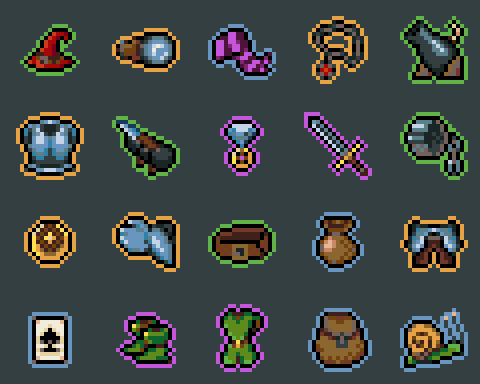
103 unique items, each and every one having a unique sprite. All the graphics are done with around 50% of the item lore finalized and it was a hell of a lot of work. Sadly something I underestimated again. Making the graphics was not difficult but coming up with unique, interesting or funny concepts, skills and short descriptions after having around 75 piece already, was tough. The last mile became a grueling, laborious crawl! When a lot of great content is already in place and almost every single archetype is taken, it becomes ridiculously hard to come up with new ideas hitting the same quality bar :( .

After all I think I achieved my goal in creating intriguing hand crafted loot what may serve as a strong hook for the game, so I'm proud of the end result. I don't want to spoil too much so I'll only show a small selection of sprites. Sorry, you have to play the game for more :) .

Localization

In Operation KREEP I hard-coded some strings, rendering the game impossible to be fully localized without code modification. Some buyers actually asked about how they could do translations. I felt really ashamed while answering those mails :( . For I am overburdened I've built a system which allows to bind assets for specific cultures and all the strings are read from asset files too. There are no major limiting factors now, so technically the game could be localized to any language without modifying the application. I know some languages are super hard to handle, e.g.: right-to-left ones or the ones with huge glyph sets, but the point is, that it is feasible now.

Since I don't have the budget to pay for professional translations, only English and Hungarian will be done for release, but if the game does well, this is something, that is high on my list ;) .

In-game UI

The user interface for the game is pretty much complete. Some finishing touches are missing here and there, but it is already pleasant looking and almost fully functional from the health-bar all the way to the item pickup pop-ups.

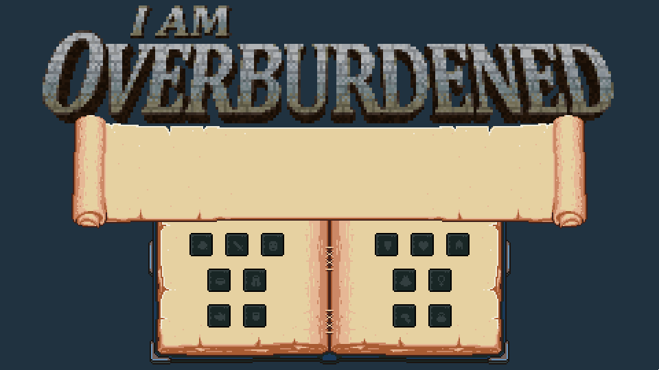
The main menu

I dislike making menus because they are usually boring to design and program. For Operation KREEP I came up with the idea of creating a "screen in the screen" look, to make it more interesting and alleviate this feeling while working on it. You navigated the menus of a retro-looking computer and the whole frame of the machine was drawn. It blitted the maps on the level selection screen in awful 4 colors and all the cozy stuff like that :) . It worked for me and for the game too.

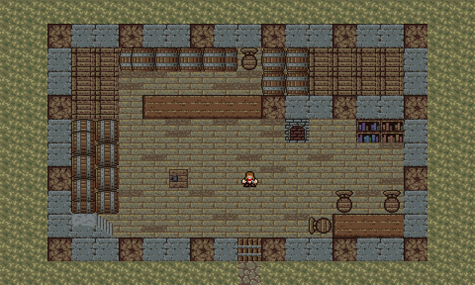
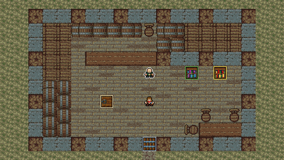
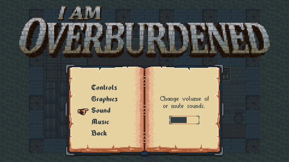
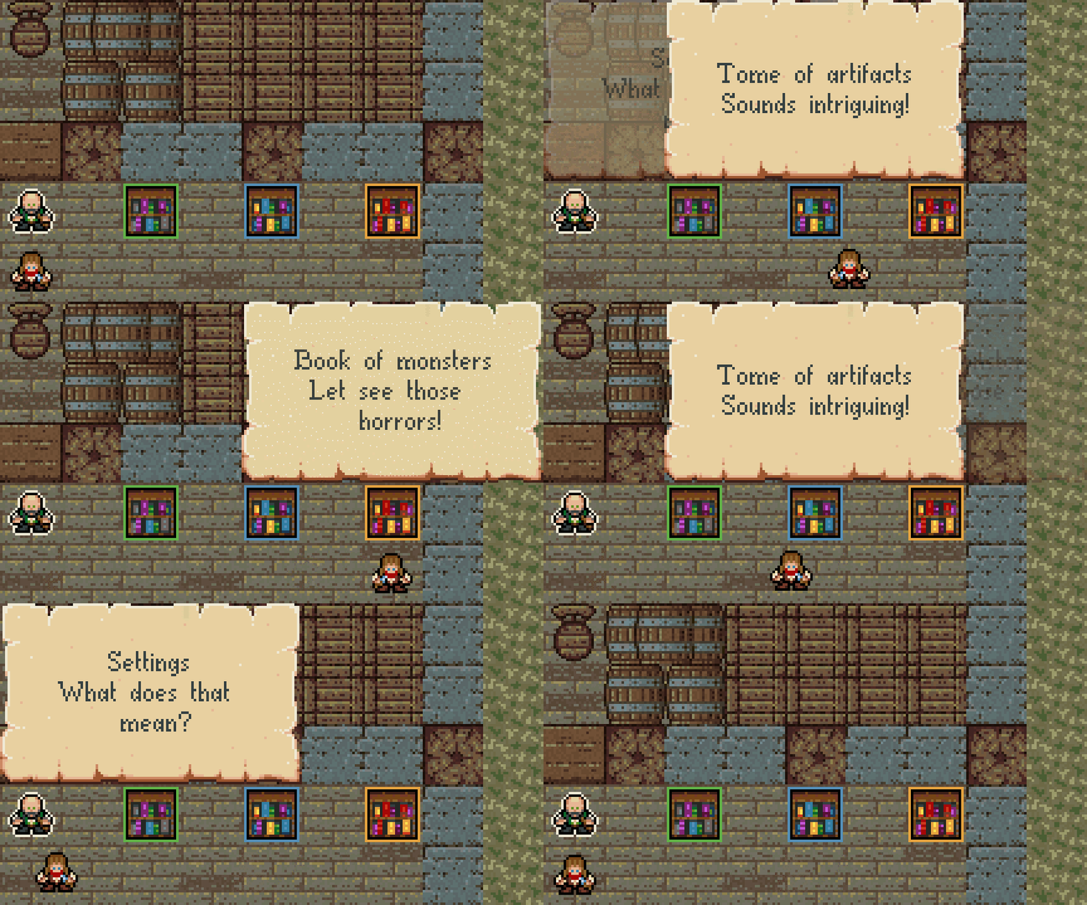
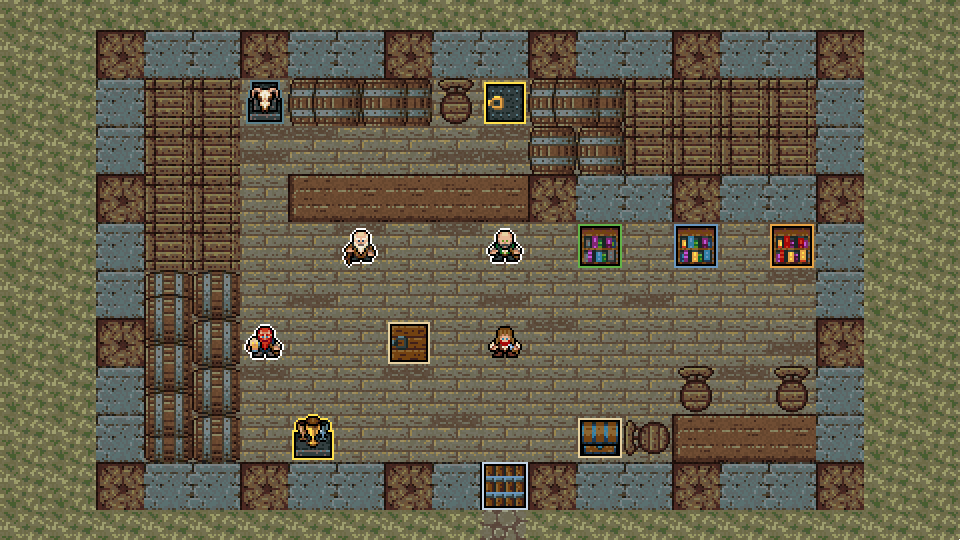
I tried a non-traditional approach again, but menus are still boring :D . Since it is a classic trope to have a city in action RPG-s and roguelikes where you return to from time-to-time, I thought about including one in I am overburdened. The idea did not align well with its mechanics, so I decided to make it the main menu! You move around in an inn, interacting with people and objects there to enter specific parts of the game. Talking with the inn-keeper lands you on a help screen, poking a bookshelf shows the settings, leaving the inn exits the game and the trap-door starts the actual dungeon crawling... If a player gets lost, escape will bring-up an ordinary focus driven menu. It is far from complete, but the skeleton is there and some parts already work.

Open beta, plans

I've been talking about this open version thingy for ages and I still haven't released it. In my original plans I wanted to have the full game completed by now :( . For the most part it is, but some planned content and finalization (+polish) is missing. There comes a time when I have to say stop and I think it is here, so from now on I will only focus on wrapping the whole thing up and this starts with putting out a beta version. Will prepare some marketing materials beforehand, like store page graphics and texts, maybe even a teaser trailer, so it may take a few days, but will share a download link for it in the next post :) ;) !

Stay tuned.

(1 edit) (+1)

Hello everyone!

I've been pretty silent for a while again...
I really dislike this, because I'm usually open and post a lot about my progress, but sometimes it just slows down and I end up in a spiral of "awkwardness", when I'm not progressing too much and I really don't want to talk about that :| .

Oh well, I'm preparing for the beta, some tiny fine-tuning left before I'm ready to upload a build, but before that, I share this update with a teaser.

Menus, menus everywhere!
I completed most of the menus. Some minor stuff (few more characters) are still missing but I will finish those during June. I included myself as the inn keeper :) . Interacting with the guy brings up the help screen and he also tells the "story" of the game in the teaser.

Your journal

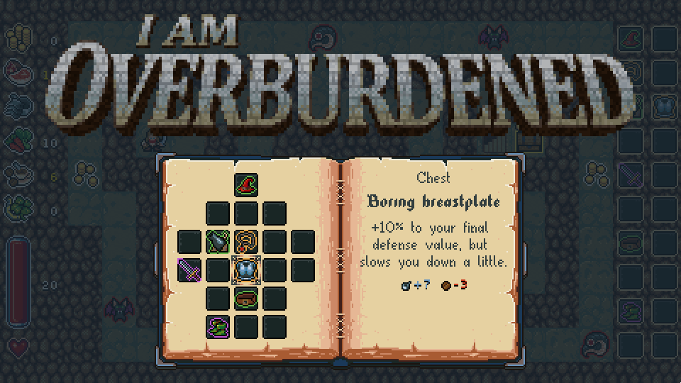
I went for a journal look for the classic focus driven menus and your inventory. I think it turned out good looking and it fits the game well.

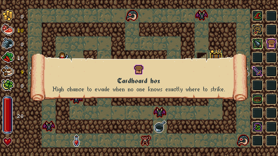
For item pickup notifications I made a fancy scroll too.

Animated box-art

While preparing the trailer and other marketing materials, I had this urge to animate something related to the game :) . The in-game sprites are all static and I wanted to keep it this way, so I made an animated box-art. Some say it's a better attention grabber on storefront pages ;) .

Dungeon templates

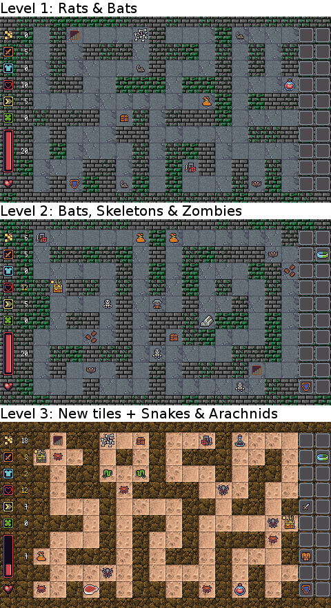
I made a bunch of new dungeon templates for the generator. Not enough for the final build, but there are already plenty and they provide good variety for a full beta play-through.

Progress, balance

First balancing pass over the item, monster and pickup power levels is also done. Nothing major, but you can complete the full 30 level deep dungeon now, encountering a new set of monsters and a new tile-set after every 3 or 4 levels and generally fighting stronger enemies as you progress. It is going to take days of tweaking to make it engaging though. I'm planning to devote a full entry to this topic soon.

Teaser trailer teaser

Yes, the following is just a teaser for the teaser trailer :D , a sneak-peek so to say. I'm working on a lengthier one which showcases gameplay features too with music, flashy texts and everything one would expect from a proper game trailer. So this is just the first 20 seconds of the real teaser, but I thought I should share it in this form and ask for some feedback/opinions about it...

Thanks for reading!
Take care.

Hi there!
Where was I for a month?! Many friends already asked this and other difficult questions like "I planned to finish this game in 4 months and I've been working on it for 6 now" or "Last month you kind-of promised to have an open beta and a complete game by now" and "quality over quantity" was the best answer I gave. Actually I really believe in what I'm doing and the way I'm doing it. I know it is madness, game development is about risk management and this project is becoming more and more risky day by day (risk of losing a lot of money and losing the ability to continue full-time game making :( ).
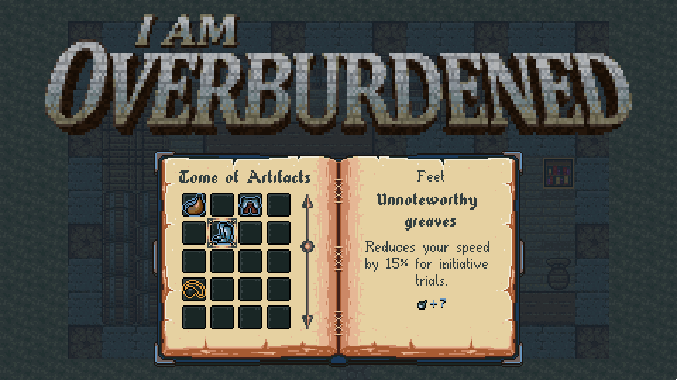
The thing is the game was NOT GOOD two months ago. I could have rushed it to market, I really could, but my ghost whispered to me and I had to follow its lead. I'm in this for the love of it and for the love of the craft as a whole. I want to make games and continue making games as a living, but at the same time I want to be good at it and be proud of what I make.

Now with this out of the way let's jump onto the progress in the last four weeks :) !

Polish

Few people said to me, based on my last entry, that the game starts to look really polished. I felt really happy about that, because I haven't actually started on my planned polishing tasks. Besides composing the sound track and working on finalizing and balancing game systems, the last few weeks were spent on polishing the look and feel of the game :) .

Movement

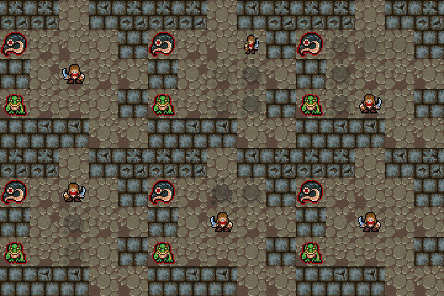
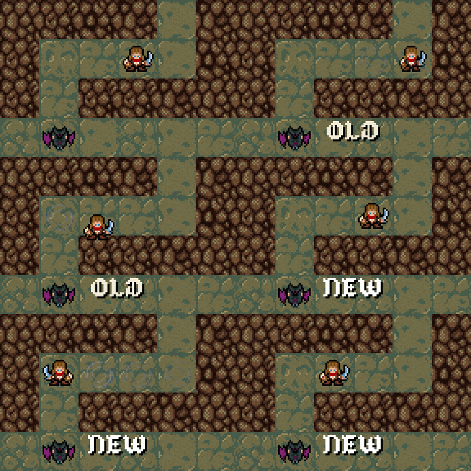
First I added some sprite effects to the player movement which fades out over time. This is a great visual cue to show the direction and the old positions of the player and also makes the "dusty & old" dungeon image more believable :) .

Then a subtle bounce was put on top of the original player movement transition. It does not seem like a big addition but it does make it feel more like walking than the old moon-walker dance move :D .

The last movement tweak was configurable sprite and sound effects for levels. Now there is splashing in the caverns instead of dust puffs as an example.

Animated health-bar

This is something which is absolutely not a necessity for a game, but once you saw the Diablo 3 health globe it cannot be unseen :D . Back to reality. I wanted to add a subtle sliding animation to better signal the player about the significance of the health change. I think it turned out wondrous :) !

Ambiance

One nice touch I really like is atmospheric sound effects. In many games if you mute the music you can easily hear a lot of background effects which do not come from entities in the world but from the environment itself. Examples include crackling fire, rats squeaking, stuff like that. I Am Overburdened is not a gothic themed nor a horror game, far from it actually, but I wanted to achieve a "spooky" overall feeling so I added something similar. Dripping water in the caves, rattling chains in the dungeons etc...

Dripping.ogg

Chains.ogg

Monster skills

This was a feature which was missing from the game for so long. I actually implemented the underlying system while working on the prototype (so really really long ago), but I had no time to actually add unique skills to the monsters :( . Now each and every one has it's own "thing" which makes them memorable and really stand out. Not just attribute differentiation, like :O careful this one is "strong", this one is "fast", bla bla, but instead something like this: careful this can dodge your attacks, or that one can interrupt you and cancel your hit, or that pesky beast can resurrect so it is a real damage sponge!

There are some neat ones which I will not spoil because they are really fun, powerful and buy the game once it's out :P (there is no fun in spoiling everything) !

The Black Raven Market

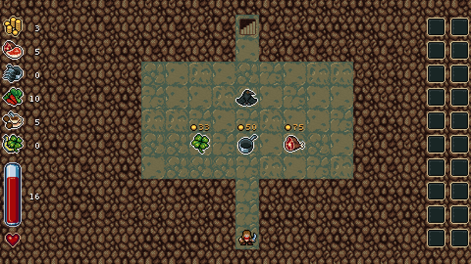
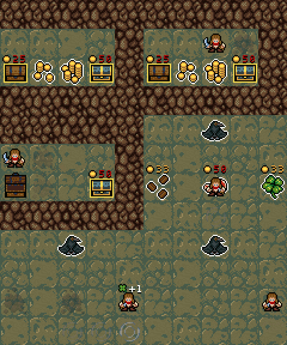
During a play-testing round I realized there is a huge problem with the pacing of the game. The game-play did not change enough during a full play-through regardless of the changing environments, monsters and increasing power levels. Another problem a lengthy game usually had is RNG (those infuriating random numbers :D ). It felt a little boring and a bit too random (not enough control over the outcome). I realized a shop could solve these issues, but not a typical buy whatever you want when ever you want type, but more like a rogue-like shop ;) , that allows more player control but it also presents another hard choice (as many things in rogue-likes).

Welcome to the Black Raven Market. Every first shop level sells random pickups (health potions, attributes etc...) and every second shop level sells random magic items, but you can only buy one stuff on each level! I'm evil, I know it :D MUWHAHA. In a full play-through you will encounter 10 shop levels which gives some extra space for player choice and nicely breaks up the "kill some monsters defending important loot and run to the next level" game-play loop.

Music makes the world go around!

I'm not a musician and the following sneak-peek into the official soundtrack of the game is proof of that. Regardless of it being pretty amateurish I'm still really proud of it :) . Instead of trying to make AWESOME music (which I simply can't :( ) I focused on adhering to some fundamentals I settled on before jumping onto composing:

  • Retro sound, match the looks of the game.
  • Leave a spooky and mysterious impression.
  • Be consistent using similar patterns and tunes.
  • Gradually get more intense and chaotic.

I hope it isn't grating at least :| .

The full OST is around 15 minutes so its my longest work in this regard yet + it is long and varies enough to not get too repetitive during a full play-through :) .

I should also mention, that I used the wonderful Bosca Ceoil tool for composing. It's quite limited, but it is really really easy to use. You should definitely check it out if you would like to make some chip tunes. It is free and works in the browser too!


Thanks for reading!
Stay tuned.

(1 edit)

Hi everyone!

I took my time again to make this new post, but I was really occupied with life and stuff and took approximately two weeks off from work (got married <3 + been pretty sick for a week :( ). Last week was only spent on polish and adding "extra" features, so it is only a matter of a few weeks to finally tackle this beast of a game :) , I'm almost at the end of this marathon!

I'm also trying a new vlog format this time, with more video content and less slides. It is a video log after all ;) ...
I hope you all will like it.


Map generator tricks

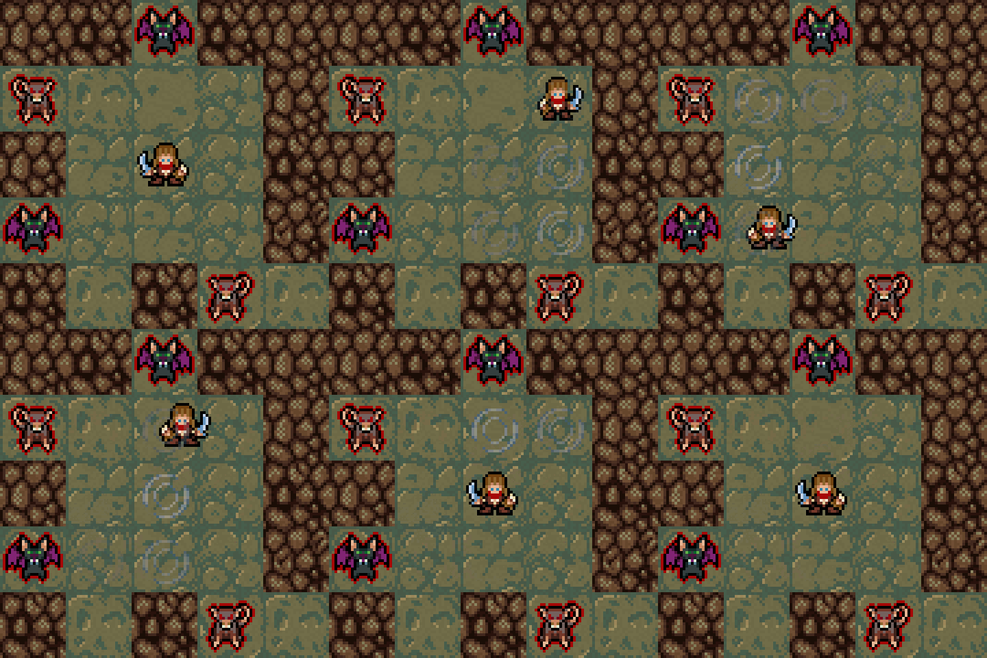
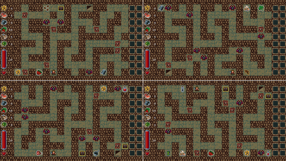
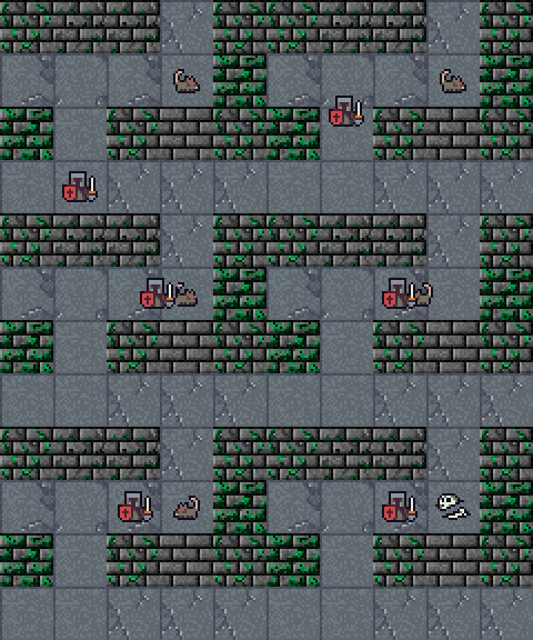
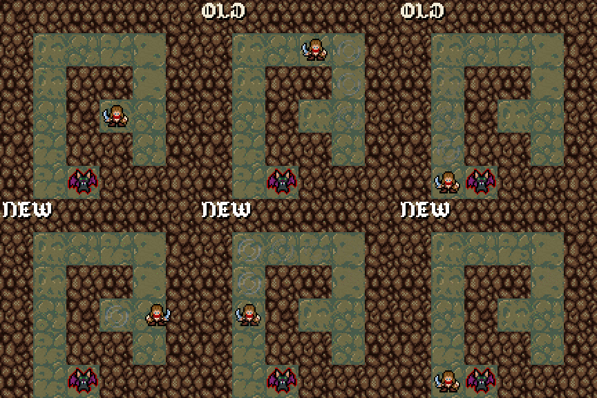
I extended the implementation of my "semi-procedural" map generator algorithm with a neat and simple trick. It is working from hand authored map templates, so I added the possibility to randomly flip over the vertical and/or horizontal axes!

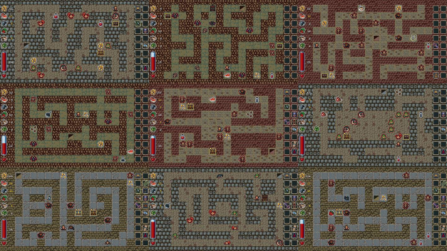
For the 4 resulting maps on that screen the exact same handmade tile-map template was used. This results in 2 to 4 (if you can use both axes) times the possibilities of slightly different generated maps for the same amount of hand made maps :wink: .

Dungeon progression

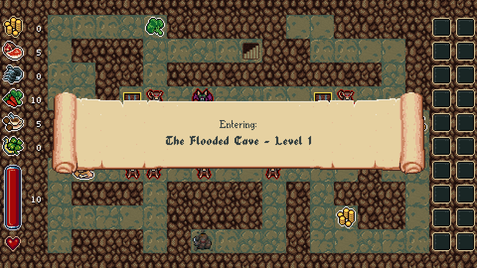
Each level type has a unique name now :) + when you enter a level you get a notification about where you are in the dungeon/story:

I'm still not 100% satisfied with this level change pacing/effect. I may add a really tiny "to black-screen and back" transition effect too. I'll try it out and see whether it works better...

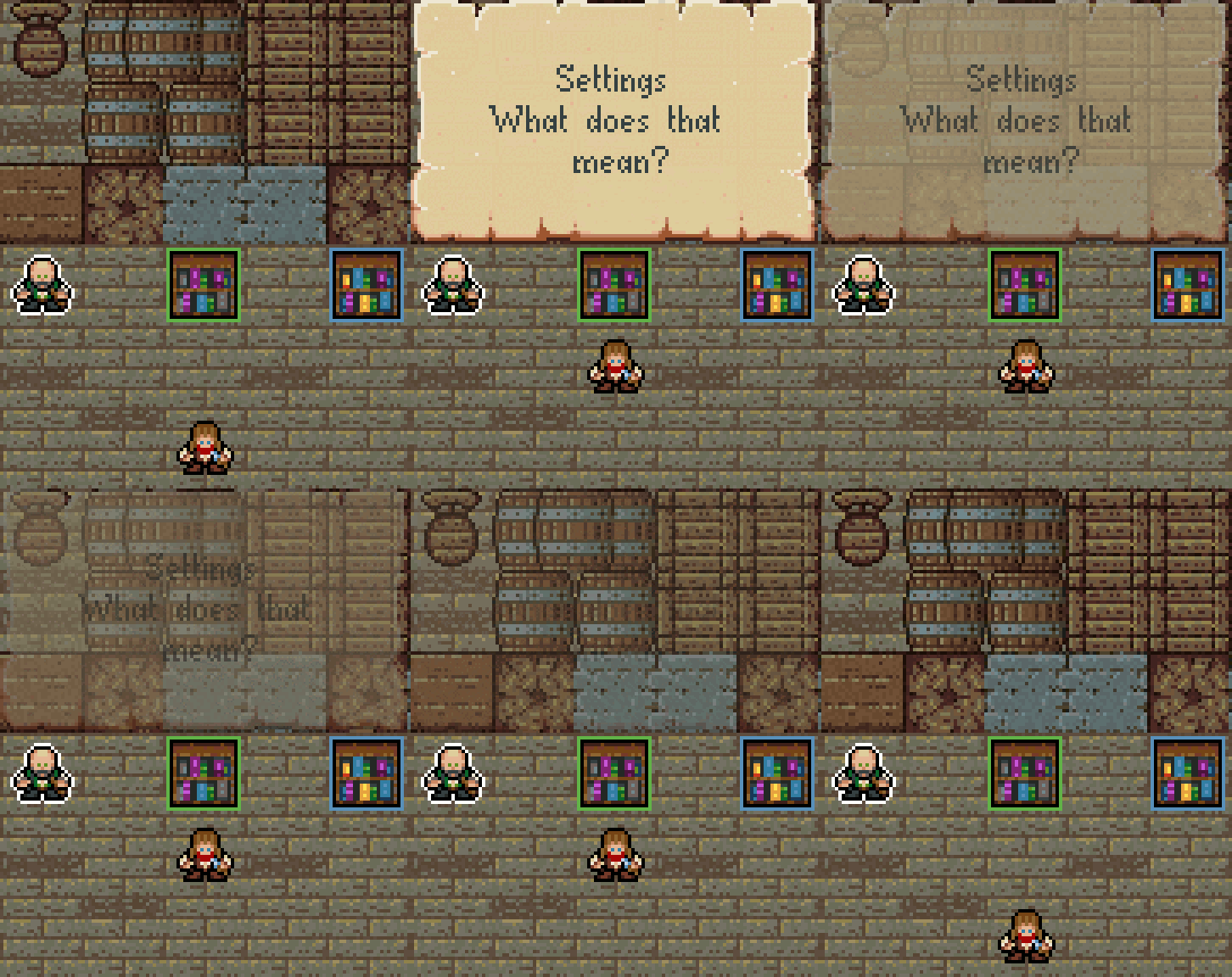
Speech bubbles

These fancy text graphics are pretty useful for delivering help notifications, narrator or character speeches and to convey more details about the world to the players.

I also implemented some features to make them easier to control and more readable:

  • New ones can optionally "cancel out" old ones (request them to start fading out), or can simply be played alongside the existing ones (conversation).
  • New ones are automatically overlaid on top of the existing ones.

Some conversations and player speeches will occur during the game-play too, not just in the "menu".

Polishing animations

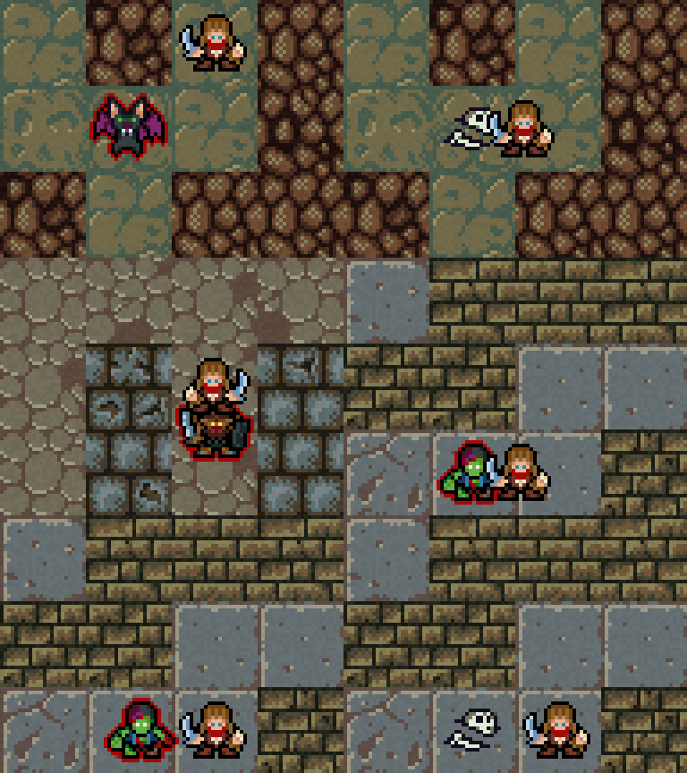
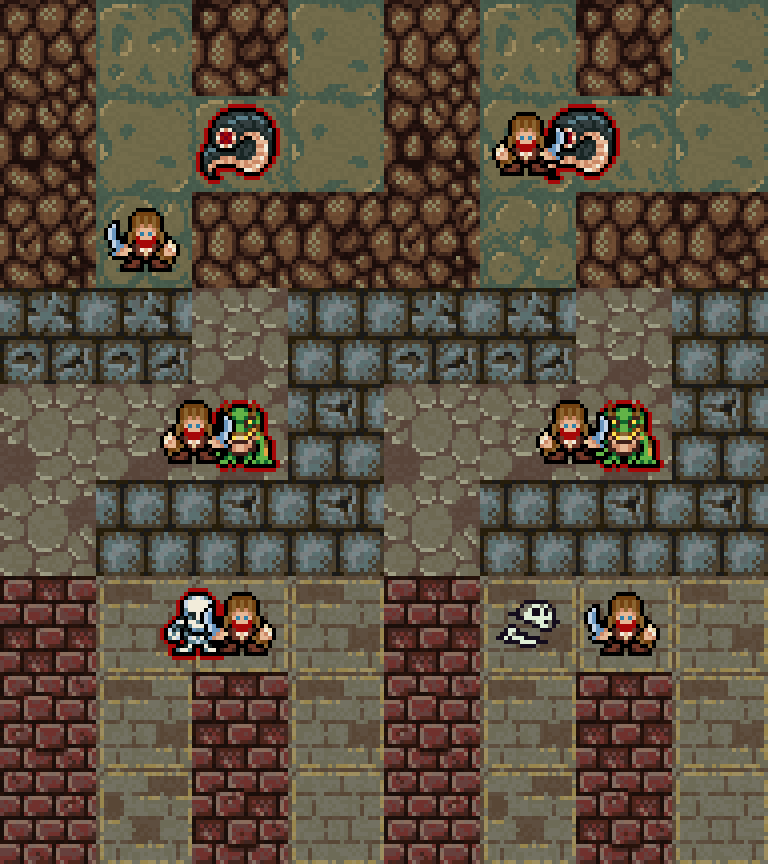
The game has only static sprites, no hand-drawn or any key-frame based animations at all. So far I tried my best to move the sprites in a way, that make all the motions look fluid, but I always had plans to go further than that! I wanted to achieve a look, regardless of having no "proper" animations, that is interesting, at least a little bit.

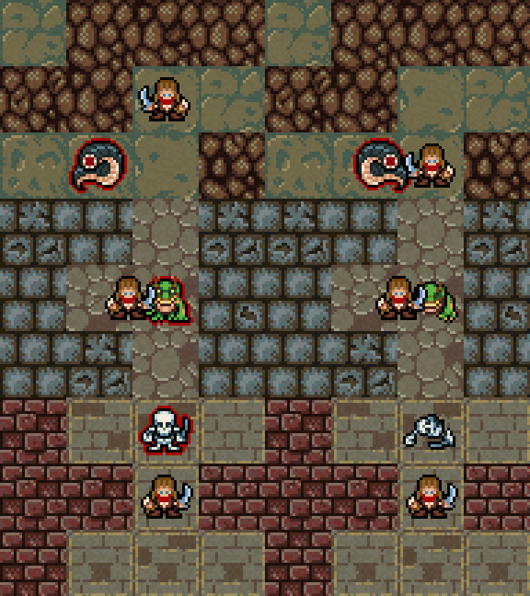
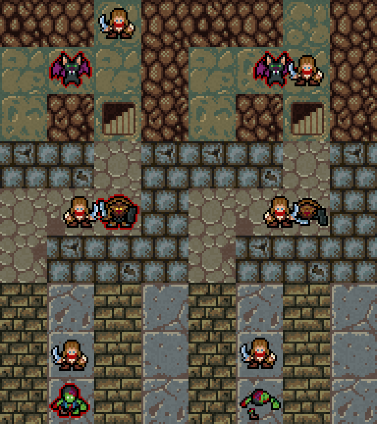
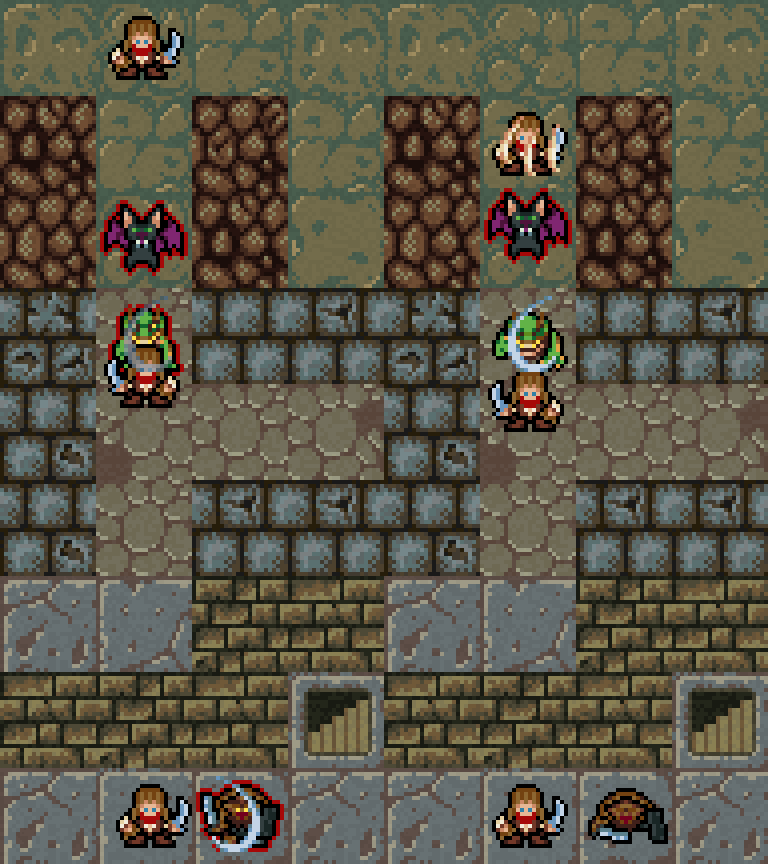
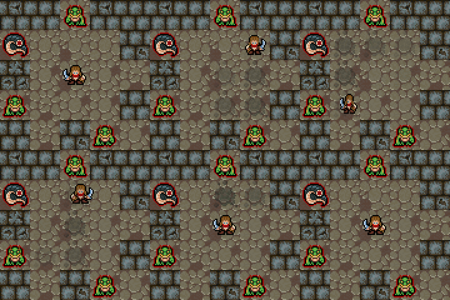
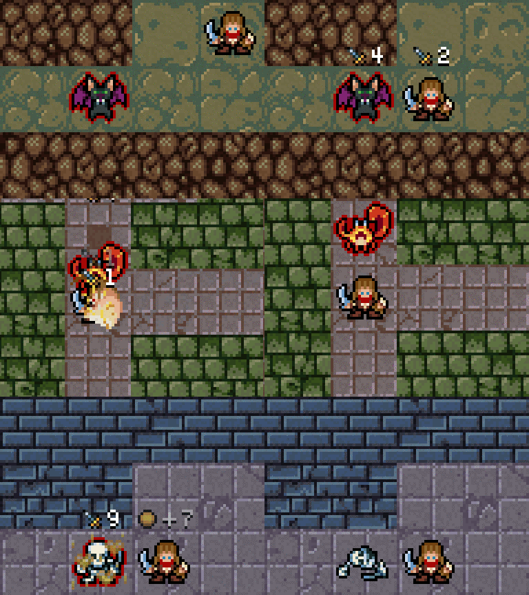
I implemented an animated "stretch and squeeze" transformation for sprites and added a subtle one to the hitting obstacles/walls movement of the player character.

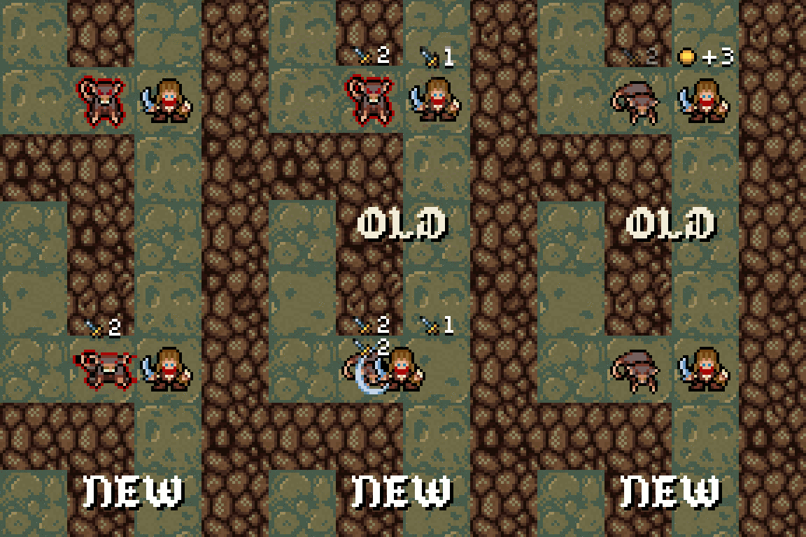
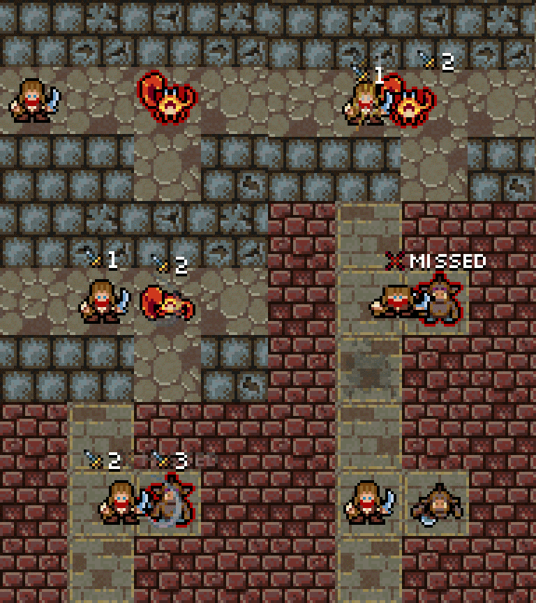
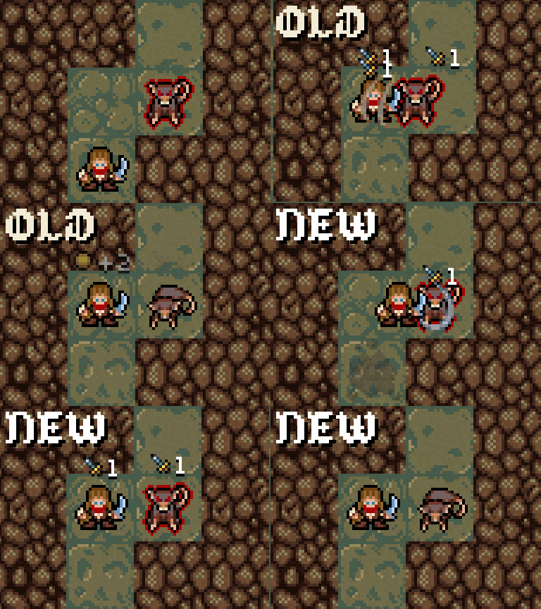
As the next step I added stretch, squeeze and shake to sprites at various points during battle.

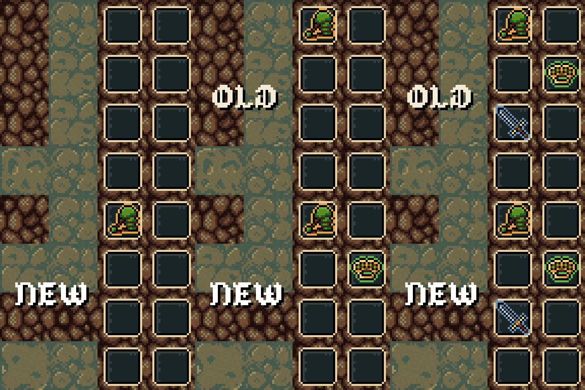
These GIFs have "New & Old" slides for comparison, but it's fun to check back how the game looked few months ago. Here goes the "same" battle from an early version:

I'm really proud how much I could achieve with only "static" sprites :) .

I wanted to further enhance the user interface too, not only the in-game action, so I added a small and short "Back Out" ease to item pickup sprites to make them pop:

I still have plans for more animation enhancements, but it is already August and I still have a lot of other tasks to take care about before releasing this game, so it most probably will have to suffice.

Collectibles

I integrated some systems into the game last week which I deemed "extra" previously, but as I mentioned around a month ago, I want to make the most out of this game, and completionist players (myself included :P :D ) are going to love this ;) !

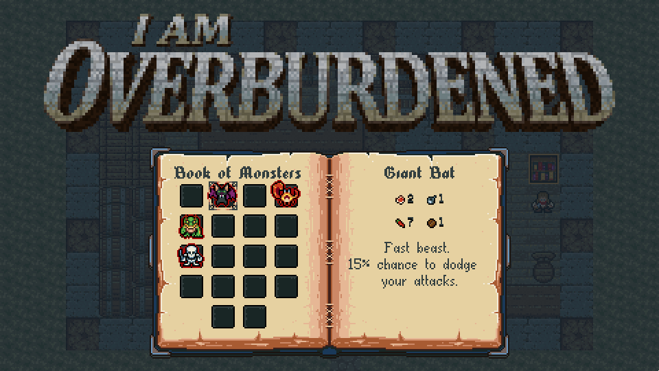
Now you can gather detailed information about the monsters and artifacts of the game. After several kills you can unlock a monster (weaker ones need more kills) and after a few pickups you can unlock an artifact (rare ones need less pickups).

There is an extra secret monster unlock too, which you have to look for carefully during a play-through, its hidden well :P . There will be more traditional achievements too, but they are currently in the design phase, so nothing to show yet.

I also ~finalized my "elevator pitch" for press/buyers:
I Am Overburdened, a silly roguelike with 20 inventory slots
Tell me what you think!

I'll be back in a week or two with more news on the game ;) .

Thanks for reading!
Take care.

(1 edit)

Hello there!

I'm still alive and working on the game so I jump right into what I worked on in the last month or so. Even though I was pretty silent a lot has "changed". The topic will be polishing, because it never stops :P , some input handling tricks and another pretty complex one: game balance.


Polishing

During a series of play-test sessions with friends, family and old colleagues I gathered some really valuable feedback on how to enhance the user experience. Thankfully the game itself was well received, but the mentioned "issues" really bugged me, so I sat down for a week or two to further enhance the presentation.

Cost indicators

This was a tiny addition but helped a lot. Now the color of the chest and shop item cost texts reflect the state whether you can open/buy them.


Animated texts

I went into an in-game UI tuning frenzy, so I added a "pop" animation on value change, besides the existing yellow highlights, to gold and attribute texts.


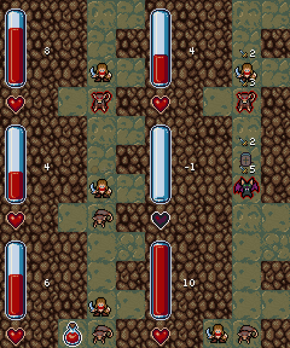
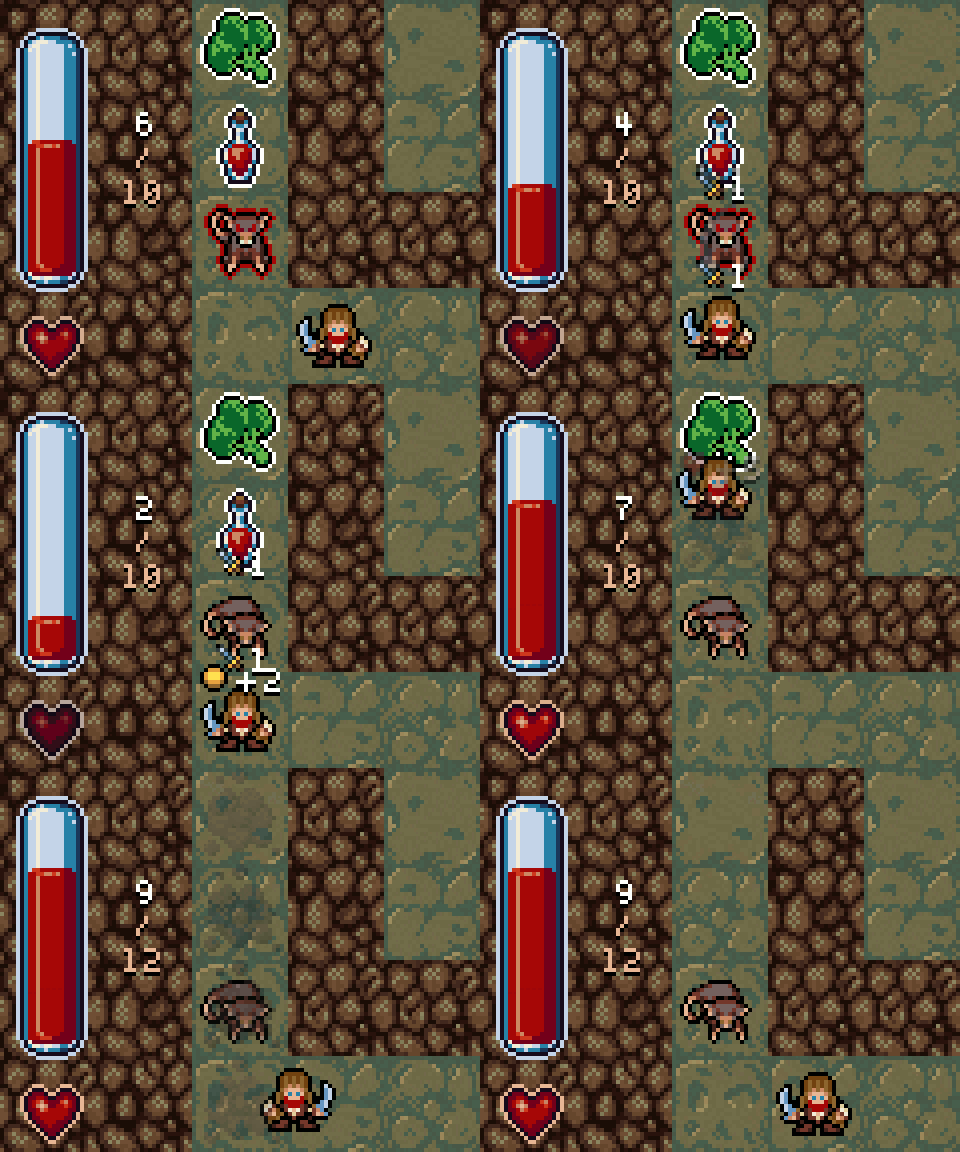
Health bar

The health bar got some love too! I implemented a fade-in/out effect for the heart sprite slowly turning it into a "black" one when you are low on health. I also added a maximum health indicator and the same value change "pop" animation I used for the gold and attribute texts.


Battle events

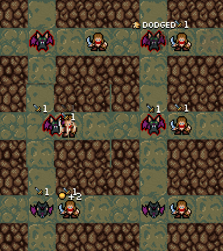
Battle events and various skills (hit miss, dodge, fear or cripple events etc...) got many complaints due to their visibility being insufficient, leaving the player puzzled sometimes why a battle didn't play out as expected. Besides using the existing sprite effects I added text notifications, similar to the ones used with pickups. No complaints ever since :) .


Critical strike

This one was an "extra". I wanted to beef-up the effects of the critical strikes to make them look more ferocious and better noticeable.


Level transition

Play testers shared my enthusiasm towards having a better level transition effect, so I slapped on a black screen fade-in/out during dungeon generation and it worked wondrous.


Input handling

I knew for a long time now, that the simple input handling logic the game had will not be good enough for the shipped version. I already worked a lot on and wrote my findings about better input handling for grid based games, so I'm not going to reiterate.

I mostly reused the special high-level input handling parts from my previous game Operation KREEP. It was a real-time action game, so some parts were obviously less relevant, but I also added tiny new extras.

I observed players hitting the walls a lot. Since the player character moves relatively fast from one cell to another this happened frequently when trying to change directions, so I added a timer which blocks the "HitWall" movement state for a few milliseconds towards each walled direction for the first time when a new grid cell is reached. Again, results were really positive :) .


Balancing

My great "wisdom" about this topic: balancing a game, especially and RPG, is hard. Not simply hard, it is ULTRA hard. Since I never worked on an RPG before, in the preparation phase I guesstimated, that it will took around 2 to 3 days of full-time work, because after all it is a simple game. Oh maaaaaaan, how naive I was :( . It took close to two weeks. Having more experience on how to approach it and how to do it effectively I probably could do it in less than a week now with a similar project, but that is still far off from from 2/3 days :D .

Before anyone plays the judge saying, I'm a lunatic and spending this much probably wasn't worth it, I have to say, that during the last 6 months nothing influenced the fairness and "feeling" of the game as much as these last 2 weeks so do not neglect the importance of it :| !

Now onto how I tamed this beast!

Tools and approach

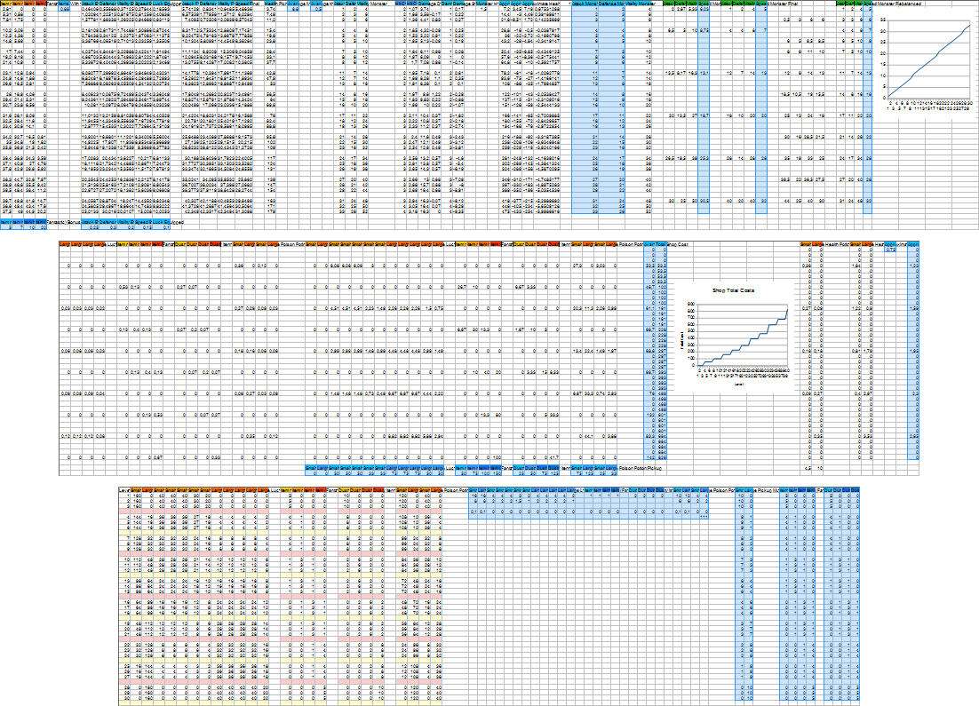
Mainly excel/open-office/google-sheets, so good old-fashioned charting baby :) . And how? I implemented almost all the formulas (damage model, pickup probabilities, loot system etc...) in isolated sheets, filled it with the game data and tweaked it (or the formulas sometimes) to reach a desirable outcome.

This may sound boring or cumbersome, but in reality charts are really useful and these tools help tremendously. Working with a lot of data is made easy and you get results immediately when you change something. Also they have a massive library of functions built-in so mimicking something like the damage reduction logic of a game is actually not that hard.


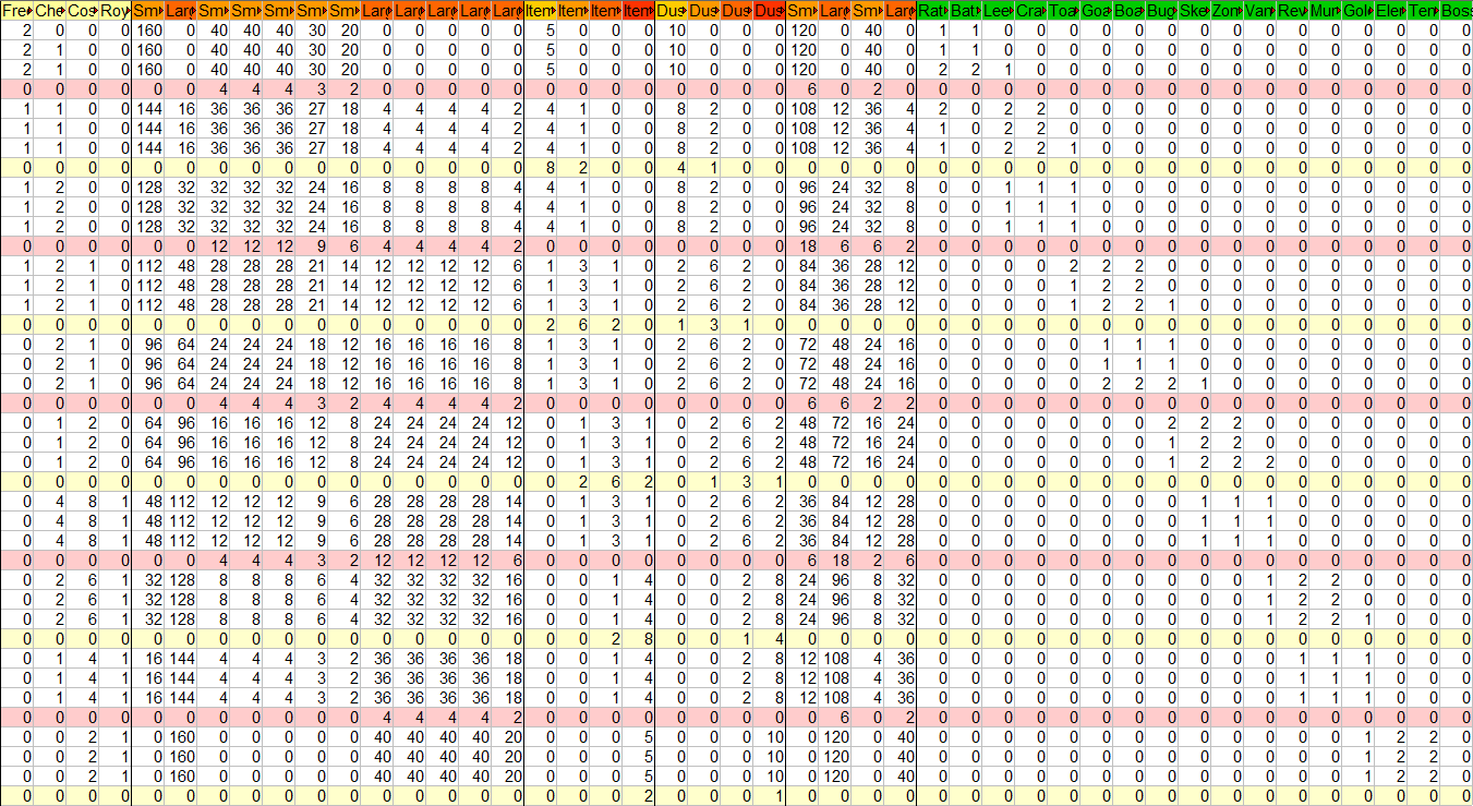
That is the main chart of the game, controlling the probabilities of specific pickups, chests and monsters occurring on levels. It plays a key role in determining the difficulty and the feel of the game so nailing it was pretty important (no pressure :P ).

If balancing this way is pretty efficient why it took so much time? Well, even a simple game like I Am Overburdened is built from an absurd number of components, so modeling it took at least a dozen gigantic charts :( . Another difficult aspect is validating your changes. The most reliable way is play-testing, so I completed the game during the last two weeks around 30 to 40 times and that takes a long while :D . There are faster but less accurate ways of course. I will talk about that topic in another post...

Tricks and tips


#1.: Focus on balancing ~isolated parts/chunks of your game first.
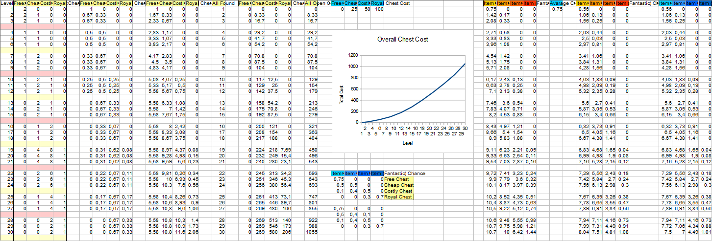
This wide "chest chart" works out how the chests "behave" (opening costs, probabilities, possible items). Balancing sections of your game is easier than trying to figure out and make the whole thing work altogether in one pass. Parts with close to final values can even help solidifying other aspects! E.g.: knowing the frequency and overall cost of chests helped in figuring out how much gold the player should find in I Am Overburdened.


#2.: Visualization and approaching problems from different perspectives are key!
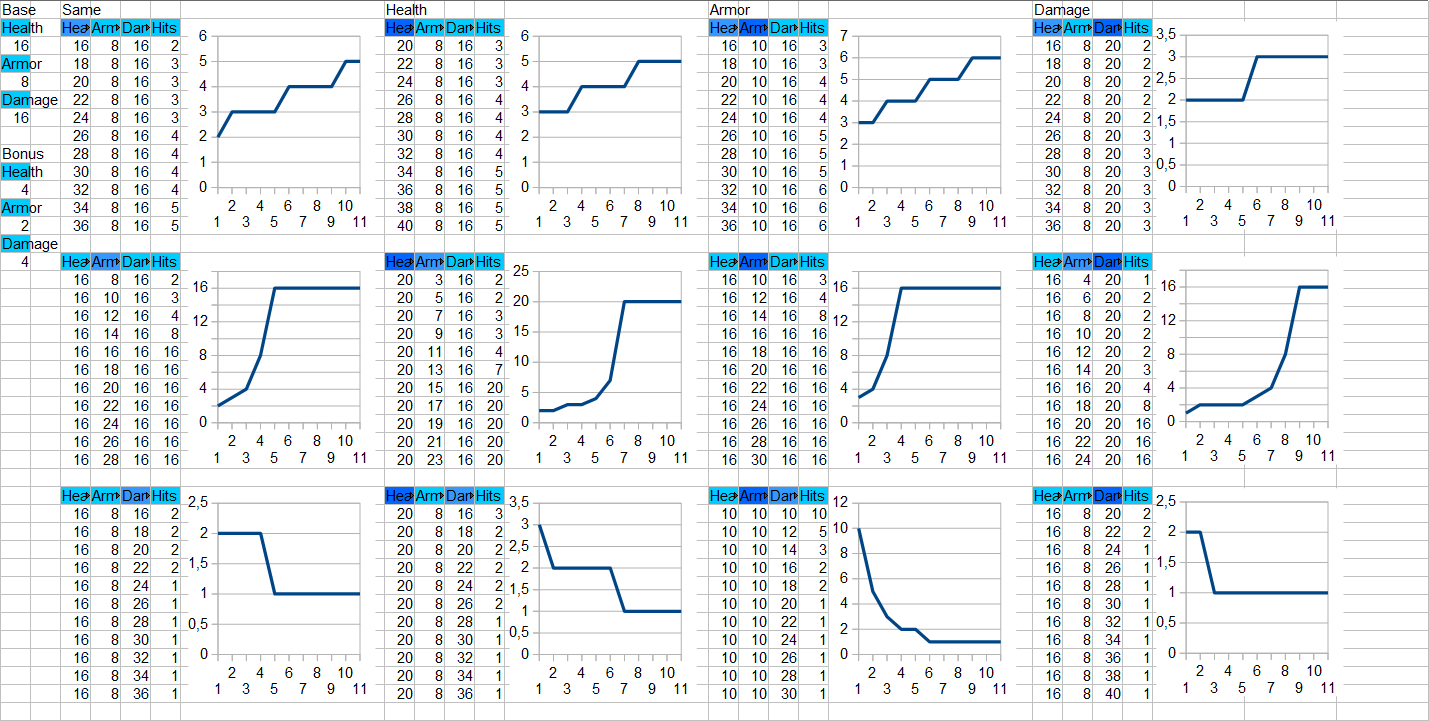
The battle model (attack/defense/damage/health formulas) wasn't working perfectly up until last week. I decided to chart the relation of the attack, defense and health values and how their change affect the number of hits required to kill an enemy. These fancy "damage model" graphs shows this relation. Seeing the number of hits required in various situations immediately sparked some ideas how to fix what was bugging me :) .


#3.: ~Fixing many formulas/numbers upfront can make your life easier.
Lot of charts I know, but the highlighted blue parts are the "interesting" ones. I settled on using them as semi-final values and formulas long before starting to balance the game. If you have some fixed counts, costs, bonuses or probabilities you can work out the numbers for your other systems more easily. In I Am Overburdened I decided on the pickup powers like the + health given by potions or the + attribute bonuses before the balancing "phase". Working out their frequencies on levels was pretty easy due to having this data. Also helps when starting out, since it gives lot of basis to work with.

Now onto the unmissable personal grounds. Spidi, you've been v/b-logging about this game for a loooooong while now, will this game ever be finished?! Yes, yes and yes. I know it has fallen into stretched and winding development, but it is really close to the finish line now and it is going to be AWESOME! I'm more proud of it than anything I've ever created in my life prior :) .
Soon, really soon...

Thanks for reading!
Stay tuned.

(2 edits)

Hi everyone!

This entry is a bit more like an announcement and less like a devlog entry, but here it goes:
I Am Overburdened is going to be released on October 23 for PC :) !!!
Here it is, the release trailer featuring some fun game-play footage in all its glory:

Store, platform, price & following

The game will be sold through itch.io for Windows PC initially. I'm already working on some fancy graphics and going to put together the store-page in a day or two. The future platforms will depend on how well the game does sales wise. I would not like to promise any other devices/OSs upfront as porting can be a big effort so if the game flops I may not have the time/capital to deliver.

It will cost 4.99$.

It is a relatively short game, but has a huge "replayability" factor.
Since it is run focused and has permanent death, completing it once will take less than an hour, but the game has enough content (artifacts, monsters, procedural dungeons, unlocks, game modes) to keep it fresh for dozens of playthroughs.

I really believe it is a correct price point. It has a lot of fun stuff to keep you entertained for a while ;) .

You can follow my developer profile to get a notification:

My website already has a lot more information about the features of the game and the release itself.

Release calendar

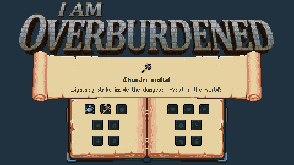
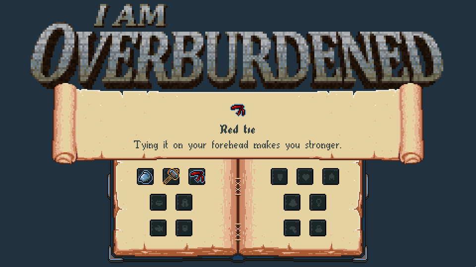
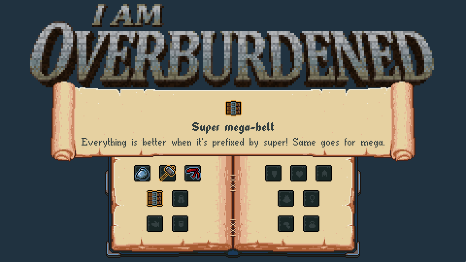
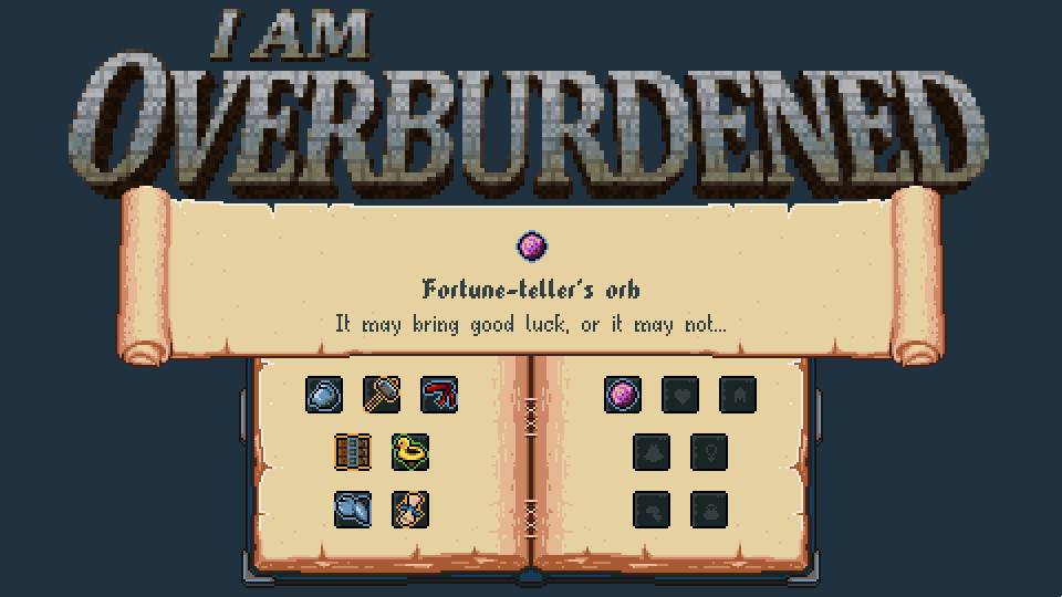
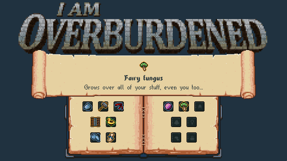
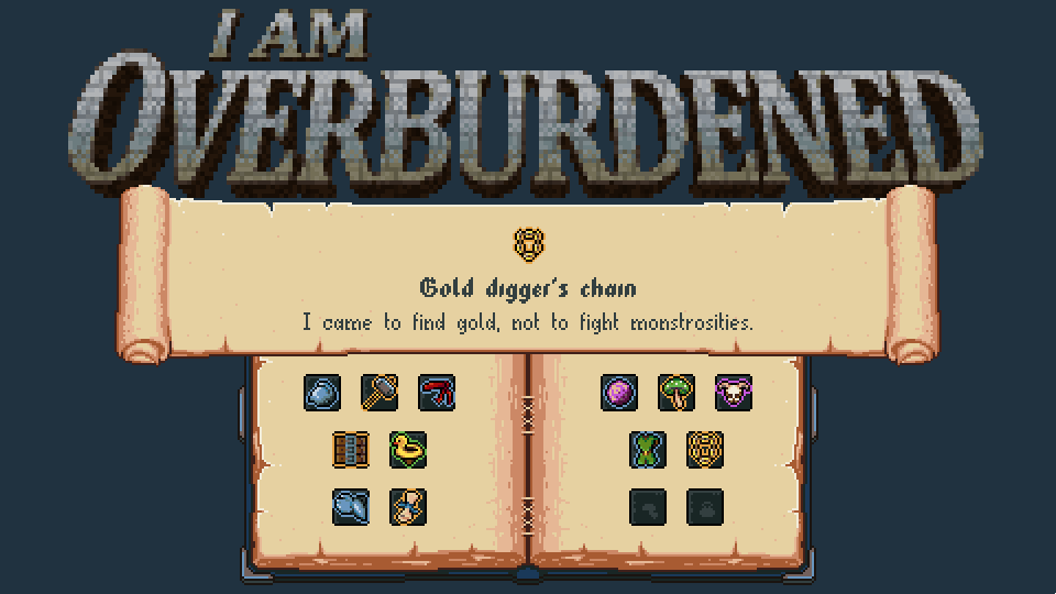
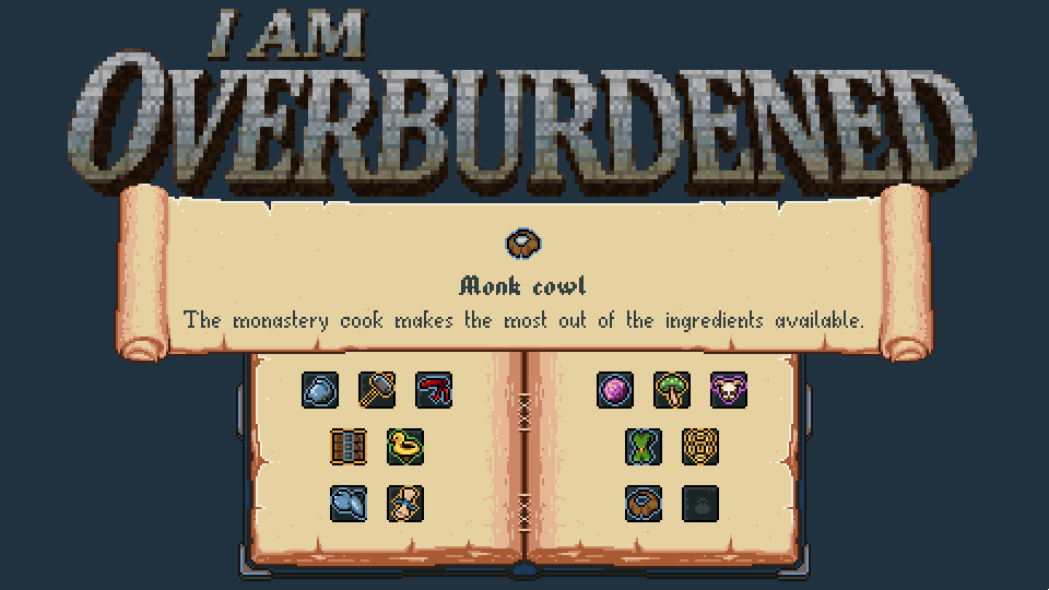
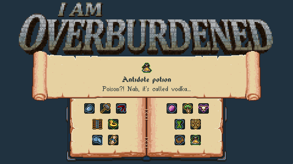
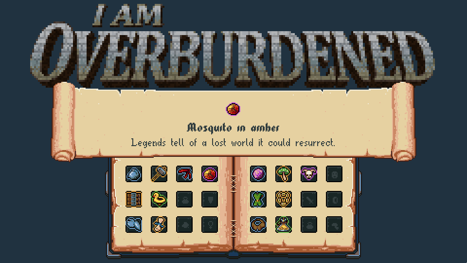
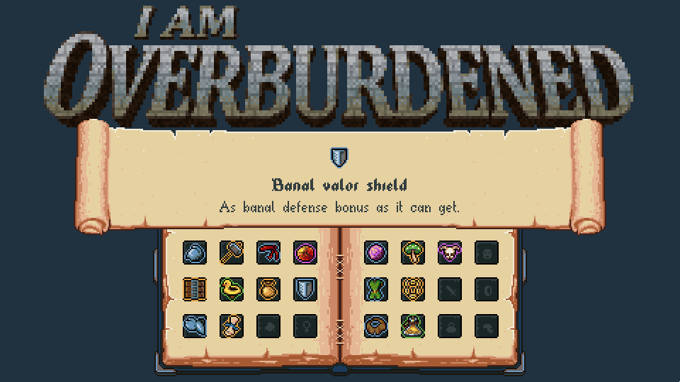
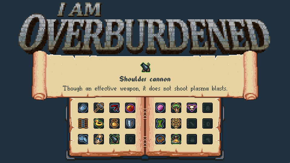
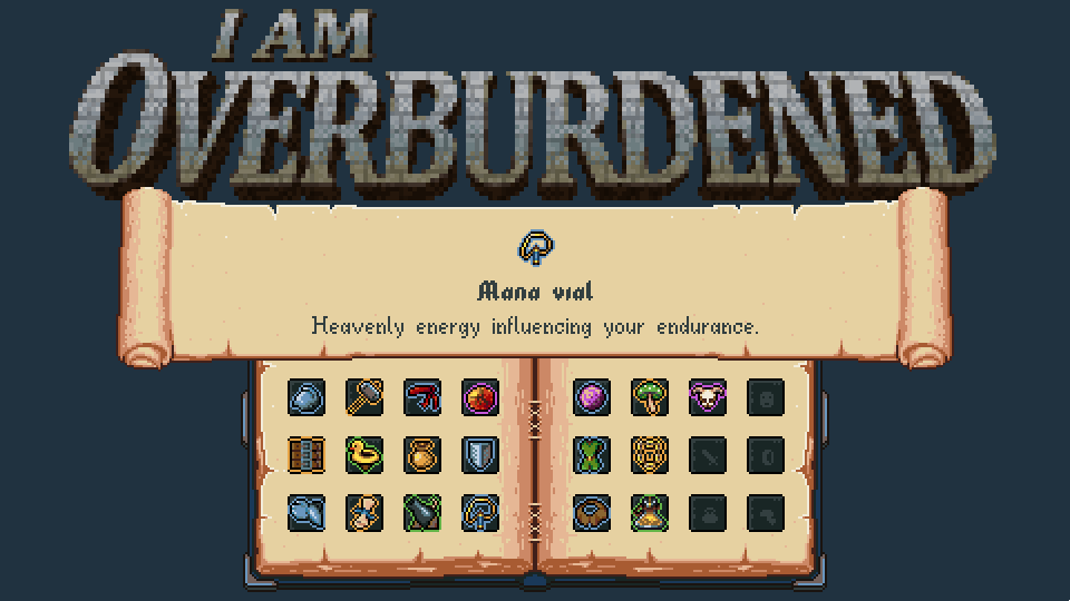
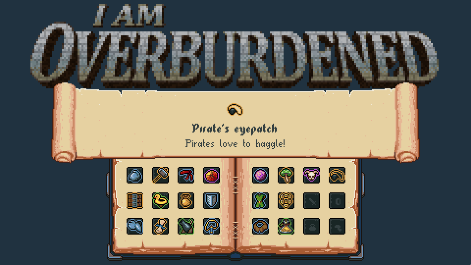
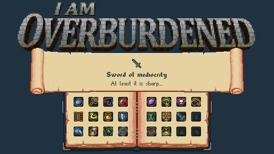
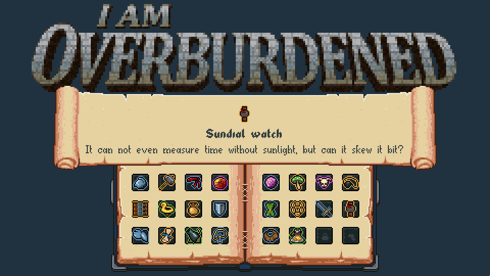
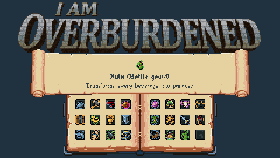
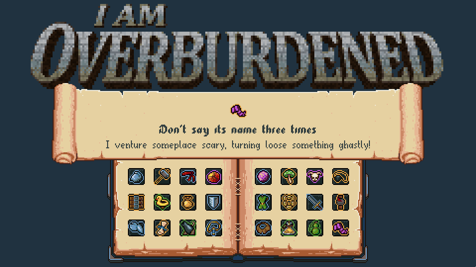
I'm doing a little marketing "sprint" thingy up until the release day. I'm calling it the "Wishlist Release Calendar". Essentially, to promote the game a little, I'm going to release an artifact from the game every day with its "fluff" text on various channels (here too) updating or posting the new version of the following image:

Heeeeeeeelp!

If you like the game or liked it's development "story" you can help me. Following me/the game now (even for buying it later) or buying it on release day (there will be a tiny discount ;) :P ) supports me tremendously. Even if you are not really interested in buying/playing the game you can help. How :O ?! It's simple, share it. Share my itch.io link or the trailer with friends and relatives who may be interested in playing it. That is all! It's really nothing, but it may allow the game to reach a broader audience, and thus in the long run may allow me to further support my game development journey :) .

Thanks in advance.

Promises, future

No one knows how the future unfolds. I have confidence in the game, because it is AWESOME, but I'm crazy nervous :( . The success of a game doesn't only depend on its quality (or I should say the quality it's developer perceives :| ). No matter how this release turns out I can promise more devlog entries ;) :) . At least one about the last development weeks of I Am Overburdened and a little later a postmortem entry about it.

My journey may change course, but it doesn't end here :) , wish me luck ;) !

Thanks for reading and thanks for all the support so far!
Take care.

(1 edit)

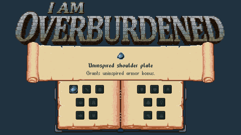
Wishlist Release Calendar nr. 1:

(1 edit)

Wishlist Release Calendar nr. 2:

If anyone is wondering :| these fluff texts are in the game! Not making them up now :P
I may went a little too far with silliness though :D

(1 edit)

Wishlist Release Calendar nr. 3:

Your development log is amazing. The game looks fantastic, but the way in which your dev log is structured so well with so many visuals... I found myself reading it like a book lol. Best of luck to you!

(1 edit)

Hi T Allen!
Thanks for the compliment for both the game and the log :) .

I guess I'm not revealing a big secret by telling, that a lot of work goes into these devlogs :) . Don't get me wrong, this doesn't mean that I don't like making them, I really love writing the logs and enjoy producing the videos more and more, it is creative work too, but it takes a lot of rewrites and some serious amount of recording and editing to get here :D (+I still feel that some entries end up boring from time-to-time :| ) . Sometimes I think I should focus more on these entries (e.g.: try to make them weekly) but that would take as much dev-b/v-log making time as game making time :D so I probably will stay with an entry once or twice a month :);) .

I'm happy that you like them and thanks again for the kind words!

P.S.: The Lone Knight looks awesome going to give it a try ;)

The work that goes into them really shows, and my pleasure! Thank you as well! Let me know what you think! 

(1 edit)

Wishlist Release Calendar nr. 4:

Of course there is a non-super and non-mega belt in the game (just a "usual" one) and this one is clearly better than that :P .

(1 edit)

Wishlist Release Calendar nr. 5:

It's one of my favorites. The trailer has some footage of it in action ;) .
+ A rubber duck also helps solving gamedev / programming problems :D :P .

The store page is live!
The release date is set to Oct. 23 ;).
I also set up the discussion boards with some prepared posts. Feel free to ask about the game, the development process or anything ;)...
I hope you all will like the game, thanks for everything so far!!!

Wishlist Release Calendar nr. 6:

(1 edit)

Wishlist Release Calendar nr. 7:

Hey Spidi, 

Good to see another GDNet comrade over here!

I just found your blog for this game today (looks like good timing. A week til release?). I skimmed it just now (bookmarked to look more in depth later), but the blog is great, and the game looks like a lot of fun. All of the little pieces of polish you've added really add up to a nice looking product. 

This is a game I look forward to playing. 

Wishlisted on Steam. 

Do you have Facebook or anything set up for the game? I'd be happy to share some links.

(2 edits) (+1)

Hi JEJoll!

Jeah, GD.Net rules ;)!

Thanks for the kind words both for the blog and the game, oh and thanks for the wishlist, means a lot and if you buy the game you are the best ;) ! Ever ever :)! In that case I really hope it will be to your liking and you will have fun while playing ;):) .

Well, I don't have a facebook page for the game yet, but planning to set one up before release. I'm not a seasoned facebook user...
Currently I only have my own website with a section for the game which has all the important links and my contact information:
Magic Item Tech website - Games - I Am Overburdened

Thanks again!

Yeah, I don't blame you for not jumping on the Facebook bandwagon. I'm not a fan myself, but I think it's a bit of a necessary evil, given the competitiveness of our trade :S.

You're welcome. Best of luck with the release! I really want to see this game do well--easy to see all of the hard work that went in!

Yep, similar feelings about Facebook, but just as you mentioned, I should have made it already, so it will happen :| ! ...

Thanks again for the kind words and wishes :)

(+1)

Wishlist Release Calendar nr. 8:

I hope it does!

Wishlist Release Calendar nr. 9:

Wishlist Release Calendar nr. 10:

The trailer has some footage of this item it in action too ;) .

Wishlist Release Calendar nr. 11:

Wishlist Release Calendar nr. 12:

Wishlist Release Calendar nr. 13:


Only 2 days left till release :) !

Wishlist Release Calendar nr. 14:

This is the last one :) which also means if all goes well releasing tomorrow ;) !

(1 edit)

Hello there!

This is going to be a painful post for me, but I got to do it :( ...

TLDR:
I had to postpone the release of I Am Overburdened by a little more than a week, to the 2nd of November :( !

I messed it up big time!

During the "hopefully final" test session this weekend I discovered few severe technical issues (bugs :( yuck). Since I went to a family visit I did not start fixing stuff + it would have taken more than a few minutes (still tried to work a little during the middle of the night :P , but with no luck yet :| ) . I also miscalculated how much time I will have for creating proper release marketing materials today, so all in all I simply did not prepare well for the 23rd of October.

I can not express how sorry I am and how shameful I feel right now. This was an extremely hard decision to make. I made a lot of posts around the INTERNETZ with the previous release date, trying to gather some interest around the game, but releasing it in this state would go against my principles. I simply don't want to publish a buggy product.

I know, I know, there will be bugs, no software is perfect, but as I stated numerous times before, a good game tomorrow is better than a mediocre one today and we are talking about only 10 extra days. "If it is only a few bugs and a bunch of marketing materials why not only a few days instead, why more than a week?!" Good question and the answer is simple. This is already and immensely embarrassing situation, even though I know I'm making the right choice. I feel like I'm letting people down who wanted to play the game today :( . It is a no-brainer, that I don't want to end up in something similar again. Targeting the 2nd of November will give me plenty of time to fix the remaining issues and prepare for a better launch without an absurd work-schedule.

I hope you understand my decision and forgive me for my messed up planning. I thought about continuing the release calendar at least. I prepared the first extra one and if you are interested I will keep posting it ;) .

Wishlist Release Calendar nr. 15:

Again, I'm really sorry. I'll try to make it up to you with an even better game :| !
Take care.

Wishlist Release Calendar nr. 16:

Wishlist Release Calendar nr. 17:

Wishlist Release Calendar nr. 18:

Wishlist Release Calendar nr. 19:

Wishlist Release Calendar nr. 20:

Wishlist Release Calendar nr. 21:

Wishlist Release Calendar nr. 22:

Wishlist Release Calendar nr. 23:

Wishlist Release Calendar nr. 24:

(3 edits)

Hello there!

In the big sprint towards publishing this game I forgot to update my blog with a proper release announcement :D . I had to split myself in millions to actually finish the game and put it out there, but still, silly me how could I forget :| .
Takeaway: I have to prepare better for my next release, but I heard from other developers, that no time is actually “enough” :D .


Released

Yes, I Am Overburdened was released at evening (by GMT) on the 2nd of November.
It can be bought for 4.99$ and there is a launch-week 20% discount so get it while it’s hot (so currently at 3.99$)!


First day

Now that I’m over the big rush for the release and over the first day, I can slowly ease into handling issues and working on updates, fixes and fine-tunings. The first batch of feedback is really positive and I got decent featuring from the press so far, which is awesome. People seem to understand and like the game, many even praise it and are really enthusiastic about its future :) . This is an awesome feeling!
The game is up to a slow start sales wise but it is too early to draw any kind of conclusions (it’s only been a day). Of course I will do that in a few weeks in another blog entry. Fingers crossed :) .

Thank you!

Allow me to grab this opportunity to formally say thank you. Thank you for all who followed the development. Thank you for those who supported, helped and encouraged me along the way. Thank you for everyone who contributed, either with tips, suggestions, testing or critique. And thanks for everyone who already bought the game, I hope you all are having a great time :) !
I’m adding a new screenshot about the inn in the game (pun intended :P ), because in the last two weeks of development I changed it a bit (added even more stuff to the game :D ).


Thanks for everyone who followed the release calendar too, I hope you enjoyed it :) . No more item reveals sorry, go buy the game, it has much much more artifacts :P ;) .

Thanks for reading, I’ll be back with more stuff soon.
Take care!