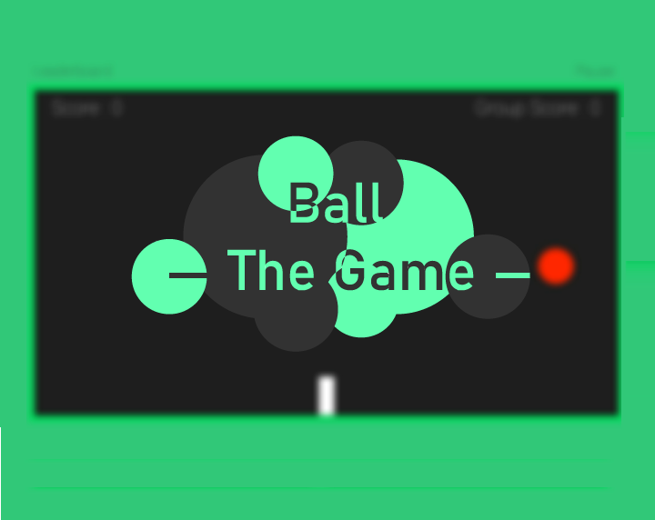
I released this game a while ago but I haven't got any feedback about the mechanics, logic, working, etc. so any feedback is welcomed.

Hi Yash Kumar Gupta,
I tried your game on Android. Here’s my feedback on it:
The intro is the logo of the game, which has a background, so the whole rectangle is visible. It would look much better if the image didn’t have the background, but the game itself would display a background color, possibly fullscreen, background.
The loading screen seems to be the game’s name blurred. Would be far better if anywhere on the screen it was mentioned this was a loading screen. Plus displaying the game’s name first with its logo, and then with plain text right after it, feels inconsistent.
The first thing I see after the loading screen, is a screen asking for a username and a field saying “Enter your name”. To me that would be a red flag. Why is this game asking for my name? Why now, I haven’t even played it yet? Assuming the name is only asked for leaderboards, I’d suggest that you ask for it once a game is played, and the user got a score. Also would be good idea to make it optional, some people just want to play fully offline, no questions asked.
Apparently typing a username and clicking “Next” will register that username to the game’s database. Would be nice to warn the user that it was about to send this type of data online. What if someone put their personal name instead of a nickname, because they didn’t realize it was this binding?
The main menu looks fun, it shows what the game is about, it’s colorful and playful.
The buttons on the main menu are currently just clickable text. They would look far better and easier to press if they had some kind of button graphic behind them. It would also make it easier for users to understand what is a button and what is plain text.
The settings button seems a bit misaligned and half of it is outside the green border. I assume that’s because the game doesn’t know how to render itself on multiple screen sizes?
After pressing the “Play” button, I get two options “Play in a local group” or “Proceed without group”. I personally have no idea what this means, and I suspect most users won’t either.
For the game itself, it looks fairly simple and straight forward, and it’s robust.
The score and some other UI elements also go beyond the green borders.
I sometimes find it difficult to accurately control the white peg to attack the circles. I can’t decide if that’s because it’s a touch screen or because the controls could use some re-design. In either case I think it’s worth investigating (assuming support for touchscreen devices is there to stay).
The game seems to be uploading my score online automatically after each game. I’d advice strongly against that. I’d expect the game to let me know if I want to upload my score, or keep my experience offline.
That’s all I could pick up for now. All ideas mentioned are just my personal opinion, it’s up to you to implement whichever you liked :)
Thanks a lot!!!!
Points related to the database and uploading of the scores was something I didn't think about. It was a very valuable piece of information that you provided me with.
Your evaluation of the game's design(about the texts, buttons, alignment and more) was something I highly appreciate. It gave me a good idea for improving it.
You were correct about my game not being able to adapt to different screen sizes(ratios). I am trying my best to re-design the UI completely and have it work properly on all devices.
I am really, I mean really, thankful to you for noticing each and every smallest detail in the game and providing your opinion as a user. I highly appreciate the time you gave to my game and analyzing it.
Really, thanks a lot!!!!