For production, we’ve been hard at work refining the game to enhance the experience of Kalidax. Here’s a quick rundown of the latest updates:

UI Enhancements:
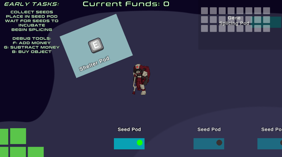
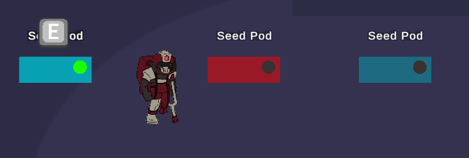
Clarity in Interaction: We’ve revamped the UI to make it crystal clear what actions you can take at any moment. Look for visual cues that highlight interactive elements, ensuring you never miss out on what’s available.

Upgrade Indicators: The upgrade interface has seen some significant improvements. Now, when you’re eyeing potential upgrades, they’ll light up in green if they’re within your budget or turn red if they’re too pricey. This visual guide is all about making your choices clearer and gameplay smoother.
Transparency for Unaffordable Upgrades: To further distinguish between what’s attainable and what’s not, upgrades you can’t yet afford will appear more transparent. This subtle cue means less time checking your resources and more time playing.


Debug Tools for Enhanced Development:
Economy Adjustments: We’ve introduced new debug tools that allow us to tweak the in-game economy on the fly. This means we can ensure the game’s economic balance is just right, making for a fair and fun progression. Upgrade Testing Made Easy: With our enhanced debug capabilities, we can now apply and test upgrades instantly.
Did you like this post? Tell us
Leave a comment
Log in with your itch.io account to leave a comment.