Once again, For production, we’ve been hard at work refining the game to enhance the experience of Kalidax. Here’s a quick rundown of the latest updates:
Quota System Introduction:
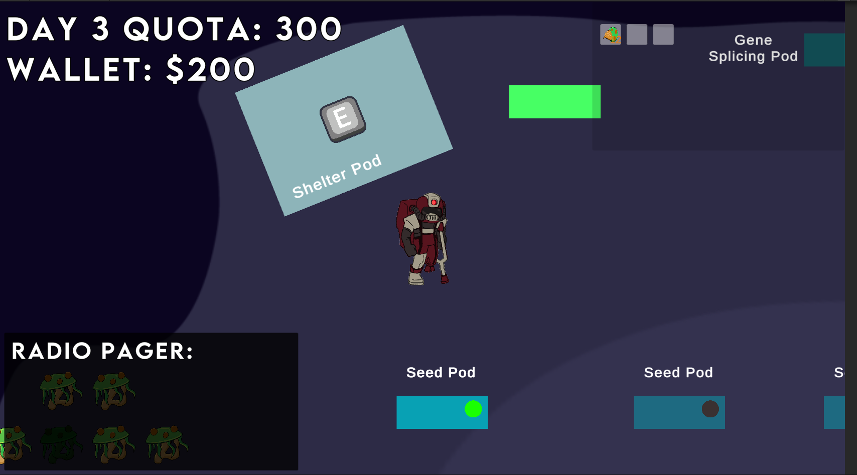
Understanding the importance of keeping track of resource usage, we’ve introduced a sophisticated quota system. This system is prominently displayed, showing the current day and a countdown to when the next quota refresh will occur. This feature ensures that you’re always aware of your current quota status and when you can expect new resources, enabling better planning and resource management.
//Quota

UI Enhancements for Better Usability:
Pager Relocation for Improved Navigation
We’ve made a strategic change to the user interface by relocating the pager to the bottom left corner. This adjustment is not merely aesthetic; it’s a thoughtful redesign aimed at enhancing usability and accessibility. By positioning the pager in this new location, we’ve made it easier for users to navigate through the application, ensuring that essential controls are within easy reach and do not interfere with the content viewing area.
Readability Backdrop
Another significant enhancement is the addition of a backdrop behind text elements to boost readability. We understand the challenge of reading text over varying backgrounds, especially in content-rich applications.
Our solution is a carefully designed backdrop that provides a consistent visual layer, ensuring that text stands out clearly regardless of the underlying content. This feature is particularly beneficial in environments with complex or detailed backgrounds, making information easier to digest and reducing eye strain.
// Pager
 //Quota Day

Did you like this post? Tell us
Leave a comment
Log in with your itch.io account to leave a comment.