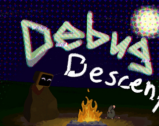
Oh my gosh this game is crispy lol. Love the isometric style, the vibrancy of the colors, and the visuals overall! Those enemy spawn effects were so cool wtf. The idea itself is also super creative and meta :] The character designs were simple yet effective, especially the non-human ones being abstract was sick. Gameplay-wise, I unfortunately didn't get super far into it so my opinion may not cover the whole experience, but it felt pretty slow overall. The sword itself was a cool ass looking weapon but it felt kinda hard to control, with a small hitbox to actually hit the enemies and the triple-hit rarely landing. I looked at your previous comment and I agree, the animation lock is good, but I really wish the enemies had knockback on your attacks so you'd be more likely to hit them. Having an enemy count would also be helpful so they know if the stage can progress or if they still have work to do. Overall, you have a really solid foundation for this game, and through some gameplay tweaks and expansion has some great potential. I hope you continue working on it!
Play game
Debug Descent's itch.io pageResults
| Criteria | Rank | Score* | Raw Score |
| Presentation | #2 | 3.500 | 3.500 |
| Overall | #4 | 3.278 | 3.278 |
| Enjoyment | #5 | 2.917 | 2.917 |
| Creativity | #6 | 3.417 | 3.417 |
Ranked from 12 ratings. Score is adjusted from raw score by the median number of ratings per game in the jam.
Was the majority of the art made by your team?
Yes. I also got some animations from Mixamo, sounds from Pixabay, and effects and a couple models from the asset store and other free sources online.
Was the majority of the music made by your team?
All of the music was made by me, but most of it not during the jam period. I'm not eligible for prizes as a judge, though, so it doesn't matter. What're ya gonna do, disqualify me? :)


Leave a comment
Log in with itch.io to leave a comment.