Play game
Chefpocalypse's itch.io pageResults
| Criteria | Rank | Score* | Raw Score |
| Overall | #9 | 3.407 | 3.407 |
| 90's | #9 | 3.889 | 3.889 |
| Fun | #9 | 3.667 | 3.667 |
| Most improved | #13 | 2.667 | 2.667 |
Ranked from 9 ratings. Score is adjusted from raw score by the median number of ratings per game in the jam.
Leave a comment
Log in with itch.io to leave a comment.




Comments
I like it and the idea but i can't beat it because I can't get onto the house with the piece of cloth.
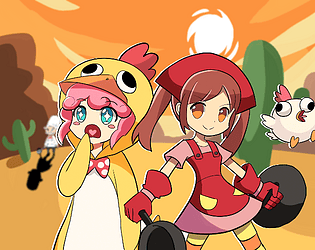
The vibe is right on!! VERY cute, VERY 90s! Bugs aside, I enjoyed what Chefpocalypse brings to the table
It was fun to play, although I’m not sure I’d keep playing for a long while after beating it. Maybe if there was some sort of score shown at the end that wasn’t just the reputation, or if I knew there’d be another ending if I talked to each doughnut exactly once. Or some other optional challenge that there was some reason to try.
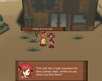
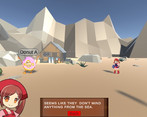
Visuals: pretty good, although I found one glitch: the “press E to talk” and “press E to feed” buttons have really tiny text. It’s hard to read, and the size depends on where you’re standing when it appears. I’d prefer to be able to sit some distance away from the screen (like in a couch) and still be able to read it easily. And for some reason the scaled text looks blurry. But the environment does look pretty nice and also pretty nineties.
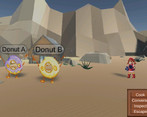
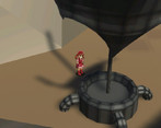
I like the mountains made of flat-coloured triangles, and the mix of 2D and 3D also works well. But the pixelated shadows on the ground (not the very dark ones, but the colour changes that show big objects) look a bit modern. They could have been made that way on 32-bit hardware though, and it’s not a big deal.
The mix of 2D and 3D also works well. But I think the UI shouldn’t use scaling. Aside from the text scaling mentioned above, there’s also some scaling issue in the dialogue text where the person that talks appears to the left of the text. Sometimes the mouth of the main character can look like it’s split in two because one of the black pixels disappears when the image is scaled. I’m guessing PS1 games didn’t scale images in their UI, but if you avoid having one-pixel-thin lines, the scaling could probably work. Another way to avoid lines disappearing completely could be to blur the image a little bit before importing it into Unity. That might look a bit like texture filtering, but it could work with 32-bit hardware.
Audio: The music fits the game well, and I like how there’s different music at different times. Weirdly enough I think the cooking music might be a bit better than the walking around music. I’d think I spent more time looking for ingredients than cooking and talking to doughnuts, so maybe the piece of music that plays when walking around could have been a bit longer (I mean, less repetitive), or there could have been two songs for it to switch forth and back between.
I’d also suggest adding some sound effects that play whenever a doughnut has a meal. It could depend on how much it likes the meal.
Other possible improvements:
Good job!
Love the graphics! its a cute fun game. if there is gonna be a full version to this one I'd get it:)
Love the graphics! its a cute fun game. if there is gonna be a full version to this one I'd get it:)
The little donut guys are scary and cute at the same time, great job! Also loving the mix of 2D and 3D visuals!