On Sale: GamesAssetsToolsTabletopComics
Indie game storeFree gamesFun gamesHorror games
Game developmentAssetsComics
SalesBundles
Jobs
TagsGame Engines
A jam submission

Aquaworld 2View game page

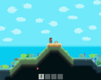
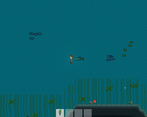
Explore, gather, craft, and fight your way through the depths of Aquaworld!
Submitted by ghost_bros, uncle_specter — 1 hour, 40 minutes before the deadline
Add to collection

Play game

Aquaworld 2's itch.io page

Results

CriteriaRankScore*Raw Score
Community Choice#54.4384.438

Ranked from 16 ratings. Score is adjusted from raw score by the median number of ratings per game in the jam.

Judge feedback

Judge feedback is anonymous.

  • A sequel to everyone's favorite Exxon/Spam product placement vehicle. Modulo a few bugs, everything here is outstanding. There's a stunning amount of gameplay and variety in Aquaworld 2. After playing through the story, this is one game jam game I may come back to.

    Liked:
    + Lots of variety, in everything
    + Story is short, sweet, and highlights mechanics well
    + Consistent pixel-art style reads well

    Needs Work:
    - Cumbersome UI and inventory management
    - Some mysterious physics glitches

    Varied enemies, swimming without constantly stressing out about an oxygen meter (!), a fun bite-sized story, lovely pixel-art graphics, simple but immersive sound design... this game has the whole package.

    I think the UI is the main part of the game that lets it down. I didn't catch the joke at first, so the draining urine-in-a-bottle meter was baffling, especially given that you can find fresh water. Moving items to the hot-bar as a rotating queue instead of drag-and-drop was frustrating, and moving things into my hot bar to eat or heal was doubly so. It would be nice if you could consume items directly from your inventory. Merging the crafting and inventory screens somehow would additionally make it easier to see what ingredients you're running low on.

    The most overt bug I experienced was when, at the end of the game, I realized I could hop on a jet-ski and ride triumphantly away from the pirate base... only for it to randomly kill me and leave me mysteriously floating into the air. Oh well.

Elevator pitch
Explore, craft, and fight your way through the depths of an underwater world. Face the horrors of the deep while you search for the last seeds of the Old World, and of humanity. And don't forget your trusty sidekick, a pile of bones!

Describe how your game adheres to the theme
In 1995, the entire world was covered by "aqua", men had gills, and pirates took their smoking very seriously. Only one man and a girl could find the tiniest of land masses.

Now, in the year 2018, a new hero emerges. She must pick up where others' journies have ended - on a tiny patch of land with nothing but a pile of bones and the gills on her face flaps. This is Aquaworld 2!

Leave a comment

Log in with itch.io to leave a comment.

Comments

Submitted(+1)
Pros:
  • Moody and atmospheric exploration
  • Surprisingly large area to explore
  • Piiiiiiiiiiiiiiiiiiiiiiiiiiiiiiiiiiiss bottles
Cons:
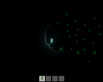
  • Darkness is very dark, perhaps too dark when dark
  • UI a little drab and unfriendly
Here & There:

This game is comfortably long and by that I mean it's long enough to add to the feeling of substance while not feeling padded or prolonged which is a nice balance to achieve. The darkness adds to the tension when you're diving in these narrow caves deep in the water, but it's also so dark that it's impossible to see much of anything which leads to taking damage that feels unearned. On that note it feels  like the day is significantly shorter than the night, but that's likely due to bias from typically being underwater where it's darker by default. After the 4th seed the arrow points left and mentions a cliff, and heading left you end up in a little cave system but what you actually need to do is get to the left half of the world and then go looking for the seed which felt a little unpolished. A map would have been cool, but would take away from the exploration. What you could have done maybe is add a very undetailed minimap that outlines geographical shapes in a limited distance which would alleviate the sort of issues I had immediately following the 4th seed. I enjoyed the writing which didn't feel like forced humour and didn't resort to memery which I will always appreciate forever. I don't know if I read in the chat on the Gong Show or in the Discord or somewhere, but I vaguely remember reading that the PC is the little girl and the skeleton is Kevin Costner. I don't know if I'm making that up or not but if I'm not, that's a good-ass idea. Well done.

(+2)

Had a good time playing this. And I didn't mention Kevin Costner once! Probably should've. That would've seemed relevant.

Developer

Thanks so much for the playthrough! Super funny and supremely patient haha. Unfortunately, there was no time during the jam to make the plant actually grow, so I'm glad you moved on with your life before your video stretched to an hour. :) It's definitely something we'll add in once the voting embargo is lifted. Thanks again for taking the time!

Submitted(+1)

I really loved the style of this. The graphics are great, especially the sunset model. The music is incredible - the sound design overall is fantastic.  It had the right amount of story. The crafting system seemed to make sense as well. That said, however, I didn't quite find it as much fun to play. The timers felt too short, and the UI a bit too fiddly, to really bother with crafting or trying to use the weapons properly.   All too quickly you would die, and it became easier to just luck into any needed food/water as opposed to grinding materials.

There was too much time spent in darkness, which never allowed any sense of location when diving down, and made it even harder to see the effect of the weapons.

 I may come back to this later, especially if the UI gets some improvement, because I really wanted to like it more than I did. (One possible suggestion already noted : have hotkeys for food/drink/healing that can persist between runs.)
Developer

We appreciate the feedback and totally understand where you're coming from. We'll definitely be working out the kinks in the UI once the voting embargo gets lifted, along with the other items you noted. Glad you enjoyed the style and music, and thanks for playing!

Submitted (1 edit) (+1)

This game is incredible for the time put in! I like me some Terraria so the game was mostly up my street. The visuals, lighting and sound were especially good.

Only real thoughts I got are it's pretty easy to get lost in the labyrinthine abyss, plus it's occasionally tricky to tell what you can break and what you can't at a glance. 

The traps didn't feel too useful, felt like I could get away with just using throwing spears.

Likewise, as food heals you (which I like, btw) it does make Bandages feel a bit redundant. Especially with how plentiful food is in the sea. 

I feel like mouse-wheel should change the active slot on the hotbar. Just something I've some to expect from games like this, heh. 

Perhaps consider adding a button like in Terraria where pressing it consumes anything edible in your inventory? So a button for using any healing item you have, a button for using any food item you have and a button for drinking any fluids you have. Play a tone to let ou know that the attempt failed because you dont have any items for that task or something. This would free up the hotbar for weaponry. 

Developer(+1)

Thanks so much for playing and for the feedback! Yeah, it seems to be a recurring theme that we'll need to take another look at the hotbar setup. Having separate slots for food / water is a great idea that we'll definitely dive into once we can make updates.

Submitted(+1)

Quite enjoyable!  The way the sounds became muted underwater and the darkness when you got to the depths helped create a really lonely, foreboding atmosphere.  Even without the pressing need for air, I still felt uneasy exploring for secrets and the like.

I appreciated how your stuff would pop out of you when you died, letting you collect it again if you could get to it - and the plentiful resources near the start to make sure you're not left helpless - but I ran into some issues with my dropped loot's collision:

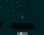
It's hard to make out in the dark, but I died in a narrow spot to a bunch of leeches/eels and had so much stuff that it lagged like crazy and pushed my body out to the left of the room's walls.  And then respawning got me this:

Slightly beneath the island.  I was able to starve to death and properly appear on the island, but the game was so bogged-down by my old inventory still stuck in that little cave that I couldn't even fight off the first kind of vicious fish without dying.  After a few failed attempts to get back down there, I had to give up.

I'll still have to give this a more proper play again before I can rate it, but I liked what I was able to play.  If you plan on developing this more, I'd suggest adding x10 versions of your inventory pickups so it won't spawn so many distinct items when you die.

Developer

Thanks so much for the feedback and for the (impromptu) bug testing! :) I think that's a great idea to stack the dropped items in quantities of ten, to avoid the kind of bug you experienced, since you really can start to collect quite a pile of stuff - it's almost like underwater Horders...I appreciate you giving it a try and I'll definitely make it a priority to get the loot drops patched up once voting is over.

Submitted(+2)

I expected, going into this, to hate it because this isn't really my genre, the Terraria-likes, or whatever you want to call them. Buuuut, this game is very awesome. Great job. I love the atmosphere, the music is cool and the way it fades the deeper you go. Sick effect. That's a classic effect for a reason. Solid story, just enough to keep it interesting and motivate the player without it bogging anything down. 

I wish the hotkey setup was a little better. I think you did a good job giving the player enough food and water without that aspect of the game feeling frustrating (Thank you for the urine bottles, lol. That was a colorful bit of flavor as well!) However, in the mid-late game my hotbar setup was knife, throwing spears, explosive spears, fish meat. So every time I had to drink water I had to set water to my hotbar, unpause, drink the water, re-pause, and then click meat, explosive spear, spear, knife in that order. Oof. I think a click-n-drag setup could work, but, especially with consumables, it would be cool if you could just eat them FROM the menu. Like, left click is add to hotbar, right click is consume. Just a thought. 

Small thing, but maybe you could call out negatives stat effects in the inventory differently? Like, maybe the human meat can have red text for "-5 Thirst" instead of the normal white text? I was chomping this stuff down for a bit without realizing i was making it harder for myself. Especially early game where water is a little scarcer. 

I would love tooltips in the crafting menu. Even if it's just tooltips for items you can currently craft (to preserve the mystery or whatever). I'm a big wimp so I was scared to waste resources seeing what stuff did. 

Lastly, this might just be me but I kept trying to press Esc to exit the item menus which paused the game and did not, in fact, exit the menus. 

Great job overall! Impressive for a jam game, for sure. 

Developer

Thanks so much for the feedback, we really appreciate it! All great points, but I particularly agree with the hot bar comments - it could have even been improved if the knife was stickied to spot 1 since it's usually the tool you're using the most. Thanks again, we'll try to make some improvements when the cease-fire is lifted after voting :)