Indie game storeFree gamesFun gamesHorror games
Game developmentAssetsComics
SalesBundles
Jobs
TagsGame Engines

Logan

71
Posts
1
Topics
254
Followers
3
Following
A member registered May 28, 2017 · View creator page →

Creator of

Recent community posts

Ha, oh no!  Sorry about that!

This was a Ludum Dare game, so it was made on a serious time crunch and there were a lot of small issues I didn't anticipate, especially the soft-lock block on the last boss that people keep running into.  I do like the "pick blocks from on-screen" solution, though.  It would be an interesting approach, but would probably require some huge restructuring of the levels.

Also, looks like you ran into a really unexpected bug when objects stopped appearing on that boss fight.  I'm guessing it's when you matched with the wall and created a hole, and the right laser kept shooting off the left side of the screen.  I didn't have any safeguards against that, since the lasers are all either supposed to hit walls or scroll off the top and be destroyed, so it kept accumulating laser objects until it hit the object limit.  First time I've seen something like that, haha!

Anyway, thanks!

Oops, sorry for leaving that part so cryptic!  The whole loot/gating logic was kind of a work-in-progress, so I didn't really get to polishing it up.

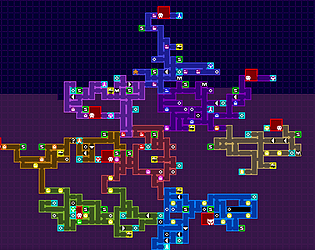
You're right about the first two: the major treasure for the area, and the post-boss treasure.  The remaining four are all locks.

The third one is "ability needed to navigate this area", and it doesn't have any actual implementation on the overall map.  It's more of a suggestion, but it basically boils down to "whatever you got from the previous boss".

The fourth one is "ability needed to access boss", and is responsible for the various locks that lead deeper into an area, particularly those around the area boss.  This one is usually the big treasure in an area, though sometimes it requires you venture into a later area a bit and double back.

Next is "ability needed to access area".  These are the locks in the inter-area passages.  They're the simple ability check before progressing to a new area.

The final one is "ability needed for challenge paths".  Occasionally an area will contain optional one-directional paths, usually with some loot hidden inside them.  They're supposed to be more dangerous technical challenges.  This icon shows which ability you'll need to navigate these paths, which is usually one you'll gain from a later area.

Hope that helps!

I'm surprised there's actually interest in this thing as a practical tool, heh!  I figured folks would at most treat it as an interesting novelty, or maybe look at the result to stir some layout ideas.

What kind of export format do you think would be useful?  An .INI file with each room listed with its position/properties?  Or some sort of delimited string output of the map grid that could be parsed into usable data?

Yeah, I hadn't really considered ways of saving the resulting maps, outside of taking a bunch of screenshots and stitching them together.

A .PNG export shouldn't be too hard.  I'll see what I can do.

That's an interesting thought!

I put in a lot of little tweaks here and there to nudge it towards being platformer-friendly, like squashing the shape to make it more horizontal, or building vertical rooms before horizontal ones.  I suppose if you could disable all those little things then you'd get something that's more top-down neutral, with the passages and gating intact.

I have no idea how well it'd work for top-down, though.  I feel like it wouldn't really resemble a Zelda-style map at least, but it could probably be tweaked into one.

Thank you!

If it can help inspire someone in new ways to make things, then it'll totally make it worth having put this together!

Haha, thank you!  I'm glad to see the whole process visualization is appreciated!

I've got some ideas on how to do the room generation, but I've already had to throw out my first two approaches.  Let's hope the third time's the charm!

Thank you!

Yeah, Metroid is an easier one to go for because it really relies on the powerups/obstacles approach to navigation.  And it's got a really distinctive map style to mimic, heh.

Ultimately I'm hoping to make this useful for both sorts of games.

Thanks!

I was really hoping folks would appreciate the step-by-step explanations!

Whoo, finally beat it!

You managed to get a lot out of those simple mechanics.  The puzzle design was really spot-on; there were some real head-scratchers in there!

Dang, I can tell this was a really ambitious project for such a short timeframe, and it's a shame its potential didn't end up getting realized!  The designs and sense of style and aesthetics are incredible, from the enemies to the dungeon tiles to the crazy-complex skill tree.  And the things like the skill tree and crafting system all gave hints of this grand, involved adventure that was to be.

I enjoyed the little dungeon and boss that you were able to make out of it.  It seems like a solid start, if rough at the edges.

Really adorable game!  The jumping movement was pretty easy to get used to, and the new elements and difficulty progressed really naturally!

Yup, I removed the original download and replaced it with the alternate uncompressed one.  There didn't seem to be much reason to keep a version that only ever caused virus alerts for people.  Aside from that, the only post-jam addition I did was the config/setup program.

 It would be neat to expand on this, to make that Metroidvania I'd originally envisioned!  I'm pretty bad at working on games post-jam, though.  But who knows?

Aaah, thank you so much!  It really means a lot to hear that you noticed and appreciated the little details, even if it's something simple like the camera panning ahead, or the feel of the tools!  Thanks for enjoying it, and for all the comments!

I like this idea; it's really inventive!  I ended up spending more time than I'd have thought just restarting and trying to figure out the best strategy to survive.  I always felt like I was just scraping by, but I was enjoying it nonetheless.

I'm sure with some fine-tuning you could make something really solid out of this!

Really excellent work!  It took me a couple rounds to get a feel for what was going on, but once it clicked it was really enjoyable!  I like how new elements were introduced, both through the player and the enemies, and every stage felt really fairly balanced.

Nicely done!

Very cool!  There was a nice sense of exploration and discovery in just feeling out the world, with what kind of challenges were out there and what you had to tackle them.  And the world and the crafting system were really impressive for the short timeframe.

The only big feedback I can think of would be QoL things, like being able to check what plants you're carrying while out on the field.

Thank you, much appreciated!  Glad to hear you enjoyed it!

I do wish I could have added a song or two, but I don't know the first thing about composing music.

It's a neat little game, though a bit too unforgiving.  I like the idea of having the stages be randomly generated, but it might be working against the game a bit.  The very first stage I got was an unusually tricky one with lots of those slip-through holes, and I was kinda flustered while also figuring out how to play.

The second time the first stage was super-simple, though.  Maybe if there were more way to control the complexity of the generated stages?

Also, I think it would help if the platforms that go up to the edges of the screen would continue on the other side for at least a couple blocks.  Edge-wrapping is already a tricky thing to wrap one's head around without the extra difficulty of a platform that's on one side but not the other.

Anyway, those are just little details.  I enjoyed the game for what it was!

A simple little concept and a fun little game!  The bouncy tune and the way the goat would float off after each stage kept things lighthearted.

Ha, oops.  Yeah, that would have been helpful.

Maybe next time!

Haha, what did I just play

I love the glitchy sort of creepypasta aesthetic.  I'd love to see it developed further.

Sorry about the vines!  If I had had more time, I would have figured out a way to make them more fair, but I was really crunched at the end.

For the diamonds, in levels 2 and 3 there are these animated tufts of grass, and if you plant a seed on them an item will pop out.  This is never explicitly required, and left to the player to discover.  I think these would be the ones you're missing.

For level 1, I'm not sure which one you're missing.  There's one in a flower bulb right at the start that's easy to miss on the first pass, since you have to backtrack after getting the shears, and if you prune too much at one point then you can't jump the wall to get back.  It's just a guess, though.

Anyway, thanks for playing!

As the current holder of the "Least Rated Game" title, I feel like I gotta remind folks that the jam is far from over, and it's time to play and rate those games!  Karma's a good system to see who's giving back, but don't forget to check the "Submissions in need of ratings" link to make sure all these games get some love!

Also, it looks like most of the games in need of help are those without a "play in browser" option, so please don't be shy about playing some download-only games!  I know it's an extra step, but people have put a lot of work into these things, and they all deserve a chance to be played and rated!

I really like the concept and the presentation, but I wasn't sure if the two parts of the game affect each other?  I had plants I was able to Frankenstein together, and I had ingredients to make brews, but did the plants I made provide me with these ingredients, or was that something that hadn't been implemented yet?

In any case, nicely done!

Nice game!  The dual-world mechanic made for some nice platforming challenges, and I like the use of the palette changes to signify between the present and the future.

I ended up mostly feeling my way through the game without a good sense of where I was, but I managed to shut off the light and water and escape, so it all worked out well enough.

It's a neat little proof of concept.  I would have liked to see it developed into more of a game, but I totally understand what deadlines can do to the best of plans.

It's always neat to see how a platformer with no jumping can deal with the actual platforming.  I liked it!

Also, that tune is catchy as heck!

It's a neat idea!  I would have liked to see the puzzles get a bit more complex, but I enjoyed what was there.

For anyone having trouble planting the first bomb: stand NEXT to the indicator and press the button, not ON it.

Haha, thanks!  Glad you got to appreciate the payoff at the end!

I was actually planning to make it a Metroidvania, but the deadline crept up pretty fast, so I ended up just making what I could out of it.

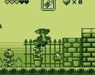
Very charming; the character and tile graphics all look very faithful to the Game Boy.

The game itself is pretty simple, but it doesn't look like there's anything stopping the player from just going off the top or bottom and avoiding all the spiky bits.  And do you ever reach the part in the last screenshot, or was that something cut from development?

Cute and simple.  I like it!

And bonus points for raccoon use!

Thanks!  Glad you liked the mechanics!

You may be right on the gravity; I ended up upping the framerate/game timing midway through development, so I might have forgot to readjust how jumping/gravity feels.  Hopefully it's still passable!

And yeah, Windows Defender has been false-flagging anything made in Clickteam Fusion lately.  I'll probably just remove the first file, since the uncompressed one seems to fare better with that.

With the silly presentation, I definitely wasn't expecting the game to get so dire and challenging by the end.  Nicely done!

Thanks a bunch!  Glad you like it, and to hear that it plays well enough!

I did notice the corner collisions, but it was a bug I couldn't figure out how to deal with in time.  At least it's relatively minor, though.

Personally, I thought up and down worked fine for the ball, but a friend suggested including a button for it as well.  If the ball button gets in the way, though, you could just re-map it somewhere else.  I'm finding there's a lot of different preferences for how a mechanic like this should be controlled.  It's pretty interesting to learn!

Thanks again!

Thanks much for including my game in your article and video!  I really appreciate it!

Really nice graphics and feel.  And a faithful follow-up to one of the most notorious video game flops of all time.

I went into the game with knowledge of the cube-shaped world, so I was able to keep track of things just by heading into each screen, finding the cartridge, then backtracking to the start.

I also found out about the the infinite-spawning candy feature, but noticed that the candy will stick around even if you don't collect it.  So you can hop in and out of a hole until 10 candies have piled up, then grab 'em all at once.

I also made use of the head extension on the back face of the cube, where you could put your head over the bottom walls of the rock maze.  Otherwise, it would have been nice for the head-extending to actual mean something.

Anyway, the game is pretty good for where it's at.

Ahh, thank you!  Glad you enjoyed it!  And yeah, there's definitely Yoshi's Island inspiration in the art style.

(1 edit)

Hot dang, this is very professionally done!  Nice job taking one of the oldest game concepts and spicing it up.  The character portraits and customized moves really add a lot.  I'd imagine if you could get it fairly balanced as multiplayer thing, you could have some good potential on your hands, though the Launch Ball ability would be a tough one to beat.

There's only the three opponents right now, yeah?  The first time I played through, I was half paying attention after I beat the third one and was afraid I'd accidentally hit Quit when it sent me back to the title screen, so I ended up playing through it again to be sure.  It ends a little abruptly right now, but at least what's there is really solid.

This game has a really wonderful feel to it.  It's got a lot of heart, and you can really feel the weight of the protagonist's problem, how when there's something indescribably wrong with an aspect of your life that you take for granted, it can feel so... crushing.  And Sam really comes off as a supportive friend.  Stepping into the protagonist's role, I appreciated that.

The only real problems I had were occasional vagueness in what to do, but I was typically able to figure things out.  Still, I wouldn't have guessed that the laptop belonged on the guest room bed when tidying up.  That one really threw me for the longest time.

Also, the adherence to the theme is pretty thin, but that's about it.

It was a really nice game, a touching little story.

Also, more freaky hallucination scenes, please!