Play game
Mode Maker's itch.io pageResults
| Criteria | Rank | Score* | Raw Score |
| Presentation (graphics, audio) | #209 | 3.245 | 3.700 |
| Originality | #220 | 3.157 | 3.600 |
| Theme | #238 | 3.070 | 3.500 |
| Fun | #402 | 1.930 | 2.200 |
Ranked from 10 ratings. Score is adjusted from raw score by the median number of ratings per game in the jam.
How does your game represent Mode?
Mode as the mathematical term of the most often appearing number in a particular set
Leave a comment
Log in with itch.io to leave a comment.


Comments
Pretty clever use of the theme. I liked the aesthetic and the funny numbers running around. Music is a bop.
thanks!
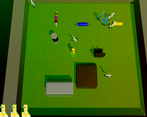
really dig the visuals on this, very windows xp. i thought using shadows to provide some clarity when the numbers were running around was pretty nifty, nice job on that
Thank you!
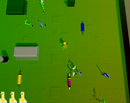
i thought the things in the bottom left corner were lives, or how many times you can accidentally shoot your assigned number. but it's just ammo, which i feel you should mention in your "how to" section.
i do like that you have limited ammo because that forces you to strategically decide which numbers to shoot. it prevents the game from just being "shoot the numbers you're not assigned." but that does require you to count the other numbers, which might be tricky since they're always moving (or maybe that's part of the challenge).
i don't know if this is just a web build issue or something, but your assigned number goes into the bottom right corner *too* much and goes out of the screen when the level starts. regardless i think there should be a reminder of what your assigned number is because sometimes i just forget instantly lol.
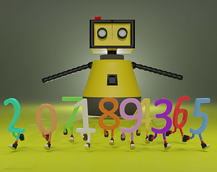
overall it's got a lot of potential. the cover image reminds me of those cgi animations of robots demonstrating sorting algorithms :)
Thank you! Yes we had some problems with the ui and resolution, thats why it sometimes goes too far.
I love the contrast between the interface and the game, its so funny and charming also really good sounds.
Congrats!
Thanks!
The contrast between the interface and the game is surprinsingly big the game looks so good while playing, the dithered aesthetic to it matches the vibe so perfetly, and the gameplay is decent on itself allthough its the artstyle that really caught my eye. Good job dude, nailed it!
Thank you!