


Play game
People's Committee of Game Development's itch.io pageResults
| Criteria | Rank | Score* | Raw Score |
| VISUALS | #42 | 1.934 | 1.934 |
| SOUNDS AND MUSIC | #49 | 1.715 | 1.715 |
| INNOVATION | #52 | 1.737 | 1.737 |
| THEME | #66 | 1.847 | 1.847 |
| OVERALL | #67 | 1.730 | 1.730 |
| THE EXPERIENCE | #71 | 1.664 | 1.664 |
Ranked from 137 ratings. Score is adjusted from raw score by the median number of ratings per game in the jam.
Leave a comment
Log in with itch.io to leave a comment.
Comments
I love the idea of this game, it was pretty fun! The art was really good too!
Nice idea and great the art!
Also the sound design is nice. Had fun playing this game! Thanks!
This game made laugh with your options to build your setup XD
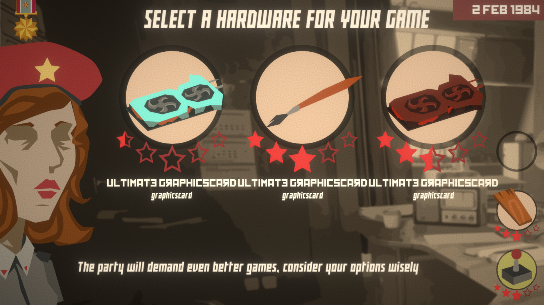
Now I want my computer with sovietic graphic card and axe controller!
Your art style is awesome! The gameplay was simple, but I enjoyed it! The humor of this game reminded me of Papers Please, I don't know if you were inspired by it, but it turned out great! And the music really fit in this game!
Thanks a lot, the characters in papers please, and their colour palette was kind of an inspiration for us. :)
The best art I've seen in a jam so far. Vodka instead of graphics card? Hell yes! This is probably what it wold be like making games it the USSR. Great job!
p. s. Почему Василий Лебедев доска? XD
Thank you, we worked hard for getting the art-style.
And yeah what you discovered with Василий is a bug that needs some ironing :) Maybe in a post-jam version though!
Love the art style! The music was fun! Just had a little trouble reading the yellow text sometimes. It blended in too much with the background.
Thanks a lot. Yea I think, we should have added an outline, or a shadow for the text. :)