Play 2D Platformer
Oh, I've seen this one!'s itch.io pageResults
| Criteria | Rank | Score* | Raw Score |
| VISUALS | #246 | 3.689 | 3.889 |
| INNOVATION | #289 | 3.162 | 3.333 |
| DESIGN | #346 | 3.162 | 3.333 |
| OVERALL | #446 | 3.057 | 3.222 |
| SOUNDS | #457 | 2.635 | 2.778 |
| THEME | #482 | 2.846 | 3.000 |
| MUSIC | #498 | 2.530 | 2.667 |
Ranked from 9 ratings. Score is adjusted from raw score by the median number of ratings per game in the jam.
Leave a comment
Log in with itch.io to leave a comment.


Comments
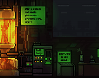
This was a fun concept. The level's background had great detail, as did the sprites and animations. Hitboxes/collision was a bit funky for me, with both spikes and the enemy. The music fit the theme well. I had an issue where the dialogue was moved just outside of where it should have been, which meant that I couldn't read all of it. Overall, great work!
Amazing visuals and really cool sound and animation! Nice job
Thank you very much :D And cool stream btw ^^
great idea for a game! i loved it! a couple of things that i didn't like was the enemy hit collision, it was bad, felt like i had to hit him in a very specific spot on his head. the spikes as well, their collision was a a pain in the butt ( no pun intended) like i was just a few pixel away from them an bam im dead, otherwise great game, i can see this expanded and made better
Wow, thank you so much! Means really much to me to hear that :D Yeah, the hit collision is a bit whacky, that’s DEFINITELY something that I‘ll consider next time. But thank you very very much ^^
Hey, I tried to play your game but I can't. I think that it is caused because I am using a 21:9 screen and some button is not visible. Do you know any way to fix it? Here is a screenshot of what I can see. Thank you.
Yeah, you‘re right, it’s probably because of your aspect ratio, I‘m super sorry for that :I So I don‘t know what screen you‘re using, but maybe there‘s an option to shrink the image down to 16:9 in the Windows Settings? Of course it’s kinda my fault and I‘ll DEFINETIVELY consider that next time, but maybe this could help.
I like the concept of using the same level and stuff, but the music got really repetitive and i sometimes wouldnt notice a platform was there since it blended in pretty well with the background. Controls felt solid. Good job dude!
Thank you so much for your feedback! :D Definetively things that I‘ll consider next time ^^ There was actually even much more music planned, but the timeframe was just too small.
Good game, controls are responsive, and the chunky pixels remind me of the C64 games I used to play.
Hey, thank you very much :D Yeah, I actually tried to catch this exact style with things like the scanlines over the screen :)
how do i run this game? the rar file says it needs other files to run.
That‘s weird... Just make sure you don’t move any files out of the folder, then try running the file called „Oh, I‘ve seen this one!“. If this doesn’t work, try downloading the game again ^^