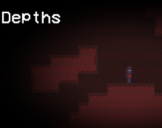
Play Depths
Depths's itch.io pageResults
Criteria | Rank | Score* | Raw Score |
Audio | #511 | 2.345 | 3.222 |
Theme | #523 | 2.749 | 3.778 |
Overall | #580 | 2.331 | 3.204 |
Graphics | #584 | 2.425 | 3.333 |
Fun | #588 | 2.183 | 3.000 |
Innovation | #590 | 2.102 | 2.889 |
Game Design | #604 | 2.183 | 3.000 |
Ranked from 9 ratings. Score is adjusted from raw score by the median number of ratings per game in the jam.
How does your game fit the theme?
You have to go deeper in the hole to get out
Did you write all the code and made all the assets from scratch?
Yup! Very poorly drawn bugs are there!
Leave a comment
Log in with itch.io to leave a comment.
Comments
Nice game with interesting mechanics and
Things to improve: It would be nice if the game was more generous with giving bullets (or there was some difficulty setting). There should be some indicator that E is the interaction button, because I had no idea. And please make the jump sound little quieter in comparison to background noises. And maybe make quick respawn, since at the beginning I died a lot and I had to go though the menu and skipping dialogue before getting back to gameplay. A
Overall, game well done!
I was planning to do ALL of the things you listed here, but due to time constraints i couldn't lol T_T, but thx for the suggestions(sorry for late response been a bit busy with life)!
Pretty nice atmosphere.
Nice art style. Sound effects are amazing and the gameplay is interesting and entertaining. Nice game overall. Underrated submission.
Please consider rating our game, It would really help us. Thanks!
Nice game. I would like more colors and brightness. Good sound effects
more of a tutorial would really help. also the player movement is a bit wack
I was thinking about adding a tutorial but all it is is just moving and shooting. So there wasn’t really a need. I was just gonna put the controls in the desc but i kinda forgot- but good suggestion, also the movement is bad bc i was playing it on opera instead of google
Funny thing, opera runs at a WAYY slower pace than google. And i kinda just thought that was my game fir a bit- and when i found out google runs construct better, it was already the last day and i didn’t really have time to mess around with the movement at that point(it was 1am when i found it out). Thx for the feedback tho!
i was playing the game on opera
well i unno, ran worse for me in the editor, probably something wrong with opera for me on my end
Very cool and challenging design, One thing I'd point out would be how slow it is to respawn and get back up playing again. Good job!
thx! Yeah, it is pretty slow to get going, i should definitely make it a but quicker