Play game
TetroFighter's itch.io pageResults
| Criteria | Rank | Score* | Raw Score |
| Innovation | #254 | 3.522 | 3.522 |
| Game Design | #257 | 3.609 | 3.609 |
| Theme | #359 | 3.652 | 3.652 |
| Fun | #362 | 3.435 | 3.435 |
| Overall | #461 | 3.341 | 3.341 |
| Audio | #748 | 2.826 | 2.826 |
| Graphics | #799 | 3.000 | 3.000 |
Ranked from 23 ratings. Score is adjusted from raw score by the median number of ratings per game in the jam.
In what way does your game fit the theme?
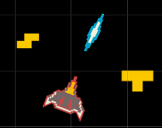
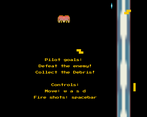
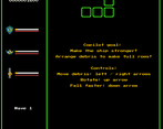
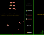
Two player co-op Space Tetris Shooter. One player must defeat the enemies and collect the debris, and the other must puzzle out the debris to power-up the ship. Through teamwork can you win the game.
Did you write all the code yourself and made all the assets from scratch?
90% of the code was written by me, with the Tetris component was made by following a tutorial (https://noobtuts.com/unity/2d-tetris-game). Modifications were made to improve controllers and to fix bugs. Utilize the book "Unity in Action" for guidance during development.
Leave a comment
Log in with itch.io to leave a comment.


Comments
Very fun game to play. I played it on my own and didn't realize it was a coop game lol, so it was more like multi-tastsking the game. Really nice art and sprites. The game lacks music tho. Would love if you could rate my game!
I know this game is meant to be played with two people but I played it solo instead
The sprites contain a lot of mixels (mixing of different pixel art resolutions)
Source: https://twitter.com/trainguy9512/status/1179184303776899074 (It’s for Minecraft but it applies to all pixel art) Also, I just want to note that mixels aren’t always bad. This link might be helpful for some more info on that
The sprites are a bit blurry. I don’t have much experience with Unity but this video might be helpful
Good use of complementary colors (orange and blue) but I’m not a fan of the colors themselves (i.e. their saturation and lightness values). I’d recommend using a pre-made palette from a site like lospec
It could do with some music since the game is very quiet and has no passive audio (i.e. audio that is played without the player needing to do anything). There’s some aural feedback (when the player shoots and hits something) which is good but I think there could be more. As far as I can tell, there are no sound effects for the copilot (Tetris component). Perhaps something subtle like a SFX when the player rotates a piece or it hits the ground?
The text is rendered after the player, Tetris pieces, and the game over UI which looks a bit weird. I think it should appear below them
I’m assuming this is a bug but sometimes the second wave doesn’t start: https://gyazo.com/95e6738e44955661513a7aa12d042e73
The game over popup scared me a little bit - it’s quite sudden. A fade-in, slide-in, or scale-up transition might fix this. You might also want to look into easing functions
The game over popup also doesn’t look good visually. The gray background clashes with the rest of the art which makes it have contrast which is good to some degree but in this case it’s off-putting. A cohesive color palette would definitely help with this
Similarly, the green lines are also quite jarring. They’re good at separating sections of the UI (otherwise I feel like it would be quite cluttered) but I think they should be more subtle. Currently they have a ton of contrast with the black background and it’s the first thing I see when the game loads instead of what is most important - the player
On that note, I’d say the player’s sprite needs to stand out more. This is usually done by reserving a few colors that are exclusively used for the player or just using a new color palette entirely. I didn’t experience this myself but I feel like you could lose focus of the player since it doesn’t stand out
Some of the green lines also seem a bit unnecessary. It’s possible it was intentional but I don’t understand the reason behind the ones I’ve circled in red. I also don’t understand the blue one but it also has another issue - it’s thicker than the other ones
You’re already aware of this being a problem but a restart button would be nice
I don’t understand how enemies shoot. I can be standing right in front of an enemy for 10 seconds and no attempt at killing me will have been made. This makes the game incredibly easy. I’m assuming this is a bug though. Edit: This seems to be specific to wave 1 but it’s still confusing. I’d suggest changing up the enemy sprites to something like a target dummy so that it is obvious that this is just a “tutorial wave”
There isn’t much visual feedback. For example, when a bullet hits an enemy nothing happens (aside from it disappearing). I would suggest adding particle effects and maybe an enemy death explosion effect. When the bullet hits the top of the screen it also just disappears. I think it would be better to allow the bullet to move past the screen and then just remove it completely when the player can no longer see it
The Tetris pieces don’t use pixel art which feels a bit off. I think the style should be consistent
I also think it’s weird how the pieces are green (especially since that’s the same color used for the separating lines)
The UI is quite confusing. Usually I would recommend a tutorial but you’ve done a good job by displaying a basic guide on screen during the first wave. I’d recommend removing some of the unneeded abilities until they are taught in game such as the laser and the special gauge. The game itself isn’t that confusing though since both Space Invaders and Tetris are pretty much familiar to everyone
In wave 2 (and some of the other waves) the enemies aren’t perfectly aligned. This is incredibly minor but it bothers me a little bit lol
It’s not clear how much damage enemies do. Sometimes they do 4 damage but sometimes they do 3. I think it should be consistent/predictable
When you lose the game the last set of hearts and the player remains. I would suggest removing the player sprite, adding an explosion, and then transitioning to the game over page
Having both shields and health seems a bit unnecessary since they serve virtually the same purpose - giving the player another shot. Since the player isn’t alive (they’re a space ship) I’d recommend removing the health and just keeping the shield to reduce UI clutter
It’s not very clear when the player takes damage. The aural feedback definitely helps but I think it would be good to have them flash white too
If you stand on top of an enemy you don’t continuously take damage. If you fix this I’d also recommend adding invincibility frames so the damage isn’t just relentless suffering
The enemy hurt SFX is much louder than the other SFX. I’d recommend keeping the audio roughly the same. However, it depends on how important the audio is. For example, the player hurt SFX should grab the player’s attention more than an enemy hurt SFX should
The SFX is sort of difficult to listen to. I ended up just muting the game after a point. Making them quieter would help but I feel like the SFX itself just isn’t that great. I’m not that knowledgeable about sound design so I can’t really help in that regard though. Perhaps making it “softer” would help?
When the next wave starts the player’s speed gets snapped to 0 which breaks immersion
The Tetris component feels like it should be more important. Since I’m playing solo my first long playthrough was completely as the pilot and I found it easy enough. I managed to get to wave 10 (score of 16500) without much difficulty
I feel like you should think more about what is important to the game. Adding new mechanics that aren’t that important may be forgotten about by the player. For example, my first few runs didn’t involve the laser at all
I wouldn’t suggest adding “Sorry I didn’t make this part easy :(” to the game over screen since it makes the screen quite cluttered (especially since the gap between it and the line above it is quite small). I think things like that should be added to the itch.io page under a header like “Planned features” or “Known issues”
The laser doesn’t mix well with the enemy warning popup. It darkens it slightly which looks a bit weird. The green lines are also rendered on top of it which looks odd (I feel like this might also be an issue with the normal bullets but since they are moving you can’t really tell)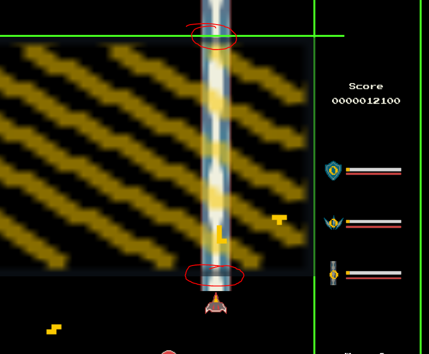
The laser is much bigger than the player’s sprite which looks weird. I think it should be narrower. The laser sprite also has the same issues as the other sprites but like with the warning popup, its size makes it more noticeable. The sprite also looks stretched vertically which doesn’t look right. The laser also doesn’t really look like a laser. I only really know it’s a laser because of the text that refers to it as such
I think the laser should appear more gradually. I can’t really give much guidance on how to do that in Unity but I’m sure there are good tutorials for it online (maybe this?)
The score is quite hard to read. Personally, I would make the ‘0’s at the start appear a bit darker (more faded into the background) so your eyes are more drawn to the score itself (see the second image, it’s quite rough but it should get the idea across). You could also do the same for the score display in the game over UI
I think the Tetris component is too easy and I’m sure it would be even easier if you had a person playing who’s sole job is to do that. What makes Tetris difficult is that it gets faster. But in this game - it doesn’t, since the number of pieces depends on how many the Pilot picks up. And you can also choose which pieces get picked up
I think there should be some visual feedback when a Tetris row is completed. A dissolving effect could be cool but I’d suggest looking at other Tetris games to see what they do
I don’t understand what the “Queue Speed” bar does
When you hit the top of the Tetris grid you are met with a cooldown which I don’t really like. I think it also resets the bonuses gained from the Tetris component which I think is a good punishment. However, I feel like the cooldown doesn’t really serve much of point since it more or less punishes the copilot by just not letting them play
On my best run, I managed to get to wave 12 with a score of 27420. I think I would have been able to get a bit further but I ran into the bug where the next wave doesn’t load. I think I could also get much faster if I could better utilise the Tetris component (I am playing solo after all)
Overall, it’s quite good! It’s certainly not a masterpiece or anything and it does have a lot of issues but I enjoyed playing it and that’s pretty much the most important thing. The idea of combining two games like this is quite innovative and definitely fits the theme very well in a way I haven’t seen before this jam. If there are any questions you have or anything you want me to critique or clarify on specifically, then don’t hesitate to let me know! Since I was playing on my own I mostly focused on the pilot so I didn’t really get to see much of what the Tetris component has to offer. I also didn’t get the chance to use the special gauge mechanic. I’m not sure how many waves it has (or if it’s infinite) but I’d love to see what the last wave looks like if there is one
Wow, I really appreciate the time you've put into your feedback.
A lot of the issues pointed out and suggestions made in regards to sprites I'll definitely be checking out after making improvements to the game design and some bug fixing (thanks for all the references and tutorials supplied!)
Actually I ended up using this palette I saw in Asperite: https://lospec.com/palette-list/matriax8c
My goal was to use something with a small selection of colors, as too many options tends to keep me second guessing myself. Plus being color blind, I found that the shades presented helped in distinguishing between the colors. That does NOT excuse me from properly using the colors in my pixel art, and will be something I'll be working on. I did forget to change up the color for the Tetris side and the borders, as both came from a tutorial I relied on for that portion of the game.
Audio was definitely neglected when making this game for the game jam. It was intentionally prioritized last and suffered due to scope creep and time (mis)management. Ironically I find audio cues important in gaming, especially when it comes to applying feedback to the player. Going to learn more on how to properly apply audio in Unity and how to manage it (e.g., volume balancing as you mentioned elsewhere).
Uff, sucks you encountered a bug with waves not starting. I'll see if I can reproduce those bugs in the waves you experienced them (wave 1 and wave 12). I also got an idea on how to better determine when a wave has been cleared.
Really good point. Since the hearts can't regenerate, I was actually thinking of moving that in the UI and use lives counter instead tucked into a corner (e.g., player has 8 lives). So now when shield is depleted and the ship gets hit, ship explodes, decrement a life, respawn with a moment of invulnerability, and continue play. I think it would also add to the allusion of classic arcade games.
Right now I think it's a level and enemy design issue. I need to do more playtesting to tailor the levels for the pilot to really rely on the copilot/Tetris player to provide shield regeneration and power-ups. For enemy design, the grunts (the enemies you see in the first few waves) actually start their shooting interval at a random time, in hopes of introducing some pattern variants for the pilot to deal it. However, as you mentioned elsewhere, that can actually make some of the levels extremely easy since you might not be shot at for a bit, so it's something I'm aiming to remediate (such as shooting more immediately at the start of a wave). Ideally the Wave 12 bugged wouldn't have occurred so you could have seen the later level designs and an introduction to a third enemy type.
This is another thing I want to see if better level/enemy design would help mitigate. I think with added pressure, besides relying on the copilot for shield and upgrades, exercising all of their attacking options will be important too, such as the laser and (later on) their special.
I agree with most everything here in regards to making it faster. It didn't have the effect I expected by coupling the speed with the number of pieces picked up by the pilot. That can easily be tweaked to increase the speed gained, but I think I'm going to toy around with tying speed to wave progression (e.g., wave 30 is gonna be a lot faster than wave 1). Ideally with the increased pressure, there would also be more communication on what the pieces the pilot should be picking up next.
I'm going to think on this, see if there's something I can try out so the copilot wouldn't just staring at their screen. You're correct in that the bonuses can go down in level, but that's tied more to a decay rate that's happening in the background. The cooldown is meant to serve as a penalty by preventing shield regeneration and to let the decay rate run unopposed, as clearing lines is meant to keep bonuses from decaying. (I'm actually considering removing that decay mechanic, but that's another conversation for now).
I really appreciate it, this means a lot. I've always wanted to make an asymmetric co-op game, and figured with the theme this was my chance try it out. Plus I now have some references and tutorials I can work on to improve my development beyond my first game.
Again, thanks a ton for putting in the time and effort on providing me your feedback.
No problem :) Glad you found it helpful
I love the art sytle, so retro and computer-like, well done!
Overall its a very creative game, great work! :)
very fun game, love its style. Plz rate mine
loved this concept, quit difficult to play alone ^^
The most creative idea I've seen so far. Way go blend to classics together and make it incredibly fun in the processes!
You have an interesting idea!
It keeps crashing for me !
I dont have any friend, so I had to play alone, and it is too hard...
This is so cool! Good job! You can rate my game if you want : )
This is such a cool idea I love it!