Play game
Heart Attack [Brackeys Game Jam 2021.2]'s itch.io pageResults
| Criteria | Rank | Score* | Raw Score |
| Game Design | #284 | 3.481 | 3.481 |
| Innovation | #391 | 3.222 | 3.222 |
| Fun | #402 | 3.296 | 3.296 |
| Overall | #493 | 3.179 | 3.179 |
| Graphics | #544 | 3.296 | 3.296 |
| Audio | #625 | 2.852 | 2.852 |
| Theme | #717 | 2.926 | 2.926 |
Ranked from 27 ratings. Score is adjusted from raw score by the median number of ratings per game in the jam.
In what way does your game fit the theme?
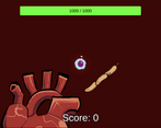
Large quantities of Bacteria and Viruses are invading the body to attack the heart, which creates chaos as you move around the heart between groups of enemies to try and control the infection, you also have limited visibility of the map and no clear indicator of where the next group of enemies may come from.
Did you write all the code yourself and made all the assets from scratch?
I wrote all the code, my teammate made all the art, and we used royalty free music and sounds with correct attribution.
Leave a comment
Log in with itch.io to leave a comment.


Comments
It's really cool game, first 4 round was easy but then it began to become more and more difficult. I like art style and gameplay.
Limited vision makes the player tense although it will be cool if there was minimap.
Your game is great and i really enjoyed it. :)
Sorry for multiple comments, my browser lagged
Thank you so much! The limited vision is part of what we tried to do to give our game a chaotic feeling, by not being able to see the enemies easily, but we do agree that some form of notice would improve the game. We intend to instead add spawning warnings, showing where the next group of enemies are coming from in a post-jam update, which hopefully should help!
I will definitely play your updated game after the voting is over! ;)
The game plays a little slow. Cool design and very innovative
Thank you! The game feeling a bit slow is a good piece of feedback, do you think making the map a bit larger and everything a bit faster would help with the pace?
Maybe increase the field of view but leave the map the same size
I had a great time playing the game and the power up system is great. the only complains are probably the ones Virtual space alredy noticed.
I enjoyed the game although I found it frustrating that I couldn't see the whole play area. Another annoyance of mine was that you have to press enter to start a new round.
I love the concept and the art was great! Good job both of you!
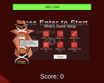
Thank you! Having the player hit enter was designed so that you have time to go to the shop in between rounds and choose what upgrades you want, but maybe a short timer would’ve been a better way to do this. The limited visibility is meant to help with the theme of chaos, but having some indicator of where enemies are coming with would probably help make things a bit clearer, we’ll add this in a post-jam update!
What I meant by you have to press enter is that you need to move your hand a long way before changing round. I would recommend the space bar or something closer so you don't have to take your hand off anything. sorry for the confusion