Play game
BOY R GIV's itch.io pageResults
| Criteria | Rank | Score* | Raw Score |
| Innovation | #1235 | 1.919 | 2.714 |
| Audio | #1247 | 1.717 | 2.429 |
| Theme | #1266 | 1.919 | 2.714 |
| Overall | #1334 | 1.818 | 2.571 |
| Fun | #1344 | 1.818 | 2.571 |
| Graphics | #1381 | 1.818 | 2.571 |
| Game Design | #1427 | 1.717 | 2.429 |
Ranked from 7 ratings. Score is adjusted from raw score by the median number of ratings per game in the jam.
How does you game fit the theme?
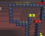
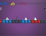
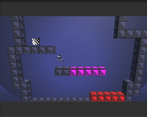
The multicolored platforms the player can use aren't really so- they are controlled by the UI.
Did you write all the code and made all the assets from scratch?
Yes- including art, code, sfx and music made by https://oldskoolepitaph.itch.io/ as this was our team submission.
Leave a comment
Log in with itch.io to leave a comment.


Comments
Great graphic, more sound effects would be nice.
The game has great concept but the gameplay do need some work. Jumping is the core of platformer and it really need some improvement.
Neat idea, but the game really fell apart and didnt work from the beginning, jump physics were really painful and way too floaty and buggy. I died atleast 5 times from just clipping through the floor and walls
The game was a bit buggy, had fun
I think this is a very innovative concept. I've never played a platformer like this. Moving by color really changes the rhythm and how I would move.
I rated and enjoyed your game. Hope you can rate mine as well.
From one of the Devs.
@fusionic
Thanks! We'll try yours out ASAP.
@Pixel Myth Studios
Thanks for your in-depth critique!
I look forward to seeing more from you and the community as a whole, in coming together to make all our projects a little better each step of the way!
It's really awesome seeing guys who appreciate the aesthetics of the classic pixel and sprite days taking a look at our projects.
Nice game rated it, pls check out my game also if you don't mind - https://itch.io/jam/brackeys-7/rate/1418152
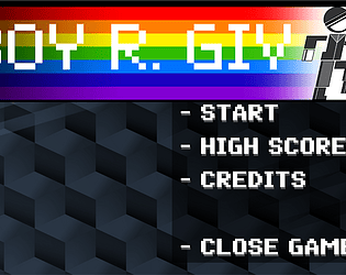
A really neat concept! It was fun having to time my jumps just right in order to avoid touching the wrong cubes. I also enjoyed the mixture of the 3D platforming space with the 2D player sprite. I think the biggest thing holding it back is the physics/collision systems. The jump felt kind of wonky, sliding on the walls often pushed me in an unpredictable direction, and it was often hard to tell if I was going to collide with a block or wrongly colored tile. The UI could also use a little sprucing up too (maybe use a pixelated font like you did for the start menu). But otherwise, I enjoyed the graphics, the use of multiple music tracks, and the concept overall.