Play CPU TAKEOVER
CPU TAKEOVER's itch.io pageResults
| Criteria | Rank | Score* | Raw Score |
| THEME | #121 | 3.174 | 3.286 |
| AUDIO | #123 | 3.174 | 3.286 |
| VISUALS | #165 | 3.174 | 3.286 |
| OVERALL | #203 | 2.760 | 2.857 |
| CREATIVE | #230 | 2.484 | 2.571 |
| EASY TO GET INTO | #249 | 2.484 | 2.571 |
| FUN | #272 | 1.932 | 2.000 |
Ranked from 7 ratings. Score is adjusted from raw score by the median number of ratings per game in the jam.
Do you have any bullet or projectile in your game?
Yes
You added some projectile or bullet in your game
How does your game implement the theme? (If your game doesn't use the theme ignore this field)
There are more enemies and patterns as waves of 10 seconds
What was the size of your team?
4 people
Credit all team-members that worked on this project (you can link itch.io/twitter/youtube/twitch)
https://gamedevtecnico.itch.io
https://jojodapen.itch.io/
https://catralitos.itch.io/
https://nalurianne.itch.io/
Leave a comment
Log in with itch.io to leave a comment.




Comments
There is some promise here :)
Looks and sounds really good supports joypad !
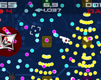
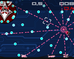
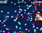
The background of the playfield should be much lighter or much darker so that there is good contrast with the bullets.
For easy dodging, you should make the hitpoint of the player visible as a center dot in the middle.
For the explosion, use zoom in zoom out and fading to make them pop :)
I like the unique art style and the bullet patterns ;) As mentioned before the keyboard and mouse controls don't work well, which makes it frustrating sometimes.
Really liked the drawings and the settings/theme. Also the song was very good, but the audio broke at some point unfortunately. Maybe the enemies should be less static. Overall, well made mate :)
Outside of a few technical issues, a solid game with a good challenge.
PROS:
CRITIQUE:
I tested mostly on a controller, should have done mouse and keyboard more. I think holding down the fire button screws with reading the aim input. Cause I think if you don't hold down the fire button, you can aim just fine. But still thank you for the feedback, I'm glad you enjoyed the game.