Come on, share what you've made so far! Here's mine. It's using textmode.
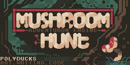
I haven't given any thought to the title screen and I've only got placeholder images for the other ones. I think it's okay to use free assets, providing you credit them. I've added an ABOUT command for this, but the text is currently empty. I'll probably use a third-party font if I can find one I like.
Chris, is it okay to change the title? I thought it had to be "The Cave of Magic".
I loosened the rules to allow a different titles (prior to the competition starting).
I do like "The Cave of Magic: xxxx", but all entries will be tagged, so you have the freedom to name your own entry as you see fit as long as you associate it with the base game and the jam.
I haven't loosened the rules since Friday, and I won't loosen them any more, there has to be some minimum spec and structure to entries.
Just a minor point about graphics. Make sure you determine the position of the sun and do your shading and highlighting consistently in all rooms. Assuming your images are all facing north, if your game is set in the morning, the highlights are on the right and the shading is on the left. In the afternoon, it's the other way around. (Sun rises in the east and sets in the west.) If you're in a cave, the shading and highlights depend on the position of your light source.
Of course not. I just thought I'd mention it for anyone that's using third-party graphics. It gives a feeling of professionalism that most users wouldn't even notice. If your graphics are reasonably symmetrical, all you do is flip the picture horizontally in your favourite graphics editor. Otherwise, you just switch the highlight and shadow colours. It's a little bit tedious, but very easy when using pixelated graphics.
Looking very nice. There appears to be a bit of a bug in the text rendering these days, where the second line of a game seems to be slightly indented. I'm not sure if this is a browser issue or an Adventuron issue, but I didn't change anything about the renderer, and it only seems to happen on certain versions of Chrome. I'll investigate and see if I can issue an update before everyone finally compiles.
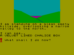
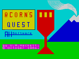
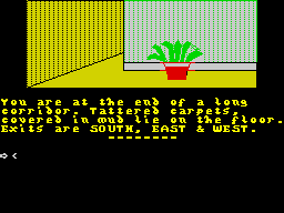
Just wanted to add a post here to reassure entrants that are not particularly skillful artists, that games using a basic style are very welcome and to remind everyone of the standard of graphic that was very common 30 years ago.
There is of course a lot of magnificent artwork from the time, but I wanted to highlight how even perfunctory artwork can work well with text.
(Screenshots from https://spectrumcomputing.co.uk )
Acorns Quest by AH Software
Castle Eerie by Tartan Software
Forest At World's End by Interceptor Software
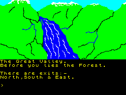
Kingdom of Kull by ZX Computing
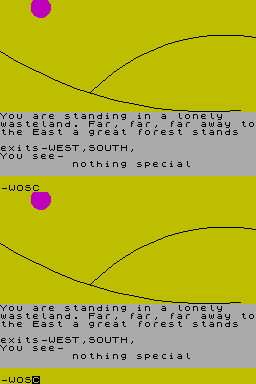
.... anyway, the purpose of this post is to highlight that even though we have some great artist in the jam, that even if you are not a great artists, by going abstract, you can still add something that makes a game a little bit more unique feeling.
Recommended tool for Spectrum style art : Multipaint
That screen is so beautiful. So so beautiful. That said, there appears to be some scaling artifacts in the game. Adventuron should never naturally render blurry fonts (notice the double thick line at the top of the E), so I wonder if you zoomed in with your browser?
Certainly before you release you'll need to confirm that the fonts are rendering properly.
And the image looks slightly blurry too, which again might be a browser zoom as I assume your core image is a lossless blocky PNG.
Forget all that though - this is BEAUTIFUL.
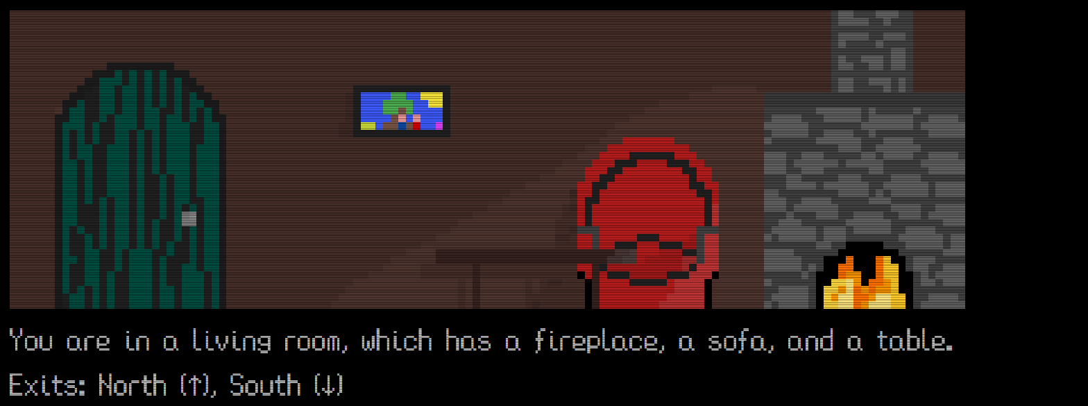 If it isn't obvious, I've never so much as touched art in my life. I hope this style isn't enough to push people away from the game! I'll have all the lighting and stuff fixed up before the end hopefully, but I wanted to get something out so I can see if it's at least alright-ish looking. So many people have such great art here!