
All things accessibility! If you have any ideas you want to share regarding how to make card games more accessible — size considerations, text requirements, graphic design, coloration, iconography, language, etc. — share it here! I really want to prioritize making games open to as many people to enjoy as possible.
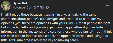
I'll start by sharing these great layout tips I was given permission to borrow from Dylan Kirk over on the Facebook group Art & Graphic Design for Tabletop Games. I found them incredibly insightful on what to keep in mind with how designs translate to physical objects that are then handled and moved, and how to account for that.
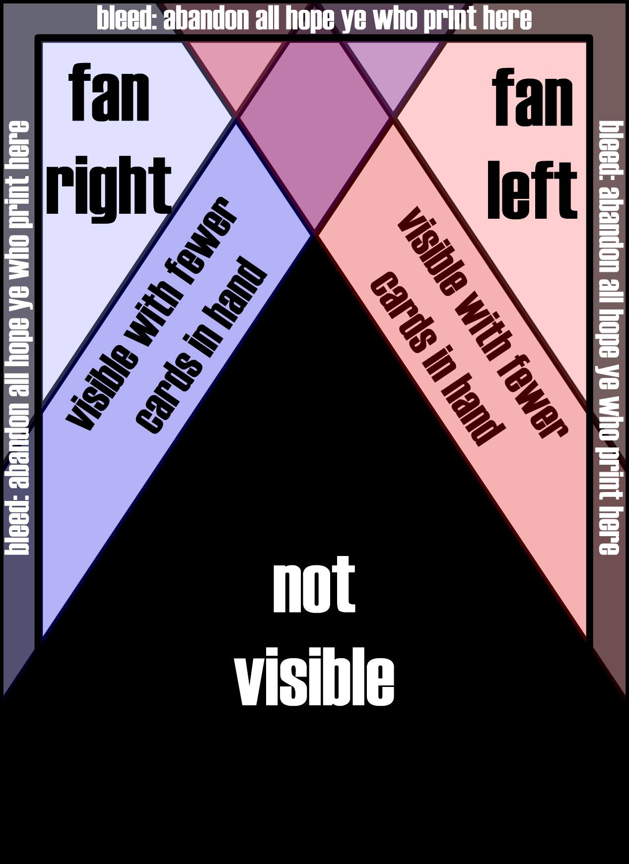 | 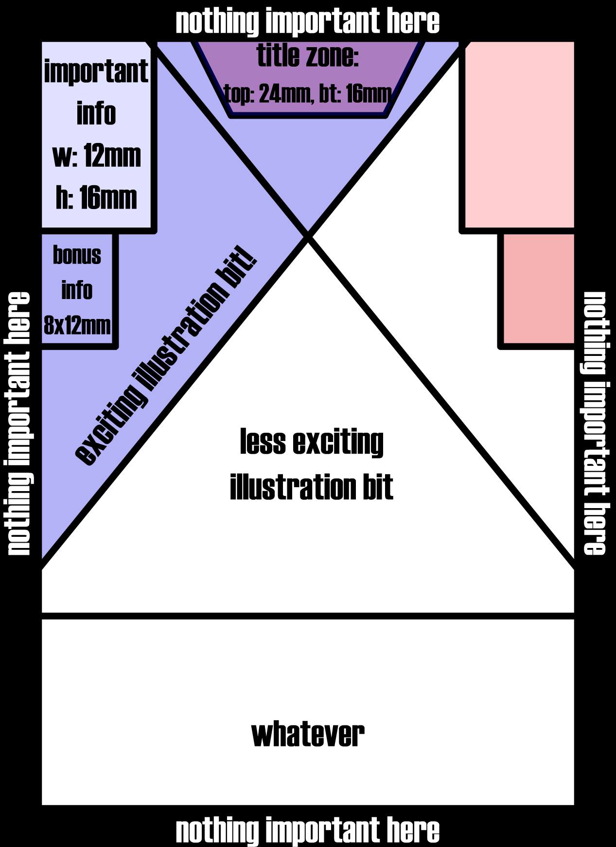 |
(For those who might not know, the "bleed" borders refer to where images purposely extend past where they will be trimmed to allow ink to extend all the way to the edge of the card, without needing to perfectly align the cutter with the card image down to the millimeter.)
Do you have any ideas on how to help make sure we keep our games usable and fun across a wide scope of players, or things you've seen that you thought were great implementations of how others have made this happen?