Play game
Light Forsaken's itch.io pageResults
| Criteria | Rank | Score* | Raw Score |
| Potential, once improved | #3 | 4.500 | 4.500 |
Ranked from 4 ratings. Score is adjusted from raw score by the median number of ratings per game in the jam.
Leave a comment
Log in with itch.io to leave a comment.


Comments
I loved this game!
The controls are a little hard to get used to but once you get how they work, it's pretty fun
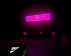
I really like the horror atmosphere you made, especially how you used the sound effects to create fear (and it worked), making it even scarier. The graphics are pretty good too
Thanks so much! Out of curiosity, what did you find difficult about the controls?
Oh, that's just my personal preference, nothing to worry about. It's just that it took me a long time to get used to the gimmicks of the game, but that's because I'm not very used to 3D games :)
Ah, fair enough! Thanks again :)
I'm so sorry because I couldn't finish the game loool it was too scary to me (which I think is a good thing)
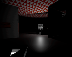
The way the PULSE system worked and the sound design that goes with that is really awesome, it makes it feel like every time you use it there could be a jumpscare. On top of that, since the player has to trigger it themselves the tension and timing is placed onto our shoulders.
I ended up watching a gameplay video instead. (and I'm relieved it seemed like there seems to be no actual monster called the Darkness that stalks you throughout the game haha.)
I do think the game gets a bit dark / how to get an idea of where things are and where you are. So maybe some type of map could help, or make the echolocation slightly brighter? But this is also personal taste since it may be that the disorientation is part of the experience.
Thanks for the game and great work!
Thank you so much for the feedback! While disorientation was definitely part of my design, I do think it goes a little far at times and leads to players feeling frustratingly lost. Boosting the pulse or including a map (likely a fairly vague one to maintain some of the fear of the unknown) are great ideas - will definitely keep them in mind for future updates/games!
Thanks again! :)
I'm so sorry because I couldn't finish the game loool it was too scary to me (which I think is a good thing)
The way the PULSE system worked and the sound design that goes with that i really awesome, it makes it feel like every time you use it there could be a jumpscare. On top of that, since the player has to trigger it themselves the tension and timing is placed onto our shoulders.
I ended up watching a gameplay video instead. (and I'm relieved it seemed like there seems to be no actual monster called the Darkness that stalks you throughout the game haha.)
I do think the game gets a bit dark / how to get an idea of where things are and where you are. So maybe some type of map could help, or make the echolocation slightly brighter? But this is also personal taste since it may be that the disorientation is part of the experience.
Thanks for the game and great work!
The game has plenty of content, shader effects, and polish. That O.G. Cola advertisement. TASTE THE EDGE. I don’t understand why a flashlight has been forsaken for an echolocation effect, but the zorcher you carry around (which should charge twice as fast imho) seems to have some in-world merit. (Perhaps to avoid being seen by monsters?)
I didn’t get far enough to enter combat if the game has it. The screenshots make the game look like Penumbra, but in reality it seems to be more of a bitcrushed pseudo-horror mall exploration game. I did not feel any fear, but I got strong pixel mallpunk vibes, and that seems to be a growing game aesthetic these days.
In terms of personal taste, I don’t like games that try to be avant-garde artsy because games are an interactive medium, therefore a lack of understanding gets players stuck in a way they can’t get stuck watching a film. The same criticism could be applied to games I developed. I often come up with better ways of doing things that end up being worse.
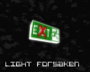
I think it’s interesting how the game trains you to go to the “exit” signs. Exit what? Exit the game? Exit the mall? Exit capitalism? Exit life? The nightmarish suggestions of grander ideas are amplified by the lack of fear or reaction-time gameplay. If I had a flashlight I could enjoy it more, but the almost total lack of light seems to be the point. If I lived in a nicer neighborhood, if I had a higher income, if I had more sex appeal, I could enjoy life more. The game is philosophical. Whatever you’re going for, you seem to have achieved it.