Thanks! I’m excited to hear about how I could improve the UI. Would you mind sharing some ideas on how I could improve the menus etc. of the game?
Motor Strip Entertainment
Creator of
Recent community posts
The game has plenty of content, shader effects, and polish. That O.G. Cola advertisement. TASTE THE EDGE. I don’t understand why a flashlight has been forsaken for an echolocation effect, but the zorcher you carry around (which should charge twice as fast imho) seems to have some in-world merit. (Perhaps to avoid being seen by monsters?)
I didn’t get far enough to enter combat if the game has it. The screenshots make the game look like Penumbra, but in reality it seems to be more of a bitcrushed pseudo-horror mall exploration game. I did not feel any fear, but I got strong pixel mallpunk vibes, and that seems to be a growing game aesthetic these days.
In terms of personal taste, I don’t like games that try to be avant-garde artsy because games are an interactive medium, therefore a lack of understanding gets players stuck in a way they can’t get stuck watching a film. The same criticism could be applied to games I developed. I often come up with better ways of doing things that end up being worse.
I think it’s interesting how the game trains you to go to the “exit” signs. Exit what? Exit the game? Exit the mall? Exit capitalism? Exit life? The nightmarish suggestions of grander ideas are amplified by the lack of fear or reaction-time gameplay. If I had a flashlight I could enjoy it more, but the almost total lack of light seems to be the point. If I lived in a nicer neighborhood, if I had a higher income, if I had more sex appeal, I could enjoy life more. The game is philosophical. Whatever you’re going for, you seem to have achieved it.
This is the second game I played in this jam, and I didn’t realize it’s by the same dev as the other (Wintercoffin). You seem to know what I like: darkness and death. Like the other game, it’s too boomery for my Mac, so I’m running the Windows version on Wine.
The game is visually interesting, but the whole purpose seems to be to move in a straight line. Also, the sailing vessel is locked to the view yaw and, amusingly, it can strafe.
Sailor’s Grave is visually nice, but it’s the same visual for a long stretch of time. For boating games in general, I would recommend putting lots of stuff in the water, adding fishing and crew interactions (onboard romances, drinking games, etc.), or adding a time warp feature. Without other elements, it’s just a big blue watery road. I prefer Wintercoffin because of its visual variety and the promise of more to do.
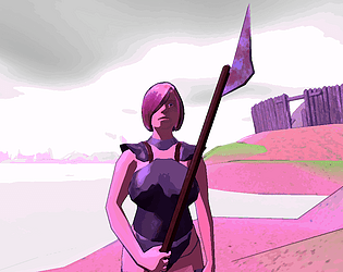
Wintercoffin does a great job of capturing The Elder Scrolls vibes, particularly of Daggerfall and Morrowind.
I first tried running the game on a Mac (Mac OS 10.11.4 El Capitan 64-bit from 2009). It crashed at launch, which is my usual experience on that machine, but it’s interesting to see a game that targets Macs of that era (though unfortunately not mine).
My experience with the Windows version was better. I ran it via Wine on Xubuntu as I do not have a Windows install, and (notwithstanding Wine’s handling of first-person games) it ran well. I played it for 15 minutes and did not find the fort. With the distractions of issues external to the game, what I got out of it was the atmosphere.
Small recommendations:
- Add adjustable mouse sensitivity
- Increase the tree LoD distance so they don’t morph into view
- Give the player a clear goal or quest from the start, even if it’s fake, just to send them in a direction
I would like to give the game a proper playthrough when I’m in the mood for a slow-paced experience because I know there is more to discover.


