Play game
CyberLight Rider's itch.io pageResults
| Criteria | Rank | Score* | Raw Score |
| Synergy | #49 | 3.167 | 3.167 |
| Polish | #72 | 3.000 | 3.000 |
| Overall | #88 | 2.944 | 2.944 |
| Relevance | #106 | 2.667 | 2.667 |
| Aesthetics | #106 | 2.944 | 2.944 |
Ranked from 18 ratings. Score is adjusted from raw score by the median number of ratings per game in the jam.
Leave a comment
Log in with itch.io to leave a comment.


Comments
Simple, but really nice! I included it in part 21 of my Cyberpunk Jam compilation video series, if you feel like giving it a look :) http://youtu.be/Gg4_JAOU_Io
Simple game. Those death chip-looking things are crazy.
Thanks Kalonica! :)
Hey 2UP, thanks guys! by the way, when you press T to Tweet, you will get a pop-up blocker note on top right of Chrome address bar. Just allow pop ups from itch.io and you're good to go! cheers
I really liked it, even tho I'm pretty bad at it ;)
The tweet your score function didn't work for me (on Win8.1 and Chrome)
Good job as usual, Rob :)
Could maybe be improved if the difficulty increased the further you progressed, to create a sense of achievement besides the score.
I really like the title screen and menu.
Nothing greater than real feedback! i'm really thankful and will implement the suggestions.
Very nice game! :)
Like others I also enjoyed my ride on the top lane after I figured that was the easiest one. I like the ideas of adding active data only on certain lanes so you're required to switch. Also a drop down (move on lane down) button would be nice.
I was missing the music in Firefox so I played it again in Chrome and there it worked nicely... But then I started missing sound effects for when I was riding the lane with the right color.
This was a lot more challenging until I started staying on the top level. Maybe you could make it more difficult to do this by adding more gaps or something? The music wasn't playing for me either (in Firefox). Cute concept!
Check out our pixelized platform runner. :)
I really like the look and the concept of changing colors. a button to drop down would be nice though and also if you just stick to yellow and jump it becomes super easy so some sort of obstacle that requires switching colros would be cool. Nice job though!
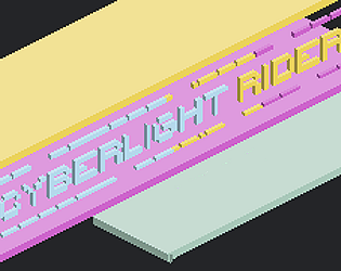
Really enjoyed this! Love the look (although I admit, I was hoping for isometric based on the title image ;) The only thing I noticed is that I really just played at the top the whole time - didn't see much reason to go below. If there was something to collect, or if only one colour had active data at a time, there'd be more reason to move around.
Thanks for the votes, people! Glad you're enjoying it.
@4KbShort - there is most definitely background music, try another browser? Its quite soothing music :)
@V.R - feedback taken on board! I see that now, it seems the pink is getting the raw deal.. hmm, i suppose it would be easier to switch the values than anything else, cheers
This was really enjoyable to play. One thing I felt was that the middle pink stream was actually more difficult to stay on for a long period of time than the top one. This was because you could avoid things on the top layer but jumping up and over, but doing so one the middle stream automatically takes you up. So maybe the middle stream should've been the most valuable?
Fun game fair play, I like the idea of changing your jacket!
Fun and profitable! Could do with a bit of sounds and maybe some tunes. I saw that the "Music: On" option was working, but I heard nothing. A bit of lag every once in a while, but otherwise a good ride.
good job man :)