Play Combo
Combos, Combos, and More Combos's itch.io pageResults
| Criteria | Rank | Score* | Raw Score |
| Humor | #6 | 2.500 | 2.500 |
| Theme | #6 | 3.500 | 3.500 |
| Innovation | #7 | 3.000 | 3.000 |
| Fun | #11 | 2.625 | 2.625 |
| Audio | #11 | 2.750 | 2.750 |
| Mood | #12 | 2.500 | 2.500 |
| Overall | #13 | 2.625 | 2.625 |
| Graphics | #16 | 1.375 | 1.375 |
Ranked from 8 ratings. Score is adjusted from raw score by the median number of ratings per game in the jam.
Leave a comment
Log in with itch.io to leave a comment.


Comments
This is a really interesting game!
Just wish there were better graphics, though I appreciate the Windows XP background
Here's the VOD: https://www.twitch.tv/videos/1555924993
Good game.
Positives:
Areas to improve:
Overall: I really appreciate the ability to press 'R' to reset the platforming. It isn't mentioned anywhere on the game page or in-game, but I instinctly hit 'R' when getting stuck, and it reset the level, which was very nice. I think the detrimental card packs was unneeded, and was easily circumvented with the 'R' button, and the platforming was very rough around the edges. Oh, and when I won the game, it just closes the game instead of taking me to a "You win" screen. I wish there was a victory screen of some sort.
Fun: So, the platforming was pretty rough, and I think that was a major issue. There was a section with moving platforms that I had to jump down to, but they were off screen and a tiny moving box. If the player cannot see what they are landing on, then this is commonly referred to as a "Blind Jump" and should certainly be avoided. I know the moving platform comes on screen if you wait long enough, but for the most of the time it's off screen and I didn't know if it would rise on screen or not, so I took several jumps without knowing where to land.
Innovation: I like the interesting combo between a platforming game and a deckbuilding card combat game. Plus, the combat is centered on combos which works very well. I know card based combat games have become pretty saturated in game jams after Slay the spire came out, so I've played all too many card based combat games, but I like the extra addition of having to run around and collect cards.
Theme: I like the multiple uses of the theme. it's a combo of genres, (platforming and card combat) as well as the combo-usage in the combat. (Cards working together). Well done!
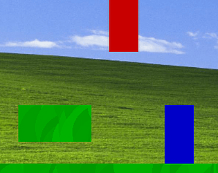
Graphics: So, it goes without saying that the artwork is underwhelming. This game is a pretty clear demonstration of a programmer making a fun game, and the visuals are an afterthought. After all, who needs shiny graphics when the gameplay is fire? That said, playing as rectangles can leave me pretty unattached the the character. That leads well into mood.
Mood: I have no emotional connection with this game. The environment is the windows XP default desktop background, and I play as a rectangle fighting against another rectangle. There's not really a story, or any motivation to move forwards, and nothing exists purely as decoration or added details. It feels empty and uninspiring. Most of these issues could be solved with a new coat of paint, some background parallax, character artwork and decorations. Perhaps even a story.
Audio: I appreciate the option to mute the SFX and music. A volume slider is preferred over binary checkboxes, but the inclusion of a method to mute at all is very nice. The music doesn't seem very fitting. The sound effects are nice though.
Humor: Not Applicable.
Final Thoughts: I think it's an interesting game with some questionable execution. The idea of platforming to collect cards to benefit you in combat is a great idea, but the platforming sections are clunky and rough. I think it was a cool concept, and with some more experience and feedback, you're probably going to make some super cool innovative stuff in the future. Nice work.
one thing that I found awkward with the platforming is a lack of weight. You are either moving at top speed, or zero. You’re right, I should’ve specified what I found rough, and that’s on me. And yes, the rising platform does eventually make it on screen, so that’s on me too. My game is by no means a perfect demonstration of adding weight to the characters movements (mimicking Mario 3’s player physics in a weekend was certainly not my best move) but the friction of the ground, or keeping speed while mid-air feels a lot nicer that letting go of the moving buttons and coming to an immediate halt. That also tangentially applies to the instant speed boost from holding shift. You definitely want them to gain and lose speed quickly, maybe a quarter of a second or a half of a second from zero speed to top speed, but making it instant is jarring. Same for slowing down, but you typically want slowing down to be faster than taking off, or it feels slippery. Mario 3 is notorious for feeling like you’re constantly on ice, and some games like Celeste instantly stop the player while on the ground, but while in the air you have a short gradual slowdown. Honestly, that’s the only issue I had with the platforming.
This... is incredible. Definitely a mood xD
There's a point where I got stuck in a hole and could not get out :'(
Without a doubt better than fortnite
can 2nd that