Play game
Jeebo & Jerbo vs. Life's itch.io pageResults
| Criteria | Rank | Score* | Raw Score |
| Overall Fun | #25 | 2.457 | 3.250 |
| Sound/Music | #27 | 2.457 | 3.250 |
| UI | #29 | 2.079 | 2.750 |
| Art | #33 | 2.079 | 2.750 |
Ranked from 4 ratings. Score is adjusted from raw score by the median number of ratings per game in the jam.
Leave a comment
Log in with itch.io to leave a comment.


Comments
Hello! I was one of the streamers who took part in Feedback Quest, and I'm here to leave some comments I had while playing.
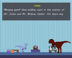
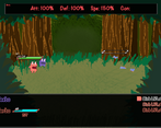
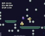
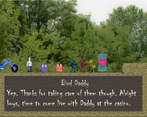
I do enjoy the characters. They're quirky and funny. I cracked up when Water Cooler Dave just vanished. I also found it an interesting mix of genres, combining platforming with RPG. That said, being slapped with a huge list of controls at the start is just bleh. I also feel like Jerbo needs a better introduction in the beginning instead of just showing up in battles.
So in the demo, Jerbo just shows up in your party. Initially that wasn't the case, but the fights were way too simple and boring (because you know... the beginning of rpgs are like that) so I basically set the party to early-mid game instead of beginning of the game, and made the fights there a bit more difficult to show off the fights, which doesn't really happen in this part of the game (which again... the beginning of rpgs are like that). In the full version of the game, only Jeebo is present during this entire section of the game, and you unlock Jerbo upon entering the city with a full introduction and everything.
As far as the list of controls, are you talking about the Obligatory Tutorial that says Z - Interact, X cancel, Backspace - respawn, Escape - Pause?
The rest of the "tutorials" are on those signs, but I was afraid that if I didn't tell players at least the very basics they would likely not know how to interact with things or anything like that.
Ahh, ok, that makes sense about Jerbo. Okay!
And no, not the obligatory tutorial. Sorry, I realized I forgot it was from me checking the controls myself in the Options. XD Ignore that comment!
That said, just now when I went back to check where I saw the controls, I went into the game and, once I had control, I hit ESC. It resulted in the game crashing.
############################################################################################
ERROR in
action number 1
of Step Event0
for object obj_MenuResume:
Variable obj_MenuResume.B(100046, -2147483648) not set before reading it.
at gml_Object_obj_MenuResume_Step_0
############################################################################################
gml_Object_obj_MenuResume_Step_0 (line -1)
Considering this game is already released it kinda seems like submitting this is just for promo.
edit: I tried the game and here's my feedback-
What I liked:
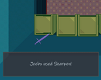
It's spunky and has lots of character to it. The character movement feels nice which is always very important. The music also slaps. And I like the combo of turn based fighting with platformer movement. Also I appreciate that the combats go really fast if you skip through the text because there are a lot so I think it'd get tedious if each battle took up more time than it needed.
What I thought could be improved:
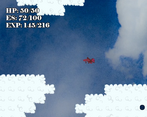
It's rough around the edges- it could use a revamp for it's ui, and the art seems very inconsistent in quality. Some spots look good but others look like default assets. Also, the first level is just really hard, I would make some of the difficult jumps significantly easier and add some more checkpoints.
What UI are you talking about exactly? The battle UI, the overworld corner UI, or the pause menu UIs? Or all of them?
The platforming is supposed to be difficult, the game is meant to be a challenging game. I'm totally fine with people struggling and dying a few times in the beginning, but if it becomes like completely excessive then that's a problem. So far most people I've seen play through it have died 1-5 times ish, which to me is completely within the realm of what I'm shooting for. Do you think it's significantly harder than that, or do you just not really like difficult platforming?
For the UI it's been a minute since I played but I think mostly all of it. For the platforming, I like difficult platformers- Celeste and melee are 2 of my favorite games (obviously melee isn't exactly the same genre but still a very precise platformer). I thought the type of difficulty in certain parts wasn't the "fun" kind of difficulty. I don't mean that in an insulting way and I don't think it was an issue with all of the platforming challenges in the demo by any means. Idk how to describe it exactly but I think that specifically the difficult parts that I didn't like were where I had to time a jump at a very precise spacing before falling off of a platform combined with the fact that the checkpoints were pretty infrequent. I think it's okay to have very difficult jump like that, but it's frustrating when you get set back really far for it so I'd rather have some more checkpoints. Or else you can have more infrequent checkpoints but less difficult maneuvers, but each one feels like you could consistently do it so when you mess up it's just your fault. This blog from the creator of celeste is also a really good read on the topic of platformers too https://maddythorson.medium.com/celeste-forgiveness-31e4a40399f1
I hope this doesn't come off as too critical! That ended up way longer than I meant it to lol
Your game looks awesome! I would have preferred a download link for the demo on itch, I'm very selective about the steam games I add to my library. Seems like a great concept, too!