Play game
Automatonics (playtest version)'s itch.io pageResults
| Criteria | Rank | Score* | Raw Score |
| Art / Graphics | #28 | 4.000 | 4.000 |
| Controls / UI | #37 | 3.571 | 3.571 |
| Overall Fun | #38 | 3.571 | 3.571 |
| Sound/Music | #47 | 3.143 | 3.143 |
Ranked from 7 ratings. Score is adjusted from raw score by the median number of ratings per game in the jam.
Leave a comment
Log in with itch.io to leave a comment.


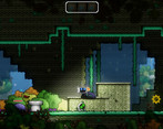
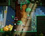
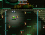
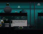

Comments
Nice little game!! I found a crazy glitch though, if you jump and then immediately talk to an NPC you'll go flying upward! Also, the restart button doesn't work. Also, I second LJF's thoughts about the tutorial it feels like it throws too much all at once, I'd give the player a bit more breathing by putting in more time between teaching new mechanics.
Hey there !
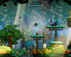
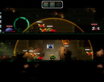
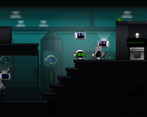
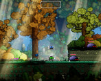
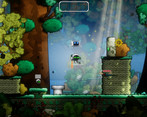
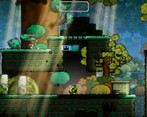
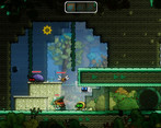
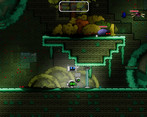
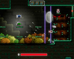
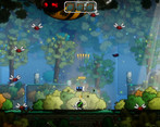
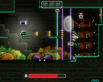
Automatronics is a charming platform / run and gun game ! I loved the art it reminded me a bit of the first Rayman's and Cuphead too. I played it with a controller and it responded well !
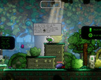
I have to say though, the tutorial is really rich in information, and I don't know why but the pannels in the background teaching me the commands were switching between gamepad controls and keyboard controls. So they were a bit blinky and hard to follow !
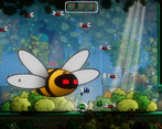
Maybe the tutorial could go on when you progress in like the first and second level ? Some hints like " remember, you have a shield !" I personally remembered it when i fought those damn dragonflies haha !
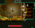
Some elements like doors that can open or holes in the ground are sometimes tricky to see.
Overall I spent a really cool moment with your game !! :)
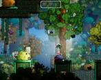
Automatonics is a cute platform game. I used the keyboard even though a controller was recommended so there was a bit of an adjustment period for me. I got the explore the world a bit, and it was wonderfully bright and colorful. I enjoyed the art, and even though I didn't get to experience the co-op feature, I think it's great that the option is available. I didn't get the chance to play around with the upgrades, but it's neat that there was a separate customization room available in a platform game like this.
I am going through all submissions to make all developers aware of an important Google form I've made.
I'm joining the IQ folks to help organize smaller events in between the main FQ event in order to help prevent us from getting too many games in main events. Right now, I have a planned structure for these events but I would like to hear from everyone who was in this event in order to tune things better. The survey is a bit long, but it covers as much as I could think of. If you can take the time to do the survey by June 1st, I would immensely appreciate it!
You can find the form here: https://forms.gle/P9LPYwERhJtpZzteA
Just played a bit of this. Love the feeling of the platforming.
Few issues for me:
Keyboard controls - I know it said better with controller and I *did* adjust to the keyboard controls, but it would be great to do these more in line with other platformers.
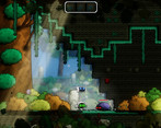
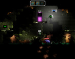
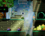
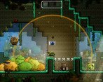
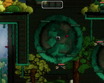
Foreground distractions - It was really hard to differentiate between some platforms and there being a hole there. Caught me off a few times.
Blended obstacles - It's also hard sometimes to know if you can jump on something, whether there is a door in the way (without walking into it and seeing it's a door).
All in all I can see this going well. Love the art style, the music is great and the sound effects (especially the spikey bomb weapon... I could listen to that sound for hours).
Hey, thank you for the feedback.
The keyboard controls is a very hard issue to tackle, I appreciate the feedback, as it tells me that there is still a lot to be improve there. Also thanks for pointing out the foreground and blended objects issues that are impacting the gameplay, it is a very direct and assertive feedback, it helps a me lot.
I'm really glad you enjoyed the art style and music!
Again, thank you very much!
Platformers are some of my favorite games, and this one was not disappointing. I really enjoyed it.
THE GOOD:
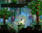
Artwork is well done. Love the cute robot and enemies. Plus the environment is very well done.
Level design and platforming are laid out nicely. I was able to easily move from place to place, dash, double jump, and even a few hidden areas.
Music is nice and fitting for the theme of the game.
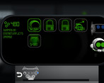
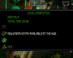
The HUD between levels seems interesting and looking forward to some of the features you'll unlock in there.
Controls are easy to understand and feel responsive. Double jump felt a wonky at first, but once I got used to it... it wasn't a problem.
SUGGESTIONS:
The text is a bit challenging to read and hard on the eyes. There are some really nice pixel fonts out there. I'd recommend a new font style.
The pits are really tough to see due to all the foreground decoration. This caused me to fall into a few, plus there are some spots that you can't tell, due to the decorations... "Is this a pit? Or not a pit?" I found myself jumping over, possibly, spots that weren't even pits lol I think you need to make these a bit more clear.
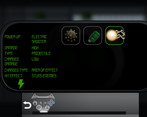
A screen showing the power up's you've received and what they do would be nice. Character menu, some sort of HUD, etc.
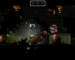
When hit by an enemy, you get stuck on top of them, and they continuously hit you over and over. The only way to get away from this is to use a shield or dash. When enemies hit you, you should either be pushed back a bit or immune to other hits for a small duration of seconds.
Thank you very much for the time and effort playing and providing the feedback and suggestions.
I'm really glad to see a positive comment regarding the artwork and robot designs. The HUD between levels is indeed an aspect that I really like and ideas for new features appear all the time, I'm glad it caught your attention on a good way.
Thank you for pointing out the need to improve the fonts and foreground decoration, it does seem like some small changes could really improve the game quality here. It is also really good to receive a feedback regarding the HUD and in-game information, there is a lot of room for changes in this aspects to improve the player experience.
The feedback regarding the enemies continuously hitting the player and even the suggested solution are really valuable to me. Thank you so much!
Hello from tonight's stream!
So I'll admit, it took me a bit to get the controls down primarily because I was on keyboard. Once I did, however, what I got was a nice jump an' shoot platformer.
That said, I noticed a few things that could use adjusting. For starters, the complete mismatch between the music and the visuals... and the music against other music. Not one track fit with how the game looked. On top of this, the tracks were all over the place. First it's this tragic doom song, then it's happy bunny land, then it's the lord of metal, then it's like something out of Donkey Kong Country. Nothing matches with the other songs in any remote way and, save for the DKC-esque song, no song fit with the aesthetic.
Another thing I noticed was how hard it was to discern what each power-up was, both on the box you collected for it and when you had it equipped. Differences are so minimal. It should be easier to see what the power-up is.
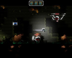
Finally, I felt having the robot above the robot you play ends up making things feel too busy.
Thank you very much for the feedback.
I really appreciate the comment regarding the mismatch on the music, it made me aware of something very imporant that was going unnoticed by me until now.
If I may ask, could you provide a little bit more detail on the feedback about the companion robot that keeps flying over the player? It would be very valueable to me.
Thank you very much for taking the time to play and evaluate the game!
Very polished and has a ton of content. Good Work
Thank you!