Play game
Aazelchi's Messaging Service's itch.io pageResults
| Criteria | Rank | Score* | Raw Score |
| Favorite game | #3 | 3.000 | 3.000 |
Ranked from 3 ratings. Score is adjusted from raw score by the median number of ratings per game in the jam.
Leave a comment
Log in with itch.io to leave a comment.




Comments
Nice short little game! It wasn't bad on a keyboard, but I do wonder if it feels better on Android. I'm a flip-phone using Luddite, so I guess I'll never know, haha.
I do think the speed on the text reveals could be a little faster. If this was coupled with a larger story, and a little more variety, it could be pretty interesting. Almost like a visual novel or text adventure, but with a more active core game loop.
I also would have loved it if the "wrong ports" gave weird or awkward responses, as if your private message hit some confused other person. (I tried a few, and as far as I could see, it just resets you)
Good work!
Forgot to mention: while I like the message animation, I would have preferred less of a delay before the text appears.
This is really slick and professionally produced (the message animation is very nice-looking). Good writing in the intro, made me chuckle a few times. Not really my type of game, but the difficulty hit the right spot of challenging me without being frustrating. The length feels about right: I would probably have enjoyed a couple more levels, but at least it didn't outstay its welcome.
Very nice interpretation of the "two buttons" theme.
This seems like a very clever concept for a text-adventure.
The colors used were pleasing to the eye and the fonts were large enough for easy reading.
The flying envelope animation is really nice.
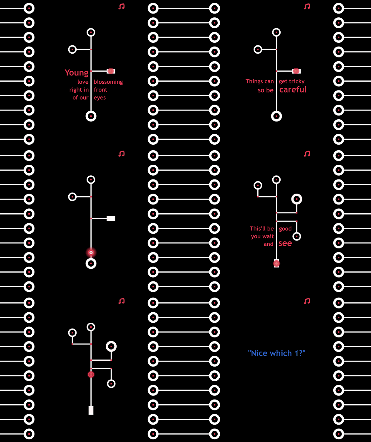
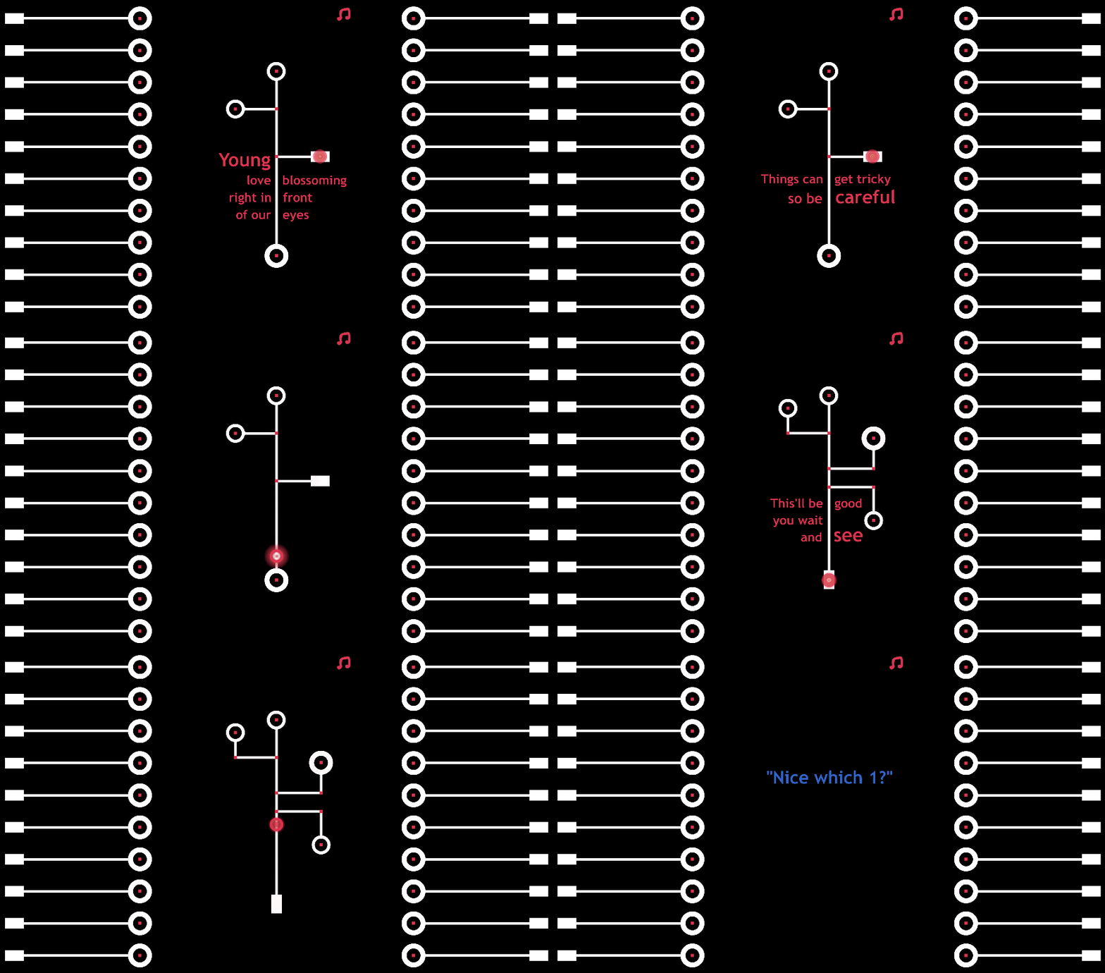
Clicking through the texts with the left mouse button (or pressing an arrow key) was pretty simple, and most of the time I could press an arrow key at a red dot intersection to pick a new direction, but I could not figure out why I would get a "try again" message when I was on the last part of a branch. At those points I could only go straight so I couldn't figure out why I was "dying". Instead of just a "try again" message, I would add a note about what the player did wrong. "Try again (you didn't turn in time)" or "Try again (you picked the wrong branch)."
I also couldn't tell what the point of the different branches was. Are they different text responses? Are the ones that are harder to get to "better" than the ones that are "easy" to get to?