Play game
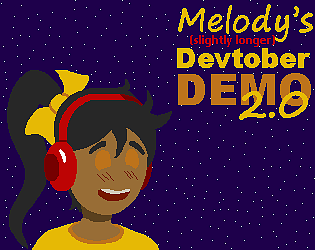
Melody's DEVTOBER 2019 Demo V2.2's itch.io pageResults
| Criteria | Rank | Score* | Raw Score |
| Favorite game | #1 | 4.000 | 4.000 |
Ranked from 4 ratings. Score is adjusted from raw score by the median number of ratings per game in the jam.
Leave a comment
Log in with itch.io to leave a comment.


Comments
Enjoyed playing this and liked how polished it felt. The main character design worked really well and I liked the way you handled the intro with the scrolling to the side, thought it was nicely done and unique. Will have to come back and try and finish it.
Thank you! Glad you enjoyed my intro story experiment. The game is pretty short still, but when I get more time I'm hoping to complete a bigger update with the multiple levels (and save points) that were originally intended. Thanks for playing :)
Enjoyed playing this and liked how polished it felt. The main character design worked really well and I liked the way you handled the intro with the scrolling to the side, thought it was nicely done and unique. Will have to come back and try and finish it.
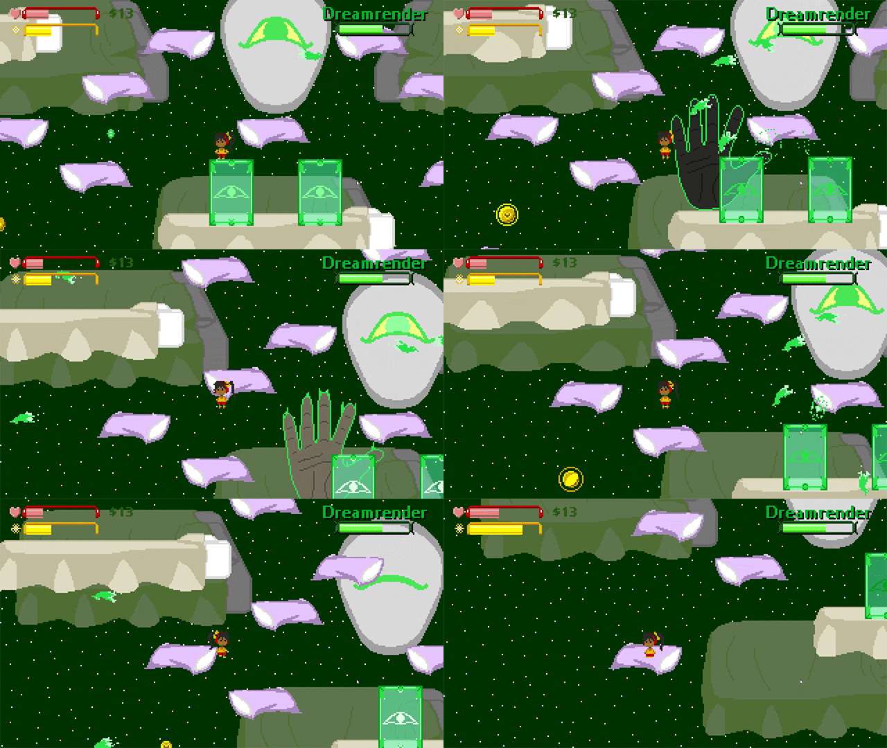
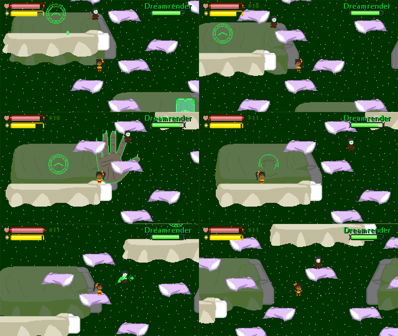
This is very polished and promising. Nice palette and good graphics. Some of it is very impressive (the giant hands), and there is some very good trippy imagery in the boss battle. Melody's jump feels a bit difficult to control, but everything else feels good to me. A bit of storyline as well, with some snappy lines, and both Melody and the bad guy are memorable characters. The music isn't insanely memorable, but it's not bad, and I enjoyed the boss music.
Unfortunately, I still haven't beaten the boss fight. In between the boss being ludicrously durable and difficult to hit, and the rather precise platforming, I don't seem able to do more than make a dent in his health bar. Unless there is some puzzly way of defeating him, I don't think I'm going to get further. Which is a shame, because I wouldn't mind seeing more of this game.
I appreciate that falling into the pit isn't insta-death, and that you respawn at the start of the boss battle when you die. However, given how hard it is, I think refilling the player's health bar upon entering the fight would be a merciful touch.
Nitpicking aside, I had fun playing this, and I keep coming back to how good-looking and all over well done it is. Best of luck continuing to expand it.
Thank you so much for playing! I'm glad you enjoyed it overall! This is an on-going project, so it'll probably continue to receive tweaks and balance as I work on it.
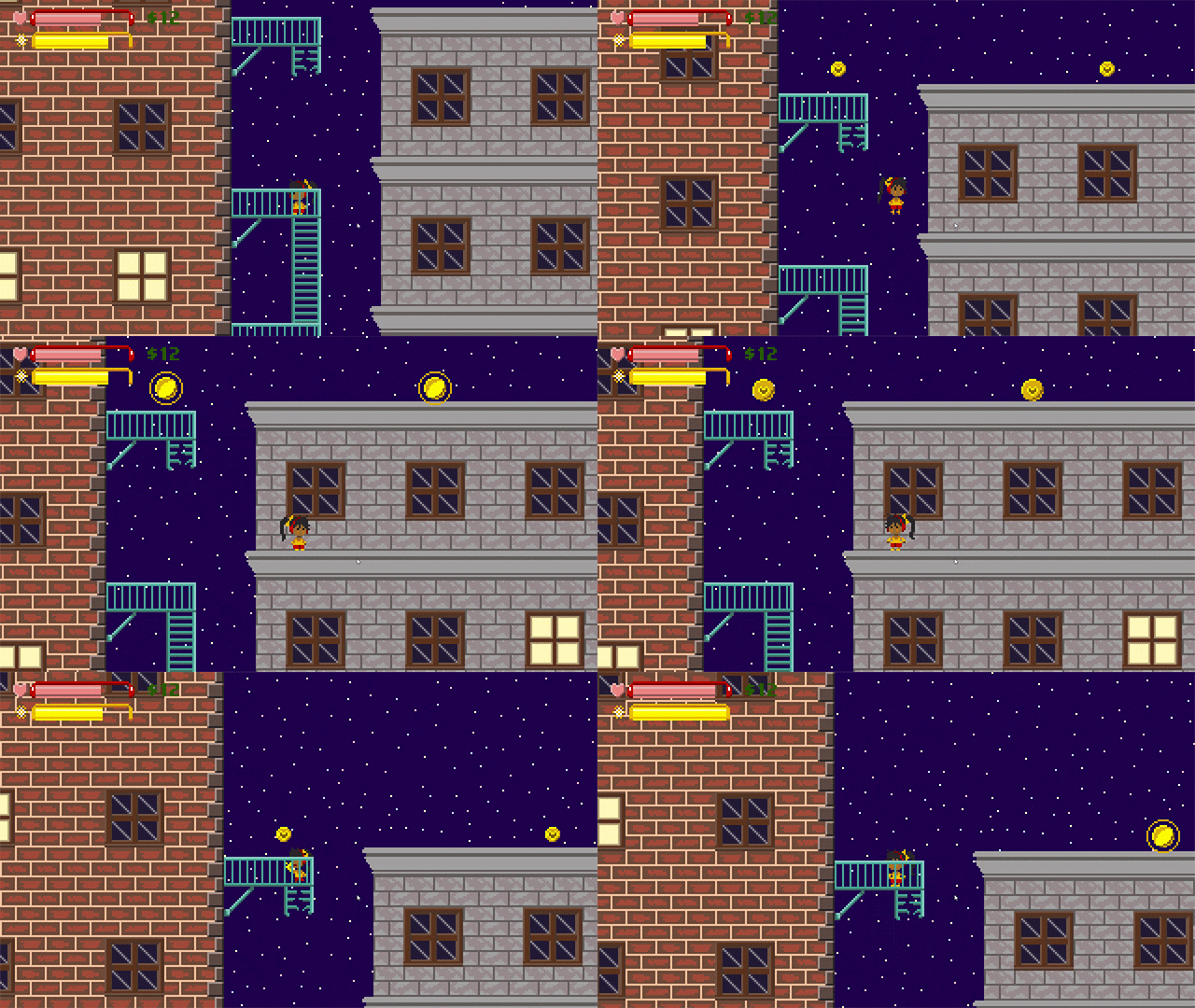
The boss fight is going to be tough, I'll have to keep watching feedback. I've had at least one player think it's too easy. Be sure to pick up the money on the way through the level, and heal up at the vending machine on the far left on the bottom floor before taking on the boss. You'll retry with whatever health you enter the fight with. I'll considering updating this in the future though, maybe a heal boost on each retry.
As for strategy, there are two phases. On the first phase (the small floating warlock) the best strategy is to quickly finish off the 2 crows, as they actually pack a solid punch if you ignore them. After that, the uppercut attack is probably the best against him, though the 3-hit punch combo allows you to briefly hang in the air, and is also effective. If you find health and power running low, the green seals can be destroyed for 1-3 orbs. If you destroy all 4, the boss will respawn them allowing more harvesting. This only works on the 1st phase though.
Once you get the enemy's health to 75%, it'll switch to the 2nd phase. This part needs some work, but there's a simple strategy right now, assuming you can get here with a decent health pool. Just avoid it's volley of ranged attacks, and once it starts to follow you just beat the tar out of it. It's large, so basic attacks should connect easily. It has a "drain" attack, but if you have the health and keep pounding it, you can beat it! That said, next update (it may be a little while) I plan to change the attack pattern a bit. This being a demo, there's just a little story afterwards, and that's about it. I do intend to continue and expand the game though! Once it's long enough, I intend to build in save slots and other helpful things.
Thanks again for your feedback, it's very helpful! :)
My favorite part of this demo was the stunned look of the birds when you punch them. I imagine them thinking: "I was just flying around minding my own business when this lady just punched me in the face!"
The controls were pretty easy to figure out and the music was very good. I also liked how the game was able to go full-screen.
Like crocdev said, I think the font could be better. It was very hard to read which made me want to skip a lot of the text. I think part of the problem is that the text screen is semi-transparent, so anything in the background is conflicting with the text in the foreground. So I would suggest making your text screens have a solid background and then pick a more readable font.
I liked how I had the option to attack with the mouse or the keyboard, but I found the decision to use "N" as the attack key to be a bit unconventional. I think space bar would have been a better choice. As a result, I often used the left mouse button to attack.
Thank you so much for playing! Sorry for the slow reply, I was also submitting to "Improve My Game Jam #9"!
In fact, because of the time I've take some of your feedback and included it in the next round of updates! I picked a new sprite font for the dialogue windows, and doubled the opacity of their backgrounds. I hope this improves the overall readability of the text. Additionally, I've added a new story into (tried to make it different that my usual stuff, but not sure if it was a good idea or not. There is a skip button, haha). There's also some additional story upon beating the boss.
If you do try it again, let me know what you think. Either way, thank you so much for playing, and especially for the feedback!
I've just beaten the boss!
Very cute artstyle. I like the mix up between platforming and fighting!
The character moves way too fast for my taste, but maybe that's just me. Also I think the dialogue font is kinda hard to read, I'd suggest just using a black font.
Good luck on your project, I'll be looking for next updates!
Thanks so much for playing! My slow response was due to this also being in the "Improve My Game Jam #9"!
I've attempted to improve the dialogue box and fonts, hopefully it's easier on the eyes now. It's hard to find small fonts that read well...
There is also a new intro story! This is part of a loose "series" so it had no context for a new player. Hopefully this helps! I tried something a little different for the intro. but there is a skip button for players who don't like it, haha. Also, I've added new story screens upon beating the boss.
If you do try it again, let me know what you think! Regardless, thanks for playing, and especially thanks for the feedback! I appreciate it