Play game
Say Thy Name's itch.io pageResults
| Criteria | Rank | Score* | Raw Score |
| Visuals | #1 | 5.000 | 5.000 |
| Story/lore | #2 | 4.167 | 4.167 |
| Audio Design | #2 | 4.167 | 4.167 |
| Gameplay | #2 | 3.500 | 3.500 |
| Overall | #2 | 4.050 | 4.050 |
| Fun | #4 | 3.417 | 3.417 |
Ranked from 12 ratings. Score is adjusted from raw score by the median number of ratings per game in the jam.
Leave a comment
Log in with itch.io to leave a comment.


Comments
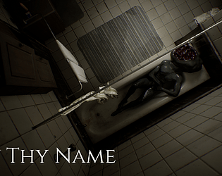
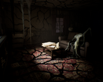
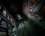
It looks awesome!
And creepy :) It gives me this uncomfortable feeling of something horrible going around. And audio design supports game mood very well.
As previously was mentioned, I also want to move faster.
Honestly very nice demo! I liked it, and it's quite impressive work.
The visuals are really top notch, the environment and animations are pleasant to look at, even though they are horrific :d The atmosphere of the game is also pretty cool, the expanding other world tendrils in the house, the lighting, I just dig it, very immersive. Also the narrator and the whole voice acting, tremendous work on that, helped with immersion massively.
I also liked the things moving when I blink idea, felt a bit like Outer Wilds. It's a shame though that it wasn't really used for some unimportant stuff. What I mean is, it's obviously main game mechanic, but at the start I blinked and that lamp moved, I tried the same with other items, but they didn't. If a lot of the things moved that would be nice and I think would add more to the already quite unsettling atmosphere.
In terms of some more feedbacks from me, I genuinely wanted to move faster so many times, even adding some time limited sprint on shift could be a blessing - and add some player agency, as a lot of things happen just when player is moving etc, so I felt more like an observant than participant at times. I'd also appreciate subtitles for the voice lines, you could maybe put them on the top to not collide with reading text on the bottom, but it would be nice to have I think. Also about the text on the bottom, it sometimes got very confusing, especially the office. There were so many areas in which I could read something, in such a small space that it was hard to fully find all of it, and I really wanted to read it, as the writing was a joy to read honestly. One more confusing thing was the monster, because I still don't fully know how it caught me :d And lastly, the ending felt a bit weird, especially the teleportation part. Personally I was waiting for a while for something to happen, because it felt like a cutscene, only after a moment I realized I gotta move and do things.
Overall, I think it's a really solid horror demo. It has everything a horror should have, intriguing story, a mechanic hook, some nice voice acting and very polished graphics(there are so many cool looking monsters and just environment pieces), plus some good animations as well. It only lacks some polish but it's completely understandable with such a short amount of time and the conditions. Would gladly play a more polished version of this! It's so nice, I'd want to play more.