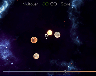
Play game
Solar Time's itch.io pageResults
Criteria | Rank | Score* | Raw Score |
Mood | #116 | 2.914 | 3.667 |
Visuals | #128 | 2.914 | 3.667 |
Overall | #142 | 2.517 | 3.167 |
Audio | #151 | 2.252 | 2.833 |
Gameplay | #186 | 1.987 | 2.500 |
Ranked from 6 ratings. Score is adjusted from raw score by the median number of ratings per game in the jam.
Engine
Unreal
Leave a comment
Log in with itch.io to leave a comment.
Comments
Hi a Nice refreshing game mechanic , the music set the mood and the graphics looked great. Not easy though but fun. well done
I like the concept of the game, and the graphics were stunning! It took me awhile to figure out exactly how to play, since there were no instructions, but I eventually got the hang of it. I noticed the progress bar of the planet was rotating as the planet rotated. It felt unnatural that way. One way to fix that might be to rotate the planet mesh only and not the widget. I also noticed the high score button was not working after I had returned to the main menu.
Overall though, I had fun playing, as it was such a unique idea!
Thank you!
The progress bar of the planet is not supposed to rotate (and I have not noticed it yet), so thanks for flagging the bug, I will have a look at it!
The Highscore Button was intentionally disabled, as I did not have time yet to implement it, but wanted to add it later (hopefully).
Solid game - I've never seen anything like it. I was hooked really quickly, but it was also super hard, so I only got to a 38s high score before giving up. Definitely really fun and innovative, some difficulty progression would take it to the next level.
Thank you!
Yes, I had some ideas for balancing and more progress, but didn't get around to implement it. It is definetly something that bothered me.
I love this concept of an animal feeding game! I feel like there isn't a game out there quite like this. Super cozy. I just noticed a couple times when canvas elements were overlapping with each other. Also would it be possible to make the level image on the Menu Screen bigger? The text could be bigger overall as well. Nice work.