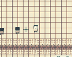
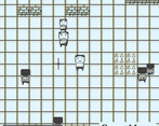
Play game
Crawlr GB's itch.io pageResults
| Criteria | Rank | Score* | Raw Score |
| Gameboy-ness | #173 | 2.772 | 3.250 |
| Fun | #174 | 2.345 | 2.750 |
| Audio | #189 | 1.706 | 2.000 |
| Overall | #199 | 2.185 | 2.563 |
| Graphics | #213 | 1.919 | 2.250 |
Ranked from 8 ratings. Score is adjusted from raw score by the median number of ratings per game in the jam.
Leave a comment
Log in with itch.io to leave a comment.


Comments
Ok so iv had a chance to play both versions of the game which not a lot of people might have had the opportunity. For those who played the first version, the countdown timer was bugged and went down to fast and you could not progress through the level quick enough even if you where skilled.
We are going to do the review but brining up the bug fixed version vs the bugged version because I think there's some things I see you where trying to go for that I didn't quite understand in the first version.
Your idea of having health run out before the dungeon ends was a really cool idea. what I didn't understand was that each time you killed a guy, you refilled on your health. I think you should definitely continue that idea but take more time on calculating how long it takes to kill a guy, how long it takes to get to the next guy and how long it would just take to explore the dungeon. To add that challenge back in, you need to calculate how much time is reasonable to subtract between rooms and that can be hard to calculate. so here's a secret.
Time your self how long it takes to run the perimeter of the entire dungeon room. "including trap areas so you will need to disable death for testing" if your really good you could set up a system to calculate each room size for you and adjust the countdown clock according too the room your in "this would be a good thing to do as a personal skill challenge"
Then take that time and cut it in half. That's how long you now have to make it through the dungeon. Using this method, if you went directly from point A to point B, you should have plenty of time to make the run if you where not to kill anything. Then when you add your mechanics of combat and gaining health, time to kill should balance how much health you gain back. So if it takes 4 seconds to kill a dude, give me 2-4 seconds back plus how long it took to kill.
I think this would balance out the time remaining and combat aspect you where originally trying to go for but might have been a bit difficult to execute.
I really enjoyed the unique directional combat controls. I had no issues hitting my targets. Very solid and can probably be improved on with better combat timing.
I think you should also reconsider your player hitbox size. Going through the levels it was a bit frustrating if i walked up to far and hit the spikes on my head. I think you could reduce the collision area your sprite has on the top just to give the player a bit more wiggle room and not die the second they touch the very tip of the pixel spike. I would move it halfway down the face.
and lastly scale. 160x144 definitely a hard challenge to accomplish and you did a very good job at it however its noticeable in the scaling of your crosshairs for where you swing your sword. Don't be afraid to use larger pixels. You can definitely stylize it to still fit the game very well and still keep that pixel scale ratio universally the same across all your sprites. and the same would go with just all your pixel art in general.
Overall super fun and definitely a great start at something that could be more!
thanks for your feedback!
I liked the combat mechanics, the inputs felt very comfortable, especially with rotating the aim. I felt like the player's hitbox was very large and I died a few times to things I wasn't expecting to die to.
The variety of enemies was good, as was the palette swapping.
Thanks for your feedback! I wasn't sure of how big to make the player's hitbox.
It might work best as just a square around the player's lower half. This will help with the player's head going over spikes.
It was a fun experience. I like the fact that the palette changes every level. But the music is a bit annoying and the game is a bit too hard (Specifically the fact that every enemy one-shots you). It was entertaining and i reached the floor 17.
thanks for your feedback! I'm not the best at making music.