Nice little concept you came up with! I love farm/collecting games a lot so this definitely hit that spot.
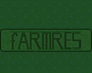
One of the things you might want to think about more is how light or dark the overall world is. you used a lot of dark green for everything so ill try to break it down.
Signs, Try using your two lighter colors for the background of the signs, and the Darkest color for the text. This will make that sign pop out of the background a lot better and be easier to read.
Your pathways. Try to only use your lightest color and your mid color for highlighting the paths. This will make them stand out a lot better from the rest of your world.
Keep the grass exactly the way it is. I think it looks really well.
loved the simple animations and everything else!


Leave a comment
Log in with itch.io to leave a comment.