Play game
Instable Incarnation's itch.io pageResults
| Criteria | Rank | Score* | Raw Score |
| Visuals | #44 | 3.667 | 3.667 |
| Overall | #59 | 3.250 | 3.250 |
| Audio | #60 | 3.083 | 3.083 |
| Juice | #61 | 3.167 | 3.167 |
| Theme | #81 | 3.000 | 3.000 |
| Fun | #93 | 2.750 | 2.750 |
Ranked from 12 ratings. Score is adjusted from raw score by the median number of ratings per game in the jam.
Leave a comment
Log in with itch.io to leave a comment.


Comments
Art and style of this game is great, I love the lighthearted but dark fantasy feeling! The music was well done too. Think it would have been cool to have a counter of how many enemies you killed so you could track your progress with each playthrough.
Love the visuals! The game felt super nice to look at :D
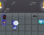
The gameplay space is a little cramped though, so I found myself struggling after killing 6 or 7 enemies.
And the music was pretty good, just maybe too loud.
Love the visuals of this, they were very well done! The movement might also need some work but I may also just be bad at the game hehe.
Love the mechanic of switching up your attack type to damage different enemies, it really helped to encourage me to try all of them out! It also helped that the impact was good, at least to the point where they all felt distinct.
Great job overall!
Effects were interesting blue projectiles impact felt really good.
Also that is a lot of colorfull necromancers.
Gj for submitting ^^ Pretty fun :)
Easy concept, really well applied!
This is a very interesting and original idea with the colors of the opponents. The game requires accurate reactions and is quite colorful. I really liked the effect after a character dies :)
very nice drawing, i was thinking it was a 3d game.
That was fun :)
The main issue here is that the game is not playable with a controller, this would have been a really perfect input system, because moving with WASD, while switching colors with arrows is already a bit counter intuitive (as those two mappings are both movement related imo), PLUS having to fire was really hard to get used to.
It would have been, I think, better to have one key to switch, and one key to fire. This way, you can just switch with your key, and it would have been okay if you had to click twice to switch a color (because in that case it would do a red/green/blue cycle), because you can still do it fairly easy and you don't have to remember the colors mapping, just click and select the color once the visual info comes on screen, and then shoot. It would also have put the emphasis on the "instable" color selection ;)
Enemies movement was great, I'm not sure about their behaviour, I believe it's pretty much random, but it looked good and it did not feel unfair, despite the area being tight, so that's a very nice point !
About the game feel, I think the shoot could be a bit more energetic. More explosions on contact, higher fire rate, charging an attack to release a huge shot or a laser, etc. I know those are not always easy or quick to implement, but it would have add a lot to the game :)
This doesn't need much to be a great game, so you should consider enhance it a little bit after the jam ! The art style is also cute though the overall game is a bit too light or lacks some contrast.
Great job :D
Thx for the detailed review :) that idea is actually really cool and I might implement it after the jam. I also thought about making it juicier but honestly, I ran out f time xD The enemies check for collisions but for the most part don't chase the player, they are meant to be rather goofy and a little stupid :)
Thank you!
Great submission! Fun little arcade game, would love to see more features being added!