Play game
TamDreams PushingBoxes's itch.io pageResults
| Criteria | Rank | Score* | Raw Score |
| Audio | #157 | 2.711 | 2.800 |
| Fun & Game Design | #194 | 2.517 | 2.600 |
| Theme | #203 | 2.453 | 2.533 |
| Overall | #203 | 2.440 | 2.520 |
| Graphics | #215 | 2.324 | 2.400 |
| Originality & Innovation | #240 | 2.195 | 2.267 |
Ranked from 15 ratings. Score is adjusted from raw score by the median number of ratings per game in the jam.
Leave a comment
Log in with itch.io to leave a comment.


Comments
its pretty hard
Hard to hard but just because of character (otherwise i like the idea great job <3 )
Controlling the character was my main challenge, interesting concepts
haha yes, the character is somewhat difficult to control, I must improve it. Thanks for your comment
If I were to remake this I'd try and make the movement more predictable!
Interesting concept though, it has lots of potential! Check out my entry if you like puzzles! :)
Yeah. I must improve the control of the character. Thanks for your comment
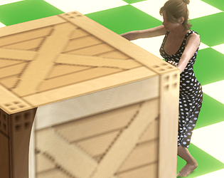
It's very hard on the eyes and controls are really tough. Very interesting choice for the main character sprite, hah. Anyway, keep it up!
the movement of the character I did what I could in the little time we had xD, and I agree that I should improve it.
As for the stage graphics, I don't really know what is not pleasing but hey, thanks for your opinion, keep it up with your project too :)
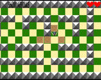
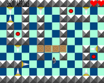
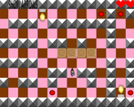
I can elaborate on the graphics. It's all too bright and has too much sharp edges. To improve it you could darken the floor, apply a texture of some sort (carpet, wood planks, anything to break up the repetition). Make the floor tiles checkerboard less prominent.
If you wanted to add some volumes to the walls, you could have made them drawn at an angle (like old rpg walls) so you could see the front face of the wall and a little bit of the top face of the wall. Or you could have used a frustum pyramid instead of the whole pyramid, that would have too reduced the amount of sharp angles.
I understand. Thanks for taking the time to tell me.
The graphics are definitely an odd choice and the game controls kind of poorly, but other than that, solid.
Well, thanks for your opinion.