Play game
Spooksvale's itch.io pageResults
Criteria | Rank | Score* | Raw Score |
Theme | #9 | 3.667 | 3.667 |
Creativity | #10 | 2.917 | 2.917 |
Fun | #10 | 2.583 | 2.583 |
Overall | #11 | 2.833 | 2.833 |
Polish | #12 | 2.167 | 2.167 |
Ranked from 12 ratings. Score is adjusted from raw score by the median number of ratings per game in the jam.
Talking points of your game
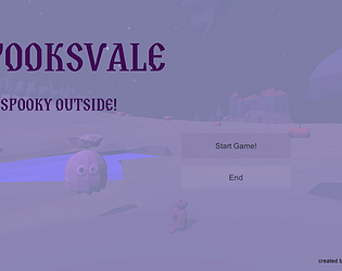
It is a dark Halloween night and Spooky has lost his teddy. Will you help him to find it and bring him back to his hut?
This is officially our first game we, nimmda and medehn, aka DaHoon Games, made together, and the first using Unity! If you find glitches, flying trees or unobedient teddys - keep them, they will bring luck! ;)
What Assets did you use?
fonts from fontfabric: slovic
all graphical assets made by medehn
Leave a comment
Log in with itch.io to leave a comment.
Comments
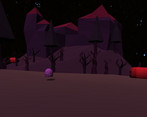
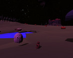
I like some of the environment models but they were hard to see due to the player's camera.
Welp! As your first game, glaring flaws are par for the course. So here you go:
Thanks for your feedback! Camera and controls are bad, I totally agree. As for falling through the water - I think this is because the environment is poorly modelled there. I did add a trigger to reset the player to the starting point if he fell through but that seems to be buggy aswell. Well... Its the effort that counts and you learn from mistakes I guess? :)
I successfully found Teddy and brought him back to base!
The environment seems well done, but character controller seems to be in need of some tweaking, maybe some angle on the camera would help. Also, some music would add a lot.
Thanks for helping Spooky, he will be forever thankful ;) Yeah, music... I kind of realized I forgot to add music an hour before the end of the jam (and while already in bed) - next game. Thank you for your feedback, its much appreciated! :)
The camera movement is making me feel uneasy. I'm guessing it's because the camera also tilts along with the player. I had to stop playing the game because of it :(
Thanks for your feedback! This is an improved version, it was so much worse before ;) But you are absolutely right, the camera and angle needs some work.
it's a good start and concept. but needs polishing and fixes. for instance character is too far. and I'm not fan of the controls. but it's good start in unity.
thx for your feedback. Much appreciate it. We definitely need to do something about controlling the character. :)
Thank you! Yeah we know there is sooo much room for improvement, but it was fun for a start :)