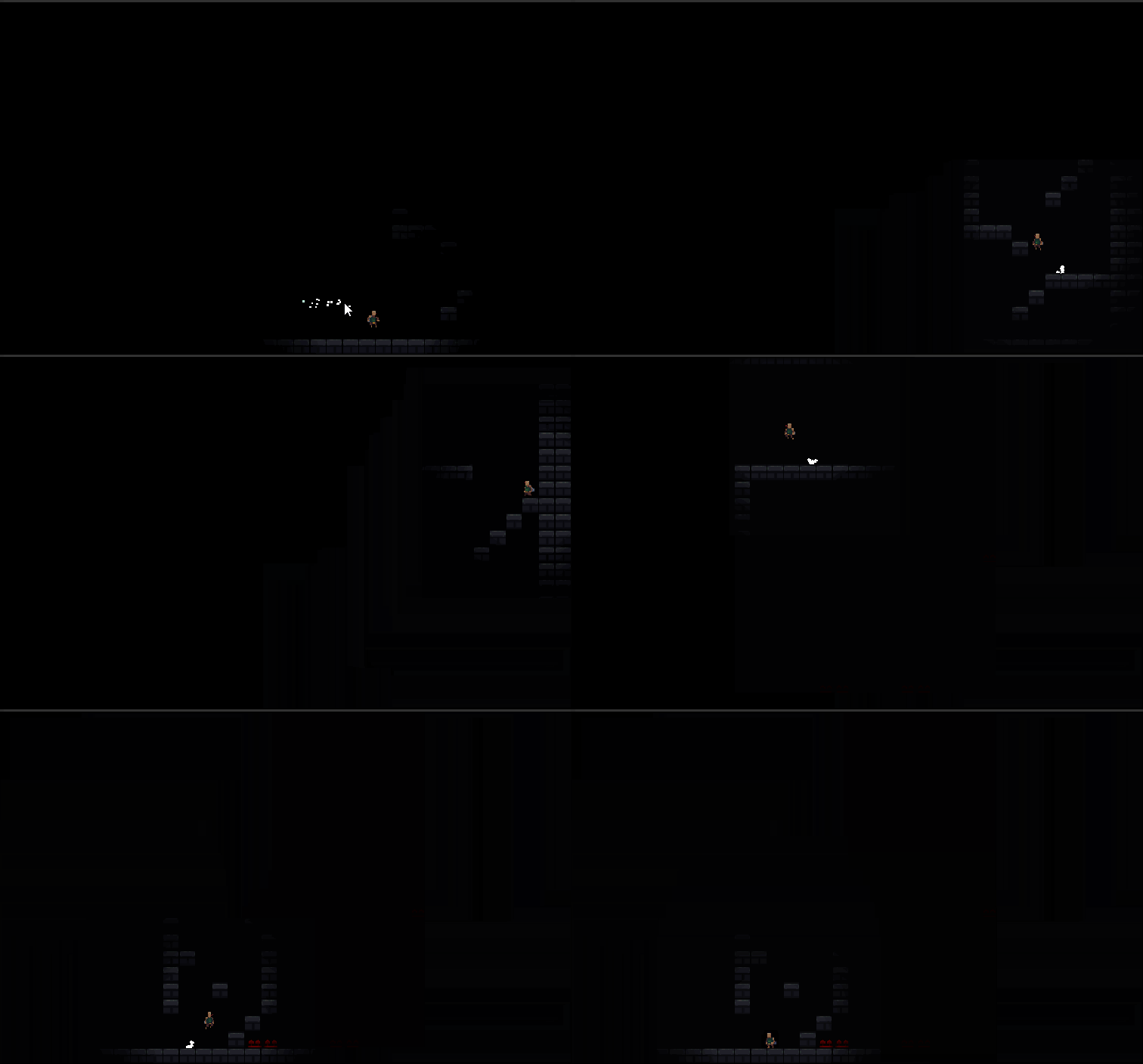
Play game
GMTK Jam 2019 Prototype - One screen platformer's itch.io pageResults
| Criteria | Rank | Score* | Raw Score |
| Design | #332 | 3.850 | 3.850 |
| Overall | #510 | 3.800 | 3.800 |
| Adherence to the Theme | #570 | 4.050 | 4.050 |
| Originality | #885 | 3.500 | 3.500 |
Ranked from 20 ratings. Score is adjusted from raw score by the median number of ratings per game in the jam.
Leave a comment
Log in with itch.io to leave a comment.


Comments
Wow, this is super creative! I've seen a few people do the "only one light" thing, but this is the only implementation I've seen where the one light thing actually affects the design on the game. The controls feel good, the animations are great, and it's all around a well put together entry.
One small thing is that you can still see the rest of the level just about even when the light isn't on it. When I was playing in full screen, I saw the level change from one to the other. If you managed to make it so anything outside the light radius was completely black, I think it'd sell the effect even better
Great job with this!
- Joe
(if you have time to check out our game, we'd love that ^_^ )
Feels good and responsive to play! This is a cool concept for a one-screen platformer, it took me a bit to realize what it was doing. I'm bad at platformers so I didn't get very far heh, but I think it's a well-executed idea. Only gripe is that I would prefer to be able to map controls as I found the existing jump buttons to be pretty awkward for me.
The controls are really well polished. I was amazed when the character held the tile edge. It is rare to see such polished controls in a jam game. The game idea is really nice, I tried to be sneaky and turn back but it turned out that you handled this case. Nice work.
Cool game, fun and feels great. I didn't really figure out how to dash until a while in (some sort of indication near the beginning would be helpful). Music would also have added a lot. Other than that, there's very little to complain about!
I really like the idea of the level constantly changing but I feel like the game is trying a bit too hard to emulate Celeste:
Don't get me wrong: The movement feels great but that's because it's already been tried and tested. Personally I would have rather liked to see more original mechanics, especially since you don't really utilize this moveset in your level design anyway.
I think this is one of the best implementations of the "only one" theme i have seen so far. despite being barebones i still played through it twice, its just a fun movement system and one screen mechanic. I only wish the level was a little darker as i could see when it switched out, but thats a minor grievance.
Ohh god... that defeats the whole purpose of this game. Let me see if i can fix it by updating the build.
Truly fantastic, best submission I've played so far. Only wish there were more levels. Mechanics are crisp and surprisingly deep (I didn't realize there was a dash until surprisingly far in, managed to get by on the vertical wall jump trick). Reminded me of Celeste which is a real compliment. Hope you expand on this idea!
Amazing concept. I love this idea. I couldn't get the first wall jump on the '2nd' screen but if that was easier, I would love to play this more
5/5 on every category, brilliant concept and very satisfying animations and controls. as others have pointed out, i would've swapped the keys, and i wish it were longer, but great nonetheless.
I don't know what kind of black magic witchery this game is but I do know that it's fantastic.
I would prefer to use up arrow or w to jump instead of spacebar or c because it just feels awkward but overall a pretty good game