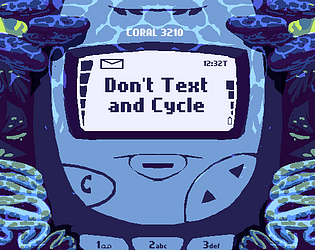
Play game
Don't Text and Cycle's itch.io pageResults
| Criteria | Rank | Score* | Raw Score |
| Presentation | #759 | 3.704 | 3.704 |
| Originality | #762 | 3.667 | 3.667 |
| Overall | #1501 | 3.130 | 3.130 |
| Fun | #2734 | 2.537 | 2.537 |
Ranked from 54 ratings. Score is adjusted from raw score by the median number of ratings per game in the jam.
How does your game fit the theme?
your bike is hard to control while you text, and stress makes it even harder to control
Did your team create the art for this game during the 48 hour time slot?
Yes
We created all art during the game jam
Did your team create the audio for this game during the 48 hour time slot?
Yes
We created all audio during the game jam
Leave a comment
Log in with itch.io to leave a comment.


Comments
Fun game! For some reason though I could send one text and then it wouldnt let me send anymore (the screen/helmet was cracked, does that affect it?)
Fits the theme nicely :)
Thanks! I think you ran into a bug. The screen cracks are supposed to make them harder to read but still let you send.
Oh! Makes sense that it was a bug, but I still thought it was a great game :)
great concept loved the helmet breaking element and level designing ! Keep creating !
Bonkers! Is this game set underwater? just nuts :)
Good concept that fits the theme. But got a black screen after clicking on restart, and could not move forward.
It seems like you have a cool concept for a game here. However, it doesn't seem to matter what answer I pick for a text, so I don't have to spend any time reading it, I can just cancel it as fast as possible. Perhaps if the point of answering the texts was to select a coherant response out of some weird responses, it would give me more incentive to actually read the texts. The more I played, the more "loose" the left and right keys felt. It got to the point where I was traveling halfway across the road with a single frame of a button press. I had to refresh the window every time I played a new round to fix this. Often, I was too focused on the road to notice that I had a text waiting for me. If there was a text alert sound, that would be super helpful. Also, I had to check previous comments to see how your game controls because on the itch.io page, it says you have to press ENTER to answer a text, but you have to press backslash in the game. If those comments werent there I would have assumed your game did not work.
Overall, I liked your concept, but the delivery wasn't quite there.
I can only agree to this comment. I was also annoyed that the controls were not as expect (you can change the websites text POST deadline ;) ) but I didn't mind too much because I much more enjoyed reading all the weird texts your friend sent me... Of course I have my Pizza in the oven... but sadly I couldn't handle my bike in the mean time. And actually only concentrating on my bike alone was hard enough. But whatever. This game wasn't supposed to be a too deep gameplay, you had only 1/3 of your time working on programming, the rest was doing art and music which were well integrated. I especially loved how you put the game in a fitting frame (if you don't play on fullscreen) that was amazing!
Thank you! I have updated those instructions :-). I'm glad you had fun.
Thanks for playing and commenting! The "looser" steering as the game goes on happens when you get the wrong answers to the text (because you get angrier, faster, more stressful replies) or when you get stressed out from ignoring the alerts and using your willpower not to look.
Also, thanks for letting us know about the instructions on the page. It should have mentioned keypad enter or slash. I have updated those instructions to make it clearer.