Play game
Party Finder's itch.io pageResults
| Criteria | Rank | Score* | Raw Score |
| Originality | #338 | 3.948 | 4.188 |
| Overall | #472 | 3.732 | 3.958 |
| Fun | #690 | 3.477 | 3.688 |
| Presentation | #709 | 3.771 | 4.000 |
Ranked from 16 ratings. Score is adjusted from raw score by the median number of ratings per game in the jam.
How does your game fit the theme?
Party Finder is about the relationship between the randoms you find on your path of MMORPG adventure and the raid party finding experience.
Did your team create the vast majority of the art during the 48 hours?
Yes
We created the vast majority of the art during the game jam
Did your team create the vast majority of the music during the 48 hours?
Yes
We created the vast majority of the music during the game jam
Leave a comment
Log in with itch.io to leave a comment.


Comments
What a fun concept! Also laughed hard at "I want to kick my own ass! I want to die!"
Might need some optimization though. It's a warm day here today, and my computer fans were wheezing while I played this.
love the concept! amazing visual and music! great job
I REALLY Love this game, I saved it on my computer to play more later, It is really fun, has a great concept and great art! I had a little trouble figuring it out at first but I enjoyed the learning processes! I would love to see this on steam some day!
This game had a really cool concept and style and I had a lot of fun playing and testing out different variations of cards. In the end, my best strategy was loading up on people who refused to die and people who didn't want to die, and then hoping their combined attacks would be enough for whatever mobs were thrown at them next. The other cards were all interesting variations, I liked cards that only wanted one specific mob and the ones that called for a healer mommy were quite amusing- and while I rarely was incentivized to use any who wanted to die or wanted to watch someone else die, they definitely proposed interesting possibilities. If anything, I wish there was more of a randomized incentive to use cards like that, and balance the cards you have and unlock new ones to use for specific fights. The idea that sometimes you should plan to loose, and pick specific cards that will reward you for losing, is very cool. I would adore seeing this game expanding post-jam, the game put together for the jam was incredible and it has so much potential. Great job!
i loved the art and concept of the game and thought using random "players" as one of the core concepts was hilarious. i would love to see more :)
I really enjoyed the concept and the aesthetics!
Love the concept and art style:)
This was a whole lotta fun! This is such an original take on the concept. The writing is so funny too. Great work!
This reminds me of hearthstone mixed with clickers mixed with visual novels somehow. I liked the nicknames of various players. Overall a solid entry, had fun playing! The guy that "wants to kick his own ass" 😂
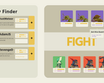
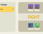
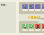
Strategic decisions were not so easy due to stats being presented as bars and not precise values.
I also dragged out a guy out of my party by accident and was not able to undo (confirmation would be cool).
💪💪💪 nice
The game did not work for me, I was stuck on the first screen. But from the screenshots, the game looks really cool!
Very unique concept with a great presentation!
It's fun to try to get that perfect party to go the distance!
The total gameplay is okay, I love the arts, stylish and magical characters, and especially the system
The game loop triggers me to play multiple times, but it's too hard tbh, enemies' stats aren't clear, so as how much heal/dmg you can deal.
The music itself is great, but I don't see how it's related to the topic? I feel like a mid-earth feeling bgm would be better, but the current one is good by itself.
I understand it's a game jam, but the UI is a bit too cheap. You see the pixel difference between corners and frames right? I'm a UI person so meh.
Yeah like the barcode dude mentioned, barcode nicknames are "i"s and "L"s, not with "1"s. I gotta say this cause I use barcodes in competitive, and this one with 1 looks like a lame copycat.
Overall is good, I'm giving applause to the system designer, coding, and arts fellas, but maybe do some more UI, it's quite off.
It's cool that strategies matters. I really enjoy the game when I'm thinking how to arrange my team. But there's clearly some bugs that shows a lack of play tests. You can drag your party member out of the team to kick them out. If I only have one member, the game breaks. If only healer survived, the game cannot end because enemies cannot kill the healer. Maybe adding a limit of rounds will be nice.
The UI is a little confusing. It does not show exactly how much hp every character has. All they have is a bar in the same length. I cannot really tell which has more hp. This makes my strategies meaningless in some situations. Also, the UI does not really fit the theme of an MMORPG world.
I love the arts, especially all of them have a tiny pointy head.
As for the music, it is good by itself. However, it has the same problem as the UI. It does not fit the theme of an MMORPG fantasy world. It is too cute for it. I would expect a fantasy-ish, middle age tavern style music, like the Hearthstone but more battle-ish.
By the way, one of the username is 1ll1lll111ll , which makes no sense. I don't know if you wanna try to make fun of it or something else(it's not funny anyway). Check my name, it's upper case 'i' and lower case 'L'.
All in all, the system, arts are super great, but you do need to spend more time on making all the functions work well together, and fitting all the stuffs into the theme. I can tell you tried hard on making all the parts, but they just feel not good together.